
渐变属性
- linear-gradient 线性渐变
- repeating-linear-gradient 重复线性渐变
- radial-gradient 径向渐变
- repeating-radial-gradient 重复径向渐变
实例
- 线性渐变背景色
- to bottom / 蓝 / 粉
<style> .boxContent {
      width: 400px; height: 200px; margin: 20px; padding: 20px 0; box-sizing: border-box; text-align: center; } .boxContent.box1 {
      background: linear-gradient(to bottom, rgb(107, 175, 240), rgb(245, 137, 227)); } </style>
讯享网

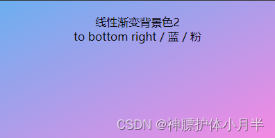
- 线性渐变背景色
- to bottom right / 蓝 / 粉
讯享网<style> .boxContent {
      width: 400px; height: 200px; margin: 20px; padding: 20px 0; box-sizing: border-box; text-align: center; } .boxContent.box2 {
      background: linear-gradient(to bottom right, rgb(107, 175, 240), rgb(245, 137, 227)); } </style>
- 线性渐变背景色
- -30deg / 蓝 / 粉
<style> .boxContent {
      width: 400px; height: 200px; margin: 20px; padding: 20px 0; box-sizing: border-box; text-align: center; } .boxContent.box3 {
background: linear-gradient(-30deg, rgb(107, 175, 240), rgb(245, 137, 227)); } </style> 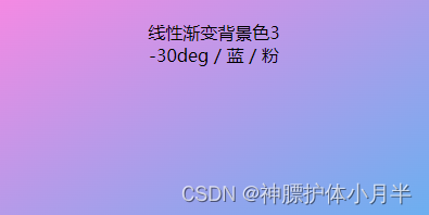
- 线性渐变背景色
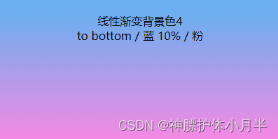
- to bottom / 蓝 10% / 粉
讯享网<style> .boxContent {
      width: 400px; height: 200px; margin: 20px; padding: 20px 0; box-sizing: border-box; text-align: center; } .boxContent.box4 {
      background: linear-gradient(to bottom, rgb(107, 175, 240) 10%, rgb(245, 137, 227)); } </style>
- 线性渐变背景色
- to bottom / 蓝 10% / 粉 60%
<style> .boxContent {
      width: 400px; height: 200px; margin: 20px; padding: 20px 0; box-sizing: border-box; text-align: center; } .boxContent.box5 {
background: linear-gradient(to bottom, rgb(107, 175, 240) 10%, rgb(245, 137, 227) 60%); } </style> 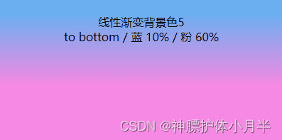

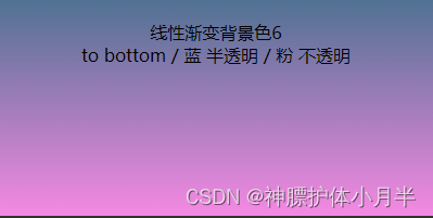
- 线性渐变背景色
- to bottom / 蓝 半透明 / 粉 不透明
讯享网<style> .boxContent {
      width: 400px; height: 200px; margin: 20px; padding: 20px 0; box-sizing: border-box; text-align: center; } .boxContent.box6 {
      background: linear-gradient(to bottom, rgba(107, 175, 240, 0.5), rgba(245, 137, 227, 1)); } </style>
- 线性渐变重复背景色
- to right / 白 0% / 蓝40% / 粉50%
- 默认第一个颜色起始是0,最后一个颜色的百分比为终止位置
- 如果最后一个颜色百分比为 20%,则图形中会出现 5 组渐变色
<style> .boxContent {
      width: 400px; height: 200px; margin: 20px; padding: 20px 0; box-sizing: border-box; text-align: center; } .boxContent.box7 {
background: repeating-linear-gradient(to right, rgb(255, 255, 255), rgb(107, 175, 240) 40%, rgb(245, 137, 227) 50%); } </style> 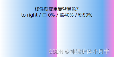
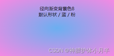
- 径向渐变背景色
- 默认形状(椭圆) / 蓝 / 粉
讯享网<style> .boxContent {
      width: 400px; height: 200px; margin: 20px; padding: 20px 0; box-sizing: border-box; text-align: center; } .boxContent.box8 {
      background: radial-gradient(rgb(107, 175, 240), rgb(245, 137, 227)); } </style>
- 径向渐变背景色
- 圆形 / 蓝 / 粉
- 径向渐变其他属性,repeat、百分比等特性都与线性渐变一样
<style> .boxContent {
      width: 400px; height: 200px; margin: 20px; padding: 20px 0; box-sizing: border-box; text-align: center; } .boxContent.box9 {
background: radial-gradient(circle, rgb(107, 175, 240), rgb(245, 137, 227)); } </style> 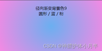
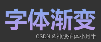
- 字体渐变
- div 添加渐变效果,字体透明镂空,形成字体颜色渐变的效果
讯享网<style> .boxContent {
      width: 400px; height: 200px; margin: 20px; padding: 20px 0; box-sizing: border-box; text-align: center; } .boxContent.box10 {
      background: linear-gradient(to bottom, rgb(107, 175, 240), rgb(245, 137, 227)); -webkit-background-clip: text; -webkit-text-fill-color: transparent; font-weight: bold; font-size: 80px; } </style>
版权声明:本文内容由互联网用户自发贡献,该文观点仅代表作者本人。本站仅提供信息存储空间服务,不拥有所有权,不承担相关法律责任。如发现本站有涉嫌侵权/违法违规的内容,请联系我们,一经查实,本站将立刻删除。
如需转载请保留出处:https://51itzy.com/kjqy/74407.html