
 .app {
    background-color: #000; padding: 20px; } .btn {
    width: 80px; height: 30px; border-radius: 8px; color: #fff; background-color: steelblue; margin: 4px; display: flex; align-items: center; justify-content: center; } .btn-text{
    text-align: center; line-height: 30px; } @keyframes btnAnimate {
    from {
    border: 2px solid #fff; width: 82px; height: 34px; } to {
    border: 1px solid rgba(255, 255, 255, 0); width: 100px; height:45px; } } .btn:hover:before {
    content: ''; position: absolute; width: 80px; height: 30px; border-radius: 10px; animation: btnAnimate 3s ease; transition: all 0.5s ease; }
讯享网
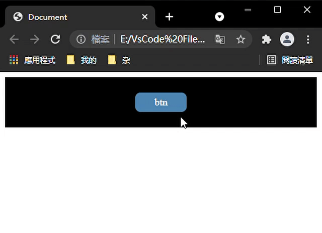
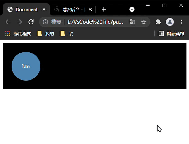
讯享网<div class="app"> <div class="btn"> <div class="btn-text">btn</div> </div> </div>
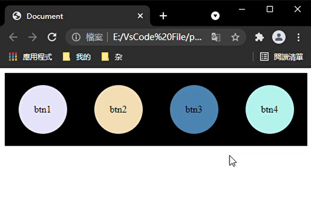
btn变成圆形时
btn加上旋转效果
 @keyframes btnAnimate {
    from {
    transform: rotate(0deg); border: 4px solid #fff; width: 82px; /* height: 34px; */ height: 82px; border-radius: 50%; } to {
transform: rotate(360deg); border: 1px solid rgba(255, 255, 255, 0); width: 100px; /* height:45px; */ height: 100px; border-radius: 50%; } } 
btn加上漾开效果
讯享网@keyframes btnAnimate {
    0% {
    border: 4px solid rgba(255,255,255,0.3); width: 82px; height: 82px; background: radial-gradient(rgba(255,255,255,0) 0%,rgba(255,255,255,.1) 20%, rgba(255,255,255,.3) 30%,rgba(255,255,255,.65) 50%, rgba(255,255,255,.55) 70%, rgba(255,255,255,.6) 80%, rgba(255,255,255,1) 95%,rgba(255,255,255,0.3) 100%); } 20% {
    background: radial-gradient(rgba(255,255,255,0) 0%,rgba(255,255,255,.1) 40%, rgba(255,255,255,.3) 50%,rgba(255,255,255,.65) 70%, rgba(255,255,255,.55) 80%, rgba(255,255,255,.6) 85%, rgba(255,255,255,1) 90%,rgba(255,255,255,0.3) 100%); } 40% {
    background: radial-gradient(rgba(255,255,255,0) 0%,rgba(255,255,255,.1) 60%, rgba(255,255,255,.3) 70%,rgba(255,255,255,.65) 80%, rgba(255,255,255,.55) 85%, rgba(255,255,255,.6) 87%, rgba(255,255,255,1) 92%,rgba(255,255,255,0.3) 100%); } 60% {
    background: radial-gradient(rgba(255,255,255,0) 0%,rgba(255,255,255,.1) 80%, rgba(255,255,255,.3) 82%,rgba(255,255,255,.65) 88%, rgba(255,255,255,.55) 90%, rgba(255,255,255,.6) 95%, rgba(255,255,255,1) 97%,rgba(255,255,255,0.3) 100%); } 80% {
    background: radial-gradient(rgba(255,255,255,0) 0%,rgba(255,255,255,.1) 100%); } 100% {
    border: 1px solid rgba(255,255,255,0); width: 100px; height: 100px; } }
btn漾开实线效果
 @keyframes btnAnimate {
    0% {
    border: 4px solid rgba(255,255,255,0.3); width: 82px; height: 82px; background: radial-gradient(rgba(255,255,255,.8) 0%, rgba(255,255,255,.2) 2%, rgba(255,255,255,0.1) 100%); } 10% {
    background: radial-gradient(rgba(255,255,255,0) 0%, rgba(255,255,255,.1) 8%, rgba(255,255,255,.8) 10%, rgba(255,255,255,.2) 12%, rgba(255,255,255,0.1) 100%)} 20% {
   background: radial-gradient(rgba(255,255,255,0) 0%,rgba(255,255,255,.1) 20%, rgba(255,255,255,.8) 22%,rgba(255,255,255,.2) 24%, rgba(255,255,255,.1) 100%);} 30% {
   background: radial-gradient(rgba(255,255,255,0) 0%,rgba(255,255,255,.1) 30%, rgba(255,255,255,.8) 32%,rgba(255,255,255,.2) 34%, rgba(255,255,255,.1) 100%);} 40% {
   background: radial-gradient(rgba(255,255,255,0) 0%,rgba(255,255,255,.1) 40%, rgba(255,255,255,.8) 42%,rgba(255,255,255,.2) 44%, rgba(255,255,255,.1) 100%);} 50% {
   background: radial-gradient(rgba(255,255,255,0) 0%,rgba(255,255,255,.1) 50%, rgba(255,255,255,.8) 52%,rgba(255,255,255,.2) 54%, rgba(255,255,255,.1) 100%);} 60% {
   background: radial-gradient(rgba(255,255,255,0) 0%,rgba(255,255,255,.1) 60%, rgba(255,255,255,.8) 62%,rgba(255,255,255,.2) 64%, rgba(255,255,255,.1) 100%);} 70% {
   background: radial-gradient(rgba(255,255,255,0) 0%,rgba(255,255,255,.1) 70%, rgba(255,255,255,.8) 72%,rgba(255,255,255,.2) 74%, rgba(255,255,255,.1) 100%);} 80% {
   background: radial-gradient(rgba(255,255,255,0) 0%,rgba(255,255,255,.1) 80%, rgba(255,255,255,.8) 82%,rgba(255,255,255,.2) 84%, rgba(255,255,255,.1) 100%);} 90% {
   background: radial-gradient(rgba(255,255,255,0) 0%,rgba(255,255,255,.1) 90%, rgba(255,255,255,.8) 92%,rgba(255,255,255,.2) 94%, rgba(255,255,255,.1) 100%);} 100% {
border: 1px solid rgba(255,255,255,0); width: 100px; height: 100px; } } 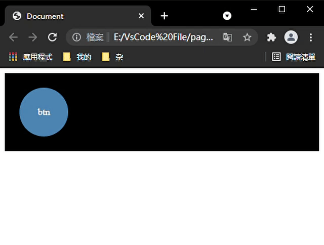
加上调节btn大小
讯享网@keyframes btnSizeAnimate {
    from{
   width: 80px;height: 80px;} to{
   width: 85px;height: 85px;} } .btn:hover{
    animation: btnSizeAnimate 0.7s linear; /* 这里调节动画时间可以让两个动画得配合更加自然 */ transition: all 0.3s linear; }

加上调整位置
@keyframes btnPositionAnimate {
    from{
   top:0px;} to{
   top: -3px;} } .btn:hover{
/* animation: btnSizeAnimate 0.7s linear; */ /* transition: all 0.3s linear; */ animation: btnPositionAnimate 0.6s linear; transition: all 0.8s linear; } 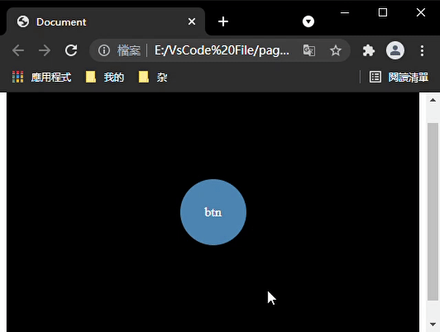
border-shadow控制的一种按钮
#000000cc代表相同的顏色 rgb(0 0 0 / 80%)(略透明的黑色)。具体可看
这个按钮的来源链接:https://melodyjerry.gitee.io/simpleindex/
讯享网 .btn {
    width: 90px; height: 90px; display: flex; justify-content: center; align-items: center; border-radius: 15px; box-shadow: 18px 18px 30px rgb(0 0 0 / 10%), -18px -18px 30px rgb(255 255 255); } .btn:hover {
    box-shadow: 0px 0px 0px rgb(0 0 0 / 20%), 0px 0px 0px rgb(255 255 255 / 80%), inset 18px 18px 30px rgb(0 0 0 / 10%), inset -18px -18px 30px rgb(255 255 255); transition: box-shadow .2s ease-out; }
<div class="btn"> <a href="http://www.baidu.com"> <img src="./image/MyIndex_files/baidu.png" alt=""> </a> </div> 
底部展开收起的btn组
讯享网 .btn-list {
    display: flex; flex-direction: column; position: absolute; bottom: 10px; right: 15px; padding: 0 10px; } .btn-item {
    display: flex; align-items: center; } .btn {
    display: inline-block; background-color: #fff; border-radius: 50%; width: 50px; height: 50px; margin: 8px 0; display: flex; justify-content: center; align-items: center; box-shadow: 5px 5px 10px rgb(0 0 0 / 10%), -5px -5px 10px rgb(255 255 255); z-index: 9; } .btn:hover {
    /* box-shadow: 0px 0px 0px rgb(0 0 0 / 10%), 0px 0px 0px rgb(255 255 255 / 60%), inset 5px 5px 10px rgb(0 0 0 / 10%), inset -5px -5px 10px rgb(255 255 255); */ /* transition: box-shadow .2s ease-out; */ } .btn-arrow {
    transform: rotate(180deg); transition: all 2s ease; } .btn i {
    font-size: 25px; } .btn-tip {
    position: absolute; font-size: 12px; color: #fff; padding: 5px; align-items: center; left: -30px; /* display: none; */ visibility: hidden; z-index: -1; } .btn-tip-content {
    background-color: #000; white-space: nowrap; padding: 8px; border-radius: 5px; display: inline-block; } .btn-tip:after {
    position: absolute; content: ''; border-top: 10px solid transparent; border-left: 10px solid #000; border-bottom: 10px solid transparent; top: 11px; }
 <div class="app"> <div class="btn-list"> <div class="btn-list-content"> <div class="btn-item"> <div class="btn btn-top"><i class="iconfont icon-retop"></i></div> <div class="btn-tip"><div class="btn-tip-content">回顶</div></div> </div> <div class="btn-item"> <div class="btn btn-theme"><i class="iconfont icon-DarkTheme"></i></div> <div class="btn-tip"><div class="btn-tip-content">明/暗</div></div> </div> </div> <div class="btn-item"> <div class="btn btn-arrow"><i class="iconfont icon-arrow-down"></i></div> <div class="btn-tip"><div class="btn-tip-content">收起</div></div> </div> </div> </div> <script> var arrowBtn = document.querySelector('.btn-arrow'); var arrowBtnItem = arrowBtn.parentNode; var arrowBtnTip = arrowBtnItem.children[1]; var btnistContent = document.querySelector('.btn-list-content'); arrowBtn.addEventListener('click', function () {
      let isRotate = arrowBtn.style.transform == 'rotate(0deg)'; arrowBtn.style.transform = isRotate ? 'rotate(180deg)' : 'rotate(0deg)'; arrowBtn.style.transition = isRotate ?'all 0.5s ease':'all 1.5s ease'; arrowBtnTip.children[0].innerHTML = isRotate ?'收起':'展开'; btnistContent.style.transform = isRotate ?'translateY(0px)':'translateY(120px)'; setTimeout(() => {
      btnistContent.style.display = isRotate ?'block':'none'; }, 500) btnistContent.style.transition = isRotate ?'all 1s ease':'all 2s ease'; }) var btns = document.querySelectorAll('.btn'); var btnTips = document.querySelectorAll('.btn-tip'); for (let i = 0; i < btns.length ; i++) {
      btns[i].addEventListener('mouseenter', btnTipShow, {
      self: true }); btns[i].addEventListener('mouseleave', btnTipShow, {
      self: true }); } function btnTipShow(e) {
      let btnNode = e.target; let btnItemNode = btnNode.parentNode; let btnTip = btnItemNode.children[1]; if (btnTip) {
btnTip.style.zIndex = btnTip.style.zIndex == '0' ? '-1' : '0'; btnTip.style.visibility = btnTip.style.visibility == 'visible' ? 'hidden':'visible'; btnTip.style.left = btnTip.style.left == '-60px' ? '-30px' : '-60px'; btnTip.style.transition = btnTip.style.transition == 'all .5s ease'?'all .2s ease':'all .5s ease'; } } </script> 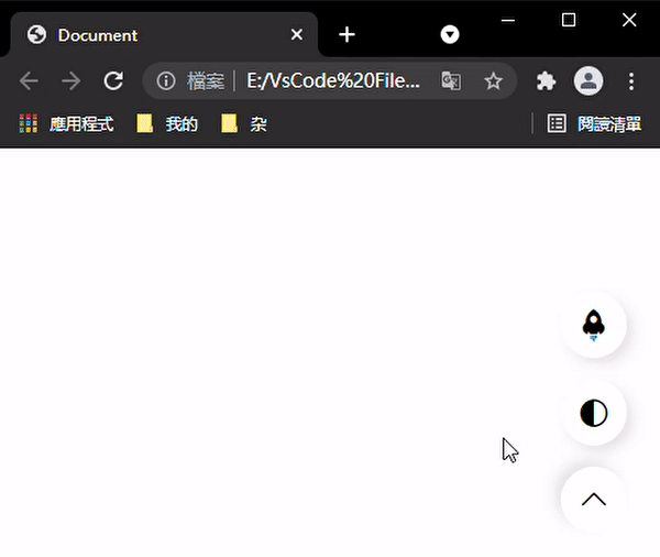
版权声明:本文内容由互联网用户自发贡献,该文观点仅代表作者本人。本站仅提供信息存储空间服务,不拥有所有权,不承担相关法律责任。如发现本站有涉嫌侵权/违法违规的内容,请联系我们,一经查实,本站将立刻删除。
如需转载请保留出处:https://51itzy.com/kjqy/38357.html