
本文主要记录几种常用的div盒子水平垂直都居中的方法。本文主要参考了该篇博文并实践加以记录说明以加深理解记忆 css之div盒子居中常用方法大全
本文例子使用的 html body结构下的div 盒子模型如下:
<body> <div class="container"> <div class="box"></div> </div> </body>讯享网
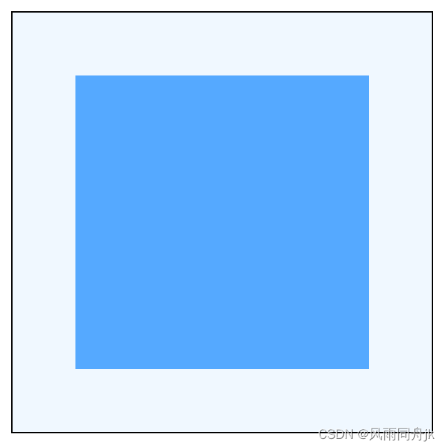
例子盒子居中效果都如下图:

注:当把div 盒子模型中子div换成其他块级元素,如<p>或<h1>~<h6>时,以下方法仍然奏效。但当把子div换成行内元素,如<span>时,第6,第7种方法将失效。
1、弹性布局 设置容器项目在横轴和纵轴上都居中对齐
讯享网<style> .container{ height: 300px; width: 300px; border: 1px solid black; background-color: aliceblue; display: flex; justify-content: center; align-items: center; } .box{ width: 120px; height: 120px; background: #55a9ff; } </style>
2、弹性布局 设置容器项目 margin:auto
该方法可以不设置容器项目横轴和纵轴的对齐方式,直接设置margin:auto即可2、弹性布局 设置容器项目 margin:auto
<style> .container{ height: 300px; width: 300px; border: 1px solid black; background-color: aliceblue; display: flex; } .box{ width: 120px; height: 120px; margin: auto; background: #55a9ff; } </style>
3、绝对定位法
父div要使用其中一种定位方式:relative / absolute / sticky / fixed,子div使用绝对定位,并使它的 top、left、right、bottom 都为0且margin:auto 即可
讯享网<style> .container{ height: 300px; width: 300px; border: 1px solid black; background-color: aliceblue; position: relative; } .box{ width: 120px; height: 120px; position: absolute; background: #55a9ff; top: 0; left: 0; right: 0; bottom: 0; margin: auto; } </style>
- 绝对定位法还可以只设置top、bottom为0,实现只垂直居中
<style> .container{ height: 300px; width: 300px; border: 1px solid black; background-color: aliceblue; position: relative; } .box{ width: 100px; height: 100px; position: absolute; background: #55a9ff; top: 0; bottom: 0; margin: auto; } </style>
- 同理可以只设置left、right为0,实现只水平居中
4、transform居中法
使用 transform 可以不用管子div自身的宽高,但要设置父子div的position属性,可都设置成 relative / absolute,此方法IE9 以下不支持

讯享网<style> .container{ height: 300px; width: 300px; border: 1px solid black; background-color: aliceblue; position: relative; } .box{ width: 120px; height: 120px; position: absolute; background: #55a9ff; top: 50%; left: 50%; transform: translate(-50%,-50%); } </style>
5、负margin居中
利用子div 负的margin来进行居中,此方法要知道子div固定的宽高,且margin-top、margin-left 要是子div 自身宽高负的一半值
<style> .container{ height: 300px; width: 300px; border: 1px solid black; background-color: aliceblue; position: relative; } .box{ width: 120px; height: 120px; position: absolute; background: #55a9ff; top: 50%; left: 50%; margin-top: -60px; margin-left: -60px; } /* 如果box的宽高都是100px,那margin-top和margin-left要是-50px */ </style>6、margin固定宽高居中
此方法要知道父子div的宽高,且要算出子div的margin 的高度和宽度 恰好在父div居中
该方法把子div换成行内元素,如<span>时将会失效
讯享网<style> .container{ height: 300px; width: 300px; border: 1px solid black; background-color: aliceblue; } .box{ width: 120px; height: 120px; background: #55a9ff; margin: 90px 90px; } /* 如果 box 的宽高都是 100px,那么 margin: 100px 100px; */ </style>
7、table-cell居中
此方法是将父div转换成表格单元格显示,然后使用垂直居中并且子div左右margin auto实现,该方法把子div换成行内元素,如<span>时将会失效
<style> .container{ height: 300px; width: 300px; border: 1px solid black; background-color: aliceblue; display: table-cell; vertical-align: middle; } .box{ width: 120px; height: 120px; background: #55a9ff; margin: 0 auto; /* 不能省 */ } </style>8、不确定宽高居中(绝对定位百分数)
此方法不设置子div的宽高,其宽高根据设置占用父div的比例来算,left和right的百分数一样就可以实现水平居中,top和bottom的百分数一样就可以实现垂直居中。其中子div要设置成绝对定位,父div 要设置成 relative / absolute / fixed / sticky
讯享网<style> .container{ height: 300px; width: 300px; border: 1px solid black; background-color: aliceblue; position: relative; } .box{ position: absolute; background: #55a9ff; top: 25%; left: 25%; right: 25%; bottom: 25%; margin: auto; } /* top / left / right / bottom 设置的比例不一样,box 的宽高将会随之变大或变小*/ </style>
以上方法如有错误请各位不吝指教,如以后有别的方法将会往下继续添加,各位有其他方法可留言告知。
版权声明:本文内容由互联网用户自发贡献,该文观点仅代表作者本人。本站仅提供信息存储空间服务,不拥有所有权,不承担相关法律责任。如发现本站有涉嫌侵权/违法违规的内容,请联系我们,一经查实,本站将立刻删除。
如需转载请保留出处:https://51itzy.com/kjqy/27534.html