
可信度Credibility, 模型Models, 和参数Parameters
本章的目标是介绍贝叶斯数据分析的概念框架。贝叶斯数据分析有两个基本思想。第一个想法是贝叶斯推理是在可能性之间重新分配可信度。第二个基本思想是,我们分配可信度的可能性是有意义的数学模型中的参数值。
贝叶斯推理是在可能性之间重新分配可信度
制作图 1 的第一步是将数据对象放在一起。为了帮助解决这个问题,我们将使用tidyverse包。
library(tidyverse) d <- crossing(iteration = 1:3, stage = factor(c("Prior", "Posterior"), levels = c("Prior", "Posterior"))) %>% expand(nesting(iteration, stage), Possibilities = LETTERS[1:4]) %>% mutate(Credibility = c(rep(.25, times = 4), 0, rep(1/3, times = 3), 0, rep(1/3, times = 3), rep(c(0, .5), each = 2), rep(c(0, .5), each = 2), rep(0, times = 3), 1)) 讯享网
我们可以使用 head() 来查看数据的前几行。
讯享网head(d)
# A tibble: 6 x 4 iteration stage Possibilities Credibility <int> <fct> <chr> <dbl> 1 1 Prior A 0.25 2 1 Prior B 0.25 3 1 Prior C 0.25 4 1 Prior D 0.25 5 1 Posterior A 0 6 1 Posterior B 0.333 在我们尝试图 2.1 之前,我们需要两个补充数据框。第一个,d_text,将提供绘图中注释的坐标。第二个,d_arrow,将提供箭头的坐标。
讯享网text <- tibble(Possibilities = "B", Credibility = .75, label = str_c(LETTERS[1:3], " is\nimpossible"), iteration = 1:3, stage = factor("Posterior", levels = c("Prior", "Posterior"))) arrow <- tibble(Possibilities = LETTERS[1:3], iteration = 1:3) %>% expand(nesting(Possibilities, iteration), Credibility = c(0.6, 0.01)) %>% mutate(stage = factor("Posterior", levels = c("Prior", "Posterior")))
现在就可以画出我们的图1了。
d %>% ggplot(aes(x = Possibilities, y = Credibility)) + geom_col(color = "grey30", fill = "grey30") + # 底行注释 geom_text(data = text, aes(label = label)) + # 底行的箭头 geom_line(data = arrow, arrow = arrow(length = unit(0.30, "cm"), ends = "first", type = "closed")) + facet_grid(stage ~ iteration) + theme(axis.ticks.x = element_blank(), panel.grid = element_blank(), strip.text.x = element_blank()) 
我们将采用类似的方法来制作我们的图 2.2 版本。但是这一次,我们将直接在geom_text()和geom_line()中定义我们的补充数据集。掌握这两种方法是很好的。还要注意我们是如何简单地将我们的主要数据集直接输入 ggplot() 而不保存它的。
讯享网# primary data crossing(stage = factor(c("Prior", "Posterior"), levels = c("Prior", "Posterior")), Possibilities = LETTERS[1:4]) %>% mutate(Credibility = c(rep(0.25, times = 4), rep(0, times = 3), 1)) %>% # plot! ggplot(aes(x = Possibilities, y = Credibility)) + geom_col(color = "grey30", fill = "grey30") + # annotation in the bottom panel geom_text(data = tibble( Possibilities = "B", Credibility = .8, label = "D is\nresponsible", stage = factor("Posterior", levels = c("Prior", "Posterior")) ), aes(label = label) ) + # the arrow geom_line(data = tibble( Possibilities = LETTERS[c(4, 4)], Credibility = c(.25, .99), stage = factor("Posterior", levels = c("Prior", "Posterior")) ), arrow = arrow(length = unit(0.30, "cm"), ends = "last", type = "closed"), color = "grey92") + facet_wrap(~ stage, ncol = 1) + theme(axis.ticks.x = element_blank(), panel.grid = element_blank())

数据是有噪音的,推论是概率性的。
现在转到图 3。我很确定图中的曲线是高斯曲线,我们将使用 dnorm() 函数来制作。经过一些试验和错误,他们的标准偏差看起来是 1.2。然而,将这些曲线与概率一起放置是很棘手的,因为四种离散大小(即 1 到 4)的概率与高斯密度曲线的度量不同。由于四个离散大小的概率度量是绘图的主要度量,我们需要使用一些代数重新调整曲线。我们在下面的数据代码中这样做。之后,绘图的代码就比较简单了。
# data tibble(mu = 1:4, p = .25) %>% expand(nesting(mu, p), x = seq(from = -2, to = 6, by = .1)) %>% mutate(density = dnorm(x, mean = mu, sd = 1.2)) %>% mutate(d_max = max(density)) %>% mutate(rescale = p / d_max) %>% mutate(density = density * rescale) %>% # plot! ggplot(aes(x = x)) + geom_col(data = . %>% distinct(mu, p), aes(x = mu, y = p), fill = "grey67", width = 1/3) + geom_line(aes(y = density, group = mu)) + scale_x_continuous(breaks = 1:4) + scale_y_continuous(breaks = 0:5 / 5) + coord_cartesian(xlim = c(0, 5), ylim = c(0, 1)) + labs(title = "Prior", x = "Possibilities", y = "Credibility") + theme(axis.ticks.x = element_blank(), panel.grid = element_blank()) 
我们可以使用相同的基本方法来制作底部面板。新的考虑是为不同的“mu”值选择相对概率——记住它们的总和必须为 1。我只是盯着它们。与之前的图相比,唯一的另一个显着变化是我们添加了一个“geom_point()”部分,我们在其中动态定义了数据。
讯享网tibble(mu = 1:4, p = c(.1, .58, .3, .02)) %>% expand(nesting(mu, p), x = seq(from = -2, to = 6, by = .1)) %>% mutate(density = dnorm(x, mean = mu, sd = 1.2)) %>% mutate(d_max = max(density)) %>% mutate(rescale = p / d_max) %>% mutate(density = density * rescale) %>% # plot! ggplot() + geom_col(data = . %>% distinct(mu, p), aes(x = mu, y = p), fill = "grey67", width = 1/3) + geom_line(aes(x = x, y = density, group = mu)) + geom_point(data = tibble(x = c(1.75, 2.25, 2.75), y = 0), aes(x = x, y = y), size = 3, color = "grey33", alpha = 3/4) + scale_x_continuous(breaks = 1:4) + scale_y_continuous(breaks = 0:5 / 5) + coord_cartesian(xlim = c(0, 5), ylim = c(0, 1)) + labs(title = "Posterior", x = "Possibilities", y = "Credibility") + theme(axis.ticks.x = element_blank(), panel.grid = element_blank())

总之,贝叶斯推理的本质是在各种可能性之间重新分配可信度。可信度的分布最初反映了关于可能性的先验知识,这可能非常模糊。然后观察新数据,重新分配可信度。与数据一致的可能性获得更高的可信度,而与数据不一致的可能性则失去可信度。贝叶斯分析是一种以逻辑连贯和精确的方式重新分配可信度(re-allocating credibility)的数学。
可能性是描述性模型中的参数值 Possibilities are parameter values in descriptive models
贝叶斯分析的一个关键步骤是定义分配可信度的可能性集。这不是一个微不足道的步骤,因为除了我们包含在初始集之中外,总有可能性存在。
在上一节中,我们使用了 dnorm() 函数来制作遵循正态分布的曲线。在这里,我们将再次这样做,但也使用 rnorm() 函数来模拟来自相同正态分布的实际数据。看图 4.a。
# set the seed to make the simulation reproducible set.seed(2) # simulate the data with `rnorm()` d <- tibble(x = rnorm(2000, mean = 10, sd = 5)) # plot! ggplot(data = d, aes(x = x)) + geom_histogram(aes(y = ..density..), binwidth = 1, fill = "grey67", color = "grey92", size = 1/10) + geom_line(data = tibble(x = seq(from = -6, to = 26, by = .01)), aes(x = x, y = dnorm(x, mean = 10, sd = 5)), color = "grey33") + coord_cartesian(xlim = c(-5, 25)) + labs(subtitle = "The candidate normal distribution\nhas a mean of 10 and SD of 5.", x = "Data Values", y = "Data Probability") + theme(panel.grid = element_blank()) 
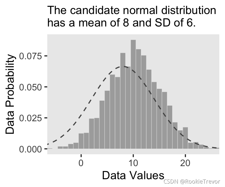
你有没有注意到我们是如何在geom_line()中制作密度曲线的数据的?这是一种方法。在我们的下一个图中,我们将使用 stat_function() 采取一种不同且更优雅的方法。这是我们的图 2.4.b。

讯享网ggplot(data = d, aes(x = x)) + geom_histogram(aes(y = ..density..), binwidth = 1, fill = "grey67", color = "grey92", size = 1/8) + stat_function(fun = dnorm, n = 101, args = list(mean = 8, sd = 6), color = "grey33", linetype = 2) + coord_cartesian(xlim = c(-5, 25)) + labs(subtitle = "The candidate normal distribution\nhas a mean of 8 and SD of 6.", x = "Data Values", y = "Data Probability") + theme(panel.grid = element_blank())
The steps of Bayesian data analysis
In general, Bayesian analysis of data follows these steps:
- 确定与研究问题相关的数据。数据的度量尺度是什么?要预测哪些数据变量,哪些数据变量应该充当预测变量(解释变量)?
- 为相关数据定义一个描述性模型。数学形式及其参数应该是有意义的并且适合于分析的理论目的。
3.指定参数的先验分布。先验必须通过听众的质疑,例如持怀疑态度的科学家。- 使用贝叶斯推理在参数值之间重新分配可信度。解释关于理论上有意义的问题的后验分布(假设模型是对数据的合理描述;见下一步)。
- 检查后验预测是否以合理的准确度模拟数据(即进行“后验预测检查”)。如果不是,则考虑不同的描述
也许解释这些步骤的最好方法是用贝叶斯数据分析的现实例子。下面的讨论是为了介绍性章节的目的而进行的缩写,其中隐藏了许多技术细节。
我将向您展示比 Kruschke 在文本中所做的更多的细节。但只要他做到了,我们将在接下来的章节中更详细地介绍这个工作流程。
为了重新创建图 2.5,我们需要生成数据并拟合模型。在他的 HtWtDataDenerator.R 脚本中,Kruschke 提供了一个函数的代码,该函数将在他的文本中生成这种类型的高度/体重数据。这是完整的代码:
HtWtDataGenerator <- function(nSubj, rndsd = NULL, maleProb = 0.50) {
    # Random height, weight generator for males and females. Uses parameters from # Brainard, J. & Burmaster, D. E. (1992). Bivariate distributions for height and # weight of men and women in the United States. Risk Analysis, 12(2), 267-275. # Kruschke, J. K. (2011). Doing Bayesian data analysis: # A Tutorial with R and BUGS. Academic Press / Elsevier. # Kruschke, J. K. (2014). Doing Bayesian data analysis, 2nd Edition: # A Tutorial with R, JAGS and Stan. Academic Press / Elsevier. # require(MASS) # Specify parameters of multivariate normal (MVN) distributions. # Men: HtMmu <- 69.18 HtMsd <- 2.87 lnWtMmu <- 5.14 lnWtMsd <- 0.17 Mrho <- 0.42 Mmean <- c(HtMmu, lnWtMmu) Msigma <- matrix(c(HtMsd^2, Mrho * HtMsd * lnWtMsd, Mrho * HtMsd * lnWtMsd, lnWtMsd^2), nrow = 2) # Women cluster 1: HtFmu1 <- 63.11 HtFsd1 <- 2.76 lnWtFmu1 <- 5.06 lnWtFsd1 <- 0.24 Frho1 <- 0.41 prop1 <- 0.46 Fmean1 <- c(HtFmu1, lnWtFmu1) Fsigma1 <- matrix(c(HtFsd1^2, Frho1 * HtFsd1 * lnWtFsd1, Frho1 * HtFsd1 * lnWtFsd1, lnWtFsd1^2), nrow = 2) # Women cluster 2: HtFmu2 <- 64.36 HtFsd2 <- 2.49 lnWtFmu2 <- 4.86 lnWtFsd2 <- 0.14 Frho2 <- 0.44 prop2 <- 1 - prop1 Fmean2 <- c(HtFmu2, lnWtFmu2) Fsigma2 <- matrix(c(HtFsd2^2, Frho2 * HtFsd2 * lnWtFsd2, Frho2 * HtFsd2 * lnWtFsd2, lnWtFsd2^2), nrow = 2) # Randomly generate data values from those MVN distributions. if (!is.null(rndsd)) {
   set.seed(rndsd)} datamatrix <- matrix(0, nrow = nSubj, ncol = 3) colnames(datamatrix) <- c("male", "height", "weight") maleval <- 1; femaleval <- 0 # arbitrary coding values for (i in 1:nSubj) {
    # Flip coin to decide sex sex <- sample(c(maleval, femaleval), size = 1, replace = TRUE, prob = c(maleProb, 1 - maleProb)) if (sex == maleval) {
   datum = MASS::mvrnorm(n = 1, mu = Mmean, Sigma = Msigma)} if (sex == femaleval) {
    Fclust = sample(c(1, 2), size = 1, replace = TRUE, prob = c(prop1, prop2)) if (Fclust == 1) {
   datum = MASS::mvrnorm(n = 1, mu = Fmean1, Sigma = Fsigma1)} if (Fclust == 2) {
   datum = MASS::mvrnorm(n = 1, mu = Fmean2, Sigma = Fsigma2)} } datamatrix[i, ] = c(sex, round(c(datum[1], exp(datum[2])), 1)) } return(datamatrix) } # end function
现在我们有了 HtWtDataGenerator() 函数,我们需要做的就是确定要生成多少个值以及我们希望这些值基于男性的值的可能性有多大。这些由 nSubj 和 maleProb 参数控制。
讯享网# set your seed to make the data generation reproducible set.seed(2) d <- HtWtDataGenerator(nSubj = 57, maleProb = .5) %>% as_tibble() d %>% head()
# A tibble: 6 x 3 male height weight <dbl> <dbl> <dbl> 1 0 62.6 109. 2 0 63.3 154. 3 1 71.8 155 4 0 67.9 146. 5 0 64.4 135. 6 0 66.8 119 我们即将为模型做好准备。我们将通过 brms 包来实现Bayesian 统计模型。([这里](https://github.com/paul-buerkner /brms) 有brms包的详细介绍)。
讯享网library(brms)
HMC 不鼓励传统使用 diffuse先验、 noninformative 先验以及sigma 的均匀分布。相反,我们将对截距和斜率使用弱正则化先验(weakly-regularizing priors),并为 σ \sigma σ 使用一个相当大尺度的半柯西(half Cauchy)参数。
fit2.1 <- brm(data = d, family = gaussian, weight ~ 1 + height, prior = c(prior(normal(0, 100), class = Intercept), prior(normal(0, 100), class = b), prior(cauchy(0, 10), class = sigma)), chains = 4, cores = 4, iter = 2000, warmup = 1000, seed = 2, file = "fits/fit02.01") 如果你想要快速的查看模型摘要,你可以执行 print(fit1)。我们可以这样制作图 5.a。
讯享网# extract the posterior draws post <- posterior_samples(fit2.1) # this will streamline some of the code, below n_lines <- 150 # plot! d %>% ggplot(aes(x = height, y = weight)) + geom_abline(intercept = post[1:n_lines, 1], slope = post[1:n_lines, 2], color = "grey50", size = 1/4, alpha = .3) + geom_point(shape = 1) + # the `eval(substitute(paste()))` trick came from: https://www.r-bloggers.com/value-of-an-r-object-in-an-expression/ labs(subtitle = eval(substitute(paste("Data with", n_lines, "credible regression lines"))), x = "Height in inches", y = "Weight in pounds") + coord_cartesian(xlim = c(55, 80), ylim = c(50, 250)) + theme(panel.grid = element_blank())

对于图 5.b.,我们将使用 tidybayes 包中的 stat_histinterval() 函数来标记关闭模式和直方图下方的 95% 最高密度间隔 (HDI)。
library(tidybayes) post %>% ggplot(aes(x = b_height, y = 0)) + stat_histinterval(point_interval = mode_hdi, .width = .95, fill = "grey67", slab_color = "grey92", breaks = 40, slab_size = .2, outline_bars = T) + scale_y_continuous(NULL, breaks = NULL) + coord_cartesian(xlim = c(0, 8)) + labs(title = "The posterior distribution", subtitle = "The mode and 95% HPD intervals are\nthe dot and horizontal line at the bottom.", x = expression(beta[1]~(slope))) + theme(panel.grid = element_blank()) 
这是图 2.6。稍后我们将讨论 brms::predict() 函数。
讯享网nd <- tibble(height = seq(from = 53, to = 81, length.out = 20)) predict(fit2.1, newdata = nd) %>% data.frame() %>% bind_cols(nd) %>% ggplot(aes(x = height)) + geom_pointrange(aes(y = Estimate, ymin = Q2.5, ymax = Q97.5), color = "grey67", shape = 20) + geom_point(data = d, aes(y = weight), alpha = 2/3) + labs(subtitle = "Data with the percentile-based 95% intervals and\nthe means of the posterior predictions", x = "Height in inches", y = "Weight in inches") + theme(panel.grid = element_blank())

相反,后验预测可能更容易用丝带ribbon和线条line来描述。
nd <- tibble(height = seq(from = 53, to = 81, length.out = 30)) predict(fit2.1, newdata = nd) %>% data.frame() %>% bind_cols(nd) %>% ggplot(aes(x = height)) + geom_ribbon(aes(ymin = Q2.5, ymax = Q97.5), fill = "grey75") + geom_line(aes(y = Estimate), color = "grey92") + geom_point(data = d, aes(y = weight), alpha = 2/3) + labs(subtitle = "Data with the percentile-based 95% intervals and\nthe means of the posterior predictions", x = "Height in inches", y = "Weight in inches") + theme(panel.grid = element_blank()) 
版权声明:本文内容由互联网用户自发贡献,该文观点仅代表作者本人。本站仅提供信息存储空间服务,不拥有所有权,不承担相关法律责任。如发现本站有涉嫌侵权/违法违规的内容,请联系我们,一经查实,本站将立刻删除。
如需转载请保留出处:https://51itzy.com/kjqy/68848.html