

在后台回复【阅读书籍】
即可获取python相关电子书~
Hi,我是山月。
在公众号后台选择【往期】--【Matplotlib】即可查看已更新的全部教程哦~

01
axes_grid1 工具包
mpl_toolkits.axes_grid1 是辅助类的集合,可以轻松地使用matplotlib显示(多个)图像。
其中ImageGrid、RGB Axes 和 AxesDivider 是调整(多个)Axes 位置的辅助类。它们会提供一个框架,可以在绘图时调整多个axes的位置。
ParasiteAxes 提供类似 twinx(或 twiny)的功能,以便你可以在相同的 Axes 中绘制不同的数据(例如,不同的 y 比例)。
AnchoredArtists 包括放置在某个固定位置的自定义artists,例如图例。
1、ImageGrid
创建Axes网格的类。
在 matplotlib 中,Axes的位置(和大小)在标准图形坐标中指定。这对于需要以给定纵横比显示的图像可能并不理想。
例如,在 matplotlib 中无法轻松地显示相同大小的图像并在它们之间设置一些固定的间距。在这种情况下就可以使用 ImageGrid。
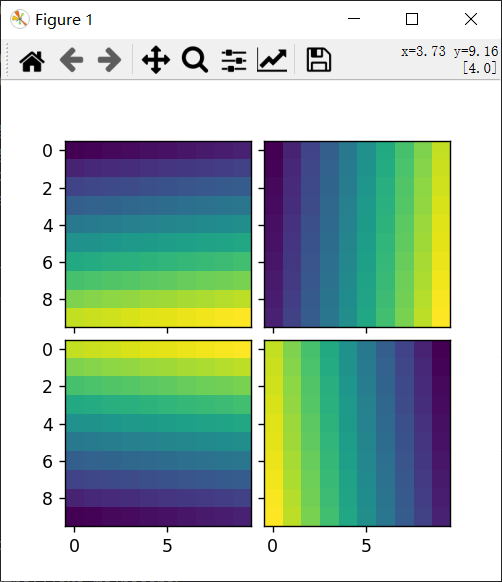
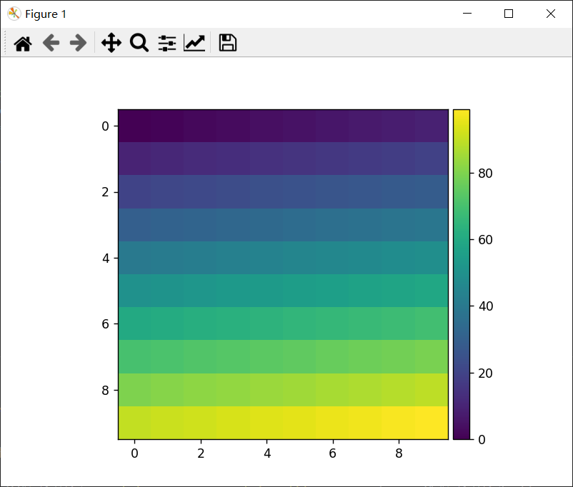
import matplotlib.pyplot as plt from mpl_toolkits.axes_grid1 import ImageGrid import numpy as np im1 = np.arange(100).reshape((10, 10)) im2 = im1.T im3 = np.flipud(im1) im4 = np.fliplr(im2) fig = plt.figure(figsize=(4., 4.)) grid = ImageGrid(fig, 111, # 类似于 subplot(111) nrows_ncols=(2, 2), # 创建axes的2x2网格 axes_pad=0.1, # 以英寸为单位的axes之间的填充距。 ) for ax, im in zip(grid, [im1, im2, im3, im4]): # 在网格上迭代,返回Axes。 ax.imshow(im) plt.show()讯享网
效果:
每个axes的位置会在绘图时确定,以便整个网格的大小适合给定的矩形。请注意,在此示例中,即使你更改了图形大小,axes之间的间距也是固定的。
同一列中的axes具有相同的宽度(在图形坐标中),同样,同一行中的axes具有相同的高度。同一行(列)中axes的宽度(高度)根据其视图限制(xlim 或 ylim)进行缩放。
讯享网import matplotlib.pyplot as plt from mpl_toolkits.axes_grid1 import ImageGrid def get_demo_image(): import numpy as np from matplotlib.cbook import get_sample_data f = get_sample_data("axes_grid/bivariate_normal.npy", asfileobj=False) z = np.load(f) # Z是15x15的numpy数组 return z, (-3, 4, -4, 3) fig = plt.figure(figsize=(5.5, 3.5)) grid = ImageGrid(fig, 111, # 类似于 subplot(111) nrows_ncols=(1, 3), axes_pad=0.1, label_mode="L", ) Z, extent = get_demo_image() im1 = Z im2 = Z[:, :10] im3 = Z[:, 10:] vmin, vmax = Z.min(), Z.max() for ax, im in zip(grid, [im1, im2, im3]): ax.imshow(im, origin="lower", vmin=vmin, vmax=vmax, interpolation="nearest") plt.show()
效果:
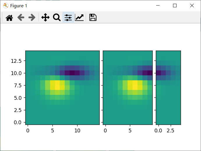
xaxis 在同一列中的axes之间共享。同样,yaxis 在同一行中的 axes之间共享。
因此,通过绘图命令或在交互式后端使用鼠标更改一个 axes的属性(视图限制、刻度位置等)将影响所有其他共享 axes。
初始化时,ImageGrid 会创建给定数量的 Axes 实例(如果 ngrids 为 None,则为 ngrids 或 ncols * nrows)。可以通过一个类似序列的接口来访问各个 Axes 实例(例如,grid[0] 是网格中的第一个 Axes)。
ImageGrid接受以下参数:
1)rect
指定网格的位置。你可以指定要使用的矩形的坐标(例如,Axes中的 (0.1, 0.1, 0.8, 0.8))或类似子图的位置(例如,121)。
2)direction
表示axes数的增加方向。
对于“行”:
| grid[0] | grid[1] |
| grid[2] | grid[3] |
对于“列”:
| grid[0] | grid[2] |
| grid[1] | grid[3] |
3)aspect
默认情况下(False),网格中axes的宽度和高度是独立缩放的。如果为 True,它们将根据其数据限制进行缩放。
4)share_all如果为 True,则共享所有axes的 xaxis 和 yaxis。
你还可以创建一个(或多个)颜色条。并且可以为每个axes设置颜色条 (cbar_mode="each"),或为网格设置一个颜色条 (cbar_mode="single")。
颜色条可以放在你的右侧或顶部。每个颜色条的axes存储为 cbar_axes 属性。
下面的示例显示了你可以使用 ImageGrid 做什么。
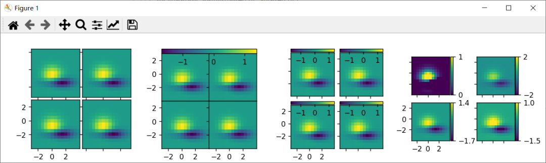
import matplotlib.pyplot as plt from mpl_toolkits.axes_grid1 import ImageGrid def get_demo_image(): import numpy as np from matplotlib.cbook import get_sample_data f = get_sample_data("axes_grid/bivariate_normal.npy", asfileobj=False) z = np.load(f) # Z是15x15的numpy数组 return z, (-3, 4, -4, 3) def demo_simple_grid(fig): """ 一个2x2图像的网格,图像之间有0.05英寸的填充距,只有左下轴被标记。 """ grid = ImageGrid(fig, 141, # 类似于 subplot(141) nrows_ncols=(2, 2), axes_pad=0.05, label_mode="1", ) Z, extent = get_demo_image() for ax in grid: ax.imshow(Z, extent=extent, interpolation="nearest") # 这只影响第一列和第二行中的轴,因为share_all=False。 grid.axes_llc.set_xticks([-2, 0, 2]) grid.axes_llc.set_yticks([-2, 0, 2]) def demo_grid_with_single_cbar(fig): """ 带有单色条的2x2图像网格 """ grid = ImageGrid(fig, 142, # 类似于 subplot(142) nrows_ncols=(2, 2), axes_pad=0.0, share_all=True, label_mode="L", cbar_location="top", cbar_mode="single", ) Z, extent = get_demo_image() for ax in grid: im = ax.imshow(Z, extent=extent, interpolation="nearest") grid.cbar_axes[0].colorbar(im) for cax in grid.cbar_axes: cax.toggle_label(False) # 这将影响所有轴,因为share_all = True。 grid.axes_llc.set_xticks([-2, 0, 2]) grid.axes_llc.set_yticks([-2, 0, 2]) def demo_grid_with_each_cbar(fig): """ 一个2x2图像的网格。每个图像都有自己的颜色条。 """ grid = ImageGrid(fig, 143, # 类似于 subplot(143) nrows_ncols=(2, 2), axes_pad=0.1, label_mode="1", share_all=True, cbar_location="top", cbar_mode="each", cbar_size="7%", cbar_pad="2%", ) Z, extent = get_demo_image() for ax, cax in zip(grid, grid.cbar_axes): im = ax.imshow(Z, extent=extent, interpolation="nearest") cax.colorbar(im) cax.toggle_label(False) # 这影响了所有的轴,因为我们设置了 share_all = True. grid.axes_llc.set_xticks([-2, 0, 2]) grid.axes_llc.set_yticks([-2, 0, 2]) def demo_grid_with_each_cbar_labelled(fig): """ 个2x2图像的网格。每个图像都有自己的颜色条。 """ grid = ImageGrid(fig, 144, # 类似于 subplot(144) nrows_ncols=(2, 2), axes_pad=(0.45, 0.15), label_mode="1", share_all=True, cbar_location="right", cbar_mode="each", cbar_size="7%", cbar_pad="2%", ) Z, extent = get_demo_image() # 每次使用不同的颜色条范围 limits = ((0, 1), (-2, 2), (-1.7, 1.4), (-1.5, 1)) for ax, cax, vlim in zip(grid, grid.cbar_axes, limits): im = ax.imshow(Z, extent=extent, interpolation="nearest", vmin=vlim[0], vmax=vlim[1]) cb = cax.colorbar(im) cb.set_ticks((vlim[0], vlim[1])) # 这影响了所有的轴,因为我们设置了share_all = True. grid.axes_llc.set_xticks([-2, 0, 2]) grid.axes_llc.set_yticks([-2, 0, 2]) fig = plt.figure(figsize=(10.5, 2.5)) fig.subplots_adjust(left=0.05, right=0.95) demo_simple_grid(fig) demo_grid_with_single_cbar(fig) demo_grid_with_each_cbar(fig) demo_grid_with_each_cbar_labelled(fig) plt.show()效果:
2、AxesDivider
在幕后,ImageGrid 类和 RGBAxes 类利用了 AxesDivider 类,其作用是在绘制时计算axes的位置。但大多数用户都不需要直接使用 AxesDivider 类。
axes_divider 模块提供了一个辅助函数 make_axes_locatable,它采用现有的axes实例并为其创建分隔线。
讯享网ax = subplot(1, 1, 1) divider = make_axes_locatable(ax)
make_axes_locatable 返回 AxesDivider 类的实例。它提供了一个 append_axes 方法,该方法在原始axes的给定侧(“top”、“right”、“bottom”和“left”)创建一个新axes。
高度(或宽度)与主axes同步的颜色条:
import matplotlib.pyplot as plt from mpl_toolkits.axes_grid1 import make_axes_locatable import numpy as np ax = plt.subplot(111) im = ax.imshow(np.arange(100).reshape((10, 10))) #在ax的右侧创建一个坐标轴。cax的宽度为ax的5%,cax和ax之间的填充距固定为0.05英寸。 divider = make_axes_locatable(ax) cax = divider.append_axes("right", size="5%", pad=0.05) plt.colorbar(im, cax=cax) plt.show()效果:
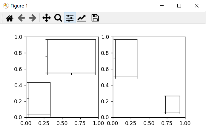
可以使用 make_axes_locatable 重写带有直方图的散点图示例:
讯享网import numpy as np import matplotlib.pyplot as plt from mpl_toolkits.axes_grid1 import make_axes_locatable # 为再现性固定随机状态 np.random.seed() # 随机数据 x = np.random.randn(1000) y = np.random.randn(1000) fig, ax = plt.subplots(figsize=(5.5, 5.5)) # 散点图: ax.scatter(x, y) # 设置主axes的方向。 ax.set_aspect(1.) # 在当前axes的右侧和顶部创建新的axes divider = make_axes_locatable(ax) # 高度和填充距的单位是英寸 ax_histx = divider.append_axes("top", 1.2, pad=0.1, sharex=ax) ax_histy = divider.append_axes("right", 1.2, pad=0.1, sharey=ax) # 使一些标签不可见 ax_histx.xaxis.set_tick_params(labelbottom=False) ax_histy.yaxis.set_tick_params(labelleft=False) # 手动确定极限: binwidth = 0.25 xymax = max(np.max(np.abs(x)), np.max(np.abs(y))) lim = (int(xymax/binwidth) + 1)*binwidth bins = np.arange(-lim, lim + binwidth, binwidth) ax_histx.hist(x, bins=bins) ax_histy.hist(y, bins=bins, orientation='horizontal') # ax_histx的x轴和ax_history的y轴与ax共用,因此不需要手动调整这些轴的xlim和ylim。 ax_histx.set_yticks([0, 50, 100]) ax_histy.set_xticks([0, 50, 100]) plt.show()
效果:

3、ParasiteAxes
ParasiteAxes 是一个寄生axes,其位置与其宿主axes相同。该位置会在绘图时调整,因此即使宿主axes改变了位置,它也能工作。
创建一个宿主axes的方法:使用 host_subplot 或 host_axes 命令。
创建寄生axes的方法:twinx, twiny和 twin。
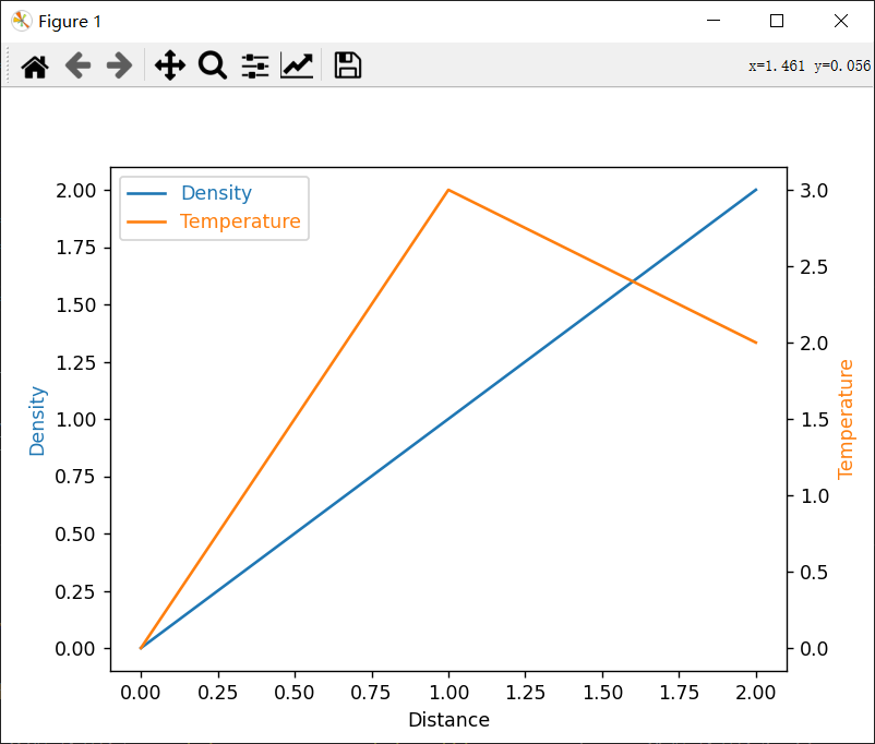
示例 1( twinx):
from mpl_toolkits.axes_grid1 import host_subplot import matplotlib.pyplot as plt host = host_subplot(111) par = host.twinx() host.set_xlabel("Distance") host.set_ylabel("Density") par.set_ylabel("Temperature") p1, = host.plot([0, 1, 2], [0, 1, 2], label="Density") p2, = par.plot([0, 1, 2], [0, 3, 2], label="Temperature") leg = plt.legend() host.yaxis.get_label().set_color(p1.get_color()) leg.texts[0].set_color(p1.get_color()) par.yaxis.get_label().set_color(p2.get_color()) leg.texts[1].set_color(p2.get_color()) plt.show()效果:
示例 2(twin):
如果没有transform参数,则假定寄生axes与宿主axes具有相同的数据转换。
这对设置顶部(或右侧)的轴与底部(或左侧)的轴具有不同的刻度位置、刻度标签很有用。
讯享网import matplotlib.pyplot as plt from mpl_toolkits.axes_grid1 import host_subplot import numpy as np ax = host_subplot(111) xx = np.arange(0, 2*np.pi, 0.01) ax.plot(xx, np.sin(xx)) ax2 = ax.twin() # ax2负责顶部轴和右侧轴 ax2.set_xticks([0., .5*np.pi, np.pi, 1.5*np.pi, 2*np.pi]) ax2.set_xticklabels(["$0$", r"$\frac{1}{2}\pi$", r"$\pi$", r"$\frac{3}{2}\pi$", r"$2\pi$"]) ax2.axis["right"].major_ticklabels.set_visible(False) ax2.axis["top"].major_ticklabels.set_visible(True) plt.show()
效果:

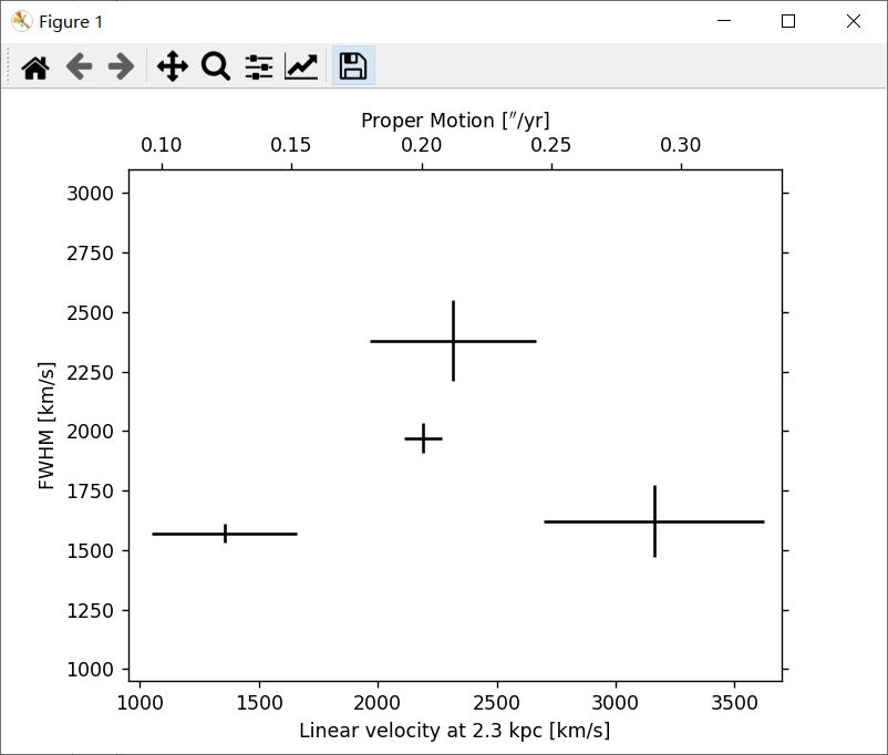
下面是一个更复杂的使用twin的示例。请注意,如果更改宿主axes中的 x 限制,则寄生axes的 x 限制将相应更改。
import matplotlib.transforms as mtransforms import matplotlib.pyplot as plt from mpl_toolkits.axes_grid1.parasite_axes import SubplotHost obs = [["01_S1", 3.88, 0.14, 1970, 63], ["01_S4", 5.6, 0.82, 1622, 150], ["02_S1", 2.4, 0.54, 1570, 40], ["03_S1", 4.1, 0.62, 2380, 170]] fig = plt.figure() ax_kms = SubplotHost(fig, 1, 1, 1, aspect=1.) pm_to_kms = 1./.*2300*3.085e18/3.15e7/1.e5 aux_trans = mtransforms.Affine2D().scale(pm_to_kms, 1.) ax_pm = ax_kms.twin(aux_trans) ax_pm.set_viewlim_mode("transform") fig.add_subplot(ax_kms) for n, ds, dse, w, we in obs: time = ((2007 + (10. + 4/30.)/12) - 1988.5) v = ds / time * pm_to_kms ve = dse / time * pm_to_kms ax_kms.errorbar([v], [w], xerr=[ve], yerr=[we], color="k") ax_kms.axis["bottom"].set_label("Linear velocity at 2.3 kpc [km/s]") ax_kms.axis["left"].set_label("FWHM [km/s]") ax_pm.axis["top"].set_label(r"Proper Motion [$''$/yr]") ax_pm.axis["top"].label.set_visible(True) ax_pm.axis["right"].major_ticklabels.set_visible(False) ax_kms.set_xlim(950, 3700) ax_kms.set_ylim(950, 3100) # ax_pms的xlim和ylim将自动调整。 plt.show()效果:
4、AnchoredArtists
这是一个artist的集合,它们的位置像图例一样是固定在bbox上的。
它衍生于Matplotlib中的OffsetBox,并且需要在画布坐标中绘制artist。
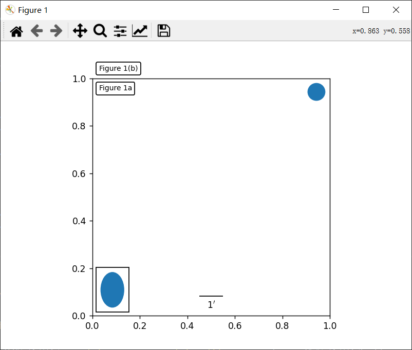
讯享网import matplotlib.pyplot as plt def draw_text(ax): """ 画两个文本框,分别固定在图的左上角。 """ from matplotlib.offsetbox import AnchoredText at = AnchoredText("Figure 1a", loc='upper left', prop=dict(size=8), frameon=True, ) at.patch.set_boxstyle("round,pad=0.,rounding_size=0.2") ax.add_artist(at) at2 = AnchoredText("Figure 1(b)", loc='lower left', prop=dict(size=8), frameon=True, bbox_to_anchor=(0., 1.), bbox_transform=ax.transAxes ) at2.patch.set_boxstyle("round,pad=0.,rounding_size=0.2") ax.add_artist(at2) def draw_circle(ax): """ 在轴坐标上画一个圆 """ from mpl_toolkits.axes_grid1.anchored_artists import AnchoredDrawingArea from matplotlib.patches import Circle ada = AnchoredDrawingArea(20, 20, 0, 0, loc='upper right', pad=0., frameon=False) p = Circle((10, 10), 10) ada.da.add_artist(p) ax.add_artist(ada) def draw_ellipse(ax): """ 在数据坐标中绘制一个宽=0.1,高=0.15的椭圆 """ from mpl_toolkits.axes_grid1.anchored_artists import AnchoredEllipse ae = AnchoredEllipse(ax.transData, width=0.1, height=0.15, angle=0., loc='lower left', pad=0.5, borderpad=0.4, frameon=True) ax.add_artist(ae) def draw_sizebar(ax): """ 在数据坐标中绘制一个长度为0.1的水平条,下面有一个固定的标签。 """ from mpl_toolkits.axes_grid1.anchored_artists import AnchoredSizeBar asb = AnchoredSizeBar(ax.transData, 0.1, r"1$^{\prime}$", loc='lower center', pad=0.1, borderpad=0.5, sep=5, frameon=False) ax.add_artist(asb) ax = plt.gca() ax.set_aspect(1.) draw_text(ax) draw_circle(ax) draw_ellipse(ax) draw_sizebar(ax) plt.show()
效果:
5、InsetLocator
mpl_toolkits.axes_grid1.inset_locator 提供了辅助类和函数来将(插入的)axes放置在父axes的固定位置,类似于 AnchoredArtist。
使用 mpl_toolkits.axes_grid1.inset_locator.inset_axes()可以拥有固定大小的插入axes,或固定比例的父axes。
示例:
import matplotlib.pyplot as plt from mpl_toolkits.axes_grid1.inset_locator import inset_axes fig, (ax, ax2) = plt.subplots(1, 2, figsize=[5.5, 2.8]) #在默认的右上角位置创建宽度为1.3英寸,高度为0.9英寸的插入 axins = inset_axes(ax, width=1.3, height=0.9) # 在左下角创建宽度为父axes边框的30%,高度为父axes边框的40%的插入(loc=3) axins2 = inset_axes(ax, width="30%", height="40%", loc=3) # 在第2个子图中创建混合插入;宽度为父axes边框的30%,左上角高度为1英寸(loc=2) axins3 = inset_axes(ax2, width="30%", height=1., loc=2) # 在右下角(loc=4)用borderpad=1创建一个插入 axins4 = inset_axes(ax2, width="20%", height="20%", loc=4, borderpad=1) # 关闭插入的标记 for axi in [axins, axins2, axins3, axins4]: axi.tick_params(labelleft=False, labelbottom=False) plt.show()效果:
当你希望inset表示父axes中的一小部分的放大时,可以使用 zoomed_inset_axes()。
并且 inset_locator 提供了一个辅助函数 mark_inset() 来标记由 inset axes表示的区域位置。
讯享网import matplotlib.pyplot as plt from mpl_toolkits.axes_grid1.inset_locator import zoomed_inset_axes, mark_inset from mpl_toolkits.axes_grid1.anchored_artists import AnchoredSizeBar import numpy as np def get_demo_image(): from matplotlib.cbook import get_sample_data import numpy as np f = get_sample_data("axes_grid/bivariate_normal.npy", asfileobj=False) z = np.load(f) # Z是15x15的numpy数组 return z, (-3, 4, -4, 3) fig, (ax, ax2) = plt.subplots(ncols=2, figsize=[6, 3]) # 第一个子图,显示带有尺寸条的插入。 ax.set_aspect(1) axins = zoomed_inset_axes(ax, zoom=0.5, loc='upper right') # 固定插入axes的刻度数 axins.yaxis.get_major_locator().set_params(nbins=7) axins.xaxis.get_major_locator().set_params(nbins=7) plt.setp(axins.get_xticklabels(), visible=False) plt.setp(axins.get_yticklabels(), visible=False) def add_sizebar(ax, size): asb = AnchoredSizeBar(ax.transData, size, str(size), loc=8, pad=0.1, borderpad=0.5, sep=5, frameon=False) ax.add_artist(asb) add_sizebar(ax, 0.5) add_sizebar(axins, 0.5) # 第二个子图,显示带有插入缩放和标记插入的图像 Z, extent = get_demo_image() Z2 = np.zeros([150, 150], dtype="d") ny, nx = Z.shape Z2[30:30 + ny, 30:30 + nx] = Z # extent = [-3, 4, -4, 3] ax2.imshow(Z2, extent=extent, interpolation="nearest", origin="lower") axins2 = zoomed_inset_axes(ax2, 6, loc=1) # zoom = 6 axins2.imshow(Z2, extent=extent, interpolation="nearest", origin="lower") # 原始图像的子区域 x1, x2, y1, y2 = -1.5, -0.9, -2.5, -1.9 axins2.set_xlim(x1, x2) axins2.set_ylim(y1, y2) # 固定插入axes的刻度数 axins2.yaxis.get_major_locator().set_params(nbins=7) axins2.xaxis.get_major_locator().set_params(nbins=7) plt.setp(axins2.get_xticklabels(), visible=False) plt.setp(axins2.get_yticklabels(), visible=False) # 绘制父axes中插入axes所在区域的方框,以及方框与插入axes区域之间的连接线 mark_inset(ax2, axins2, loc1=2, loc2=4, fc="none", ec="0.5") plt.show()
效果:

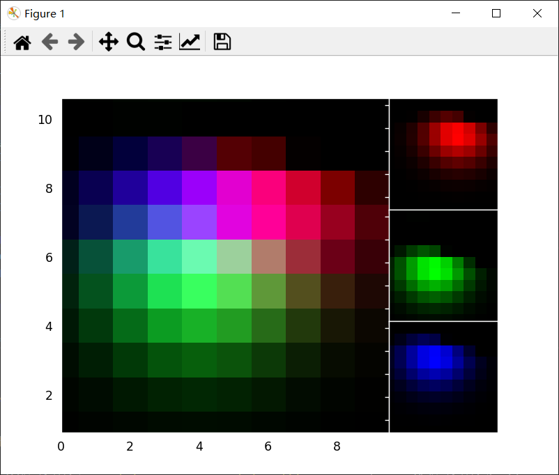
1、RGB Axes
RGBAxes 是一个辅助类,用来显示 RGB 合成图像。
像 ImageGrid 一样,可以调整axes的位置,以便它们占据的区域适合给定的矩形。
此外,每个axes的 xaxis 和 yaxis 是共享的。
import matplotlib.pyplot as plt from mpl_toolkits.axes_grid1.axes_rgb import RGBAxes def get_demo_image(): import numpy as np from matplotlib.cbook import get_sample_data f = get_sample_data("axes_grid/bivariate_normal.npy", asfileobj=False) z = np.load(f) return z, (-3, 4, -4, 3) def get_rgb(): Z, extent = get_demo_image() Z[Z < 0] = 0. Z = Z / Z.max() R = Z[:13, :13] G = Z[2:, 2:] B = Z[:13, 2:] return R, G, B fig = plt.figure() ax = RGBAxes(fig, [0.1, 0.1, 0.8, 0.8]) r, g, b = get_rgb() # r, g, b 是二维图像 kwargs = dict(origin="lower", interpolation="nearest") ax.imshow_rgb(r, g, b, kwargs) ax.RGB.set_xlim(0., 9.5) ax.RGB.set_ylim(0.9, 10.6) plt.show()效果:
6、AxesDivider
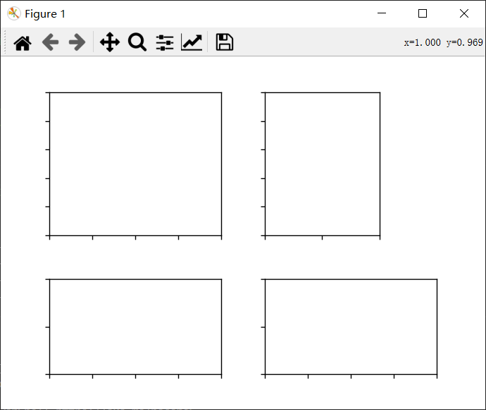
mpl_toolkits.axes_grid1.axes_divider 模块提供了辅助类来在绘图时调整一组图像的axes位置。
- axes_size 提供了一类单位,用于确定每个axes的大小,比如可以指定固定大小。
- Divider 是计算axes位置的类。它将给定的矩形区域划分为几个区域,然后通过设置分隔符所基于的水平和垂直大小列表来初始化分隔符。最后使用 new_locator(),它会返回一个可调用对象,可用于设置axes的 axes_locator。
示例:
讯享网import mpl_toolkits.axes_grid1.axes_size as Size # mpl_toolkits.axes_grid1.axes_size 包含了几个可用于设置水平和垂直配置的类。 from mpl_toolkits.axes_grid1 import Divider import matplotlib.pyplot as plt fig = plt.figure(figsize=(5.5, 4.)) # 当我们设置axes_locator时,rect参数将被忽略 rect = (0.1, 0.1, 0.8, 0.8) # rect 是将被划分的方框的边界 ax = [fig.add_axes(rect, label="%d" % i) for i in range(4)] horiz = [Size.Scaled(1.5), Size.Fixed(.5), Size.Scaled(1.), Size.Scaled(.5)] vert = [Size.Scaled(1.), Size.Fixed(.5), Size.Scaled(1.5)] # 将axes矩形划分为网格,网格的大小由水平*垂直指定 divider = Divider(fig, rect, horiz, vert, aspect=False) ax[0].set_axes_locator(divider.new_locator(nx=0, ny=0)) # 创建一个locator实例,该实例将提供给 axes对象 ax[1].set_axes_locator(divider.new_locator(nx=0, ny=2)) ax[2].set_axes_locator(divider.new_locator(nx=2, ny=2)) ax[3].set_axes_locator(divider.new_locator(nx=2, nx1=4, ny=0)) for ax1 in ax: ax1.tick_params(labelbottom=False, labelleft=False) plt.show()
效果:
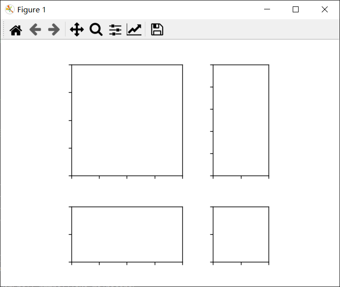
你也可以根据其 x 或 y 数据限制(AxesX 和 AxesY)调整每个轴的大小。
import mpl_toolkits.axes_grid1.axes_size as Size from mpl_toolkits.axes_grid1 import Divider import matplotlib.pyplot as plt fig = plt.figure(figsize=(5.5, 4)) # 当我们设置axes_locator时,rect参数将被忽略 rect = (0.1, 0.1, 0.8, 0.8) ax = [fig.add_axes(rect, label="%d" % i) for i in range(4)] horiz = [Size.AxesX(ax[0]), Size.Fixed(.5), Size.AxesX(ax[1])] vert = [Size.AxesY(ax[0]), Size.Fixed(.5), Size.AxesY(ax[2])] # 将axes矩形划分为网格,网格的大小由水平*垂直指定 divider = Divider(fig, rect, horiz, vert, aspect=False) ax[0].set_axes_locator(divider.new_locator(nx=0, ny=0)) ax[1].set_axes_locator(divider.new_locator(nx=2, ny=0)) ax[2].set_axes_locator(divider.new_locator(nx=0, ny=2)) ax[3].set_axes_locator(divider.new_locator(nx=2, ny=2)) ax[0].set_xlim(0, 2) ax[1].set_xlim(0, 1) ax[0].set_ylim(0, 1) ax[2].set_ylim(0, 2) divider.set_aspect(1.) for ax1 in ax: ax1.tick_params(labelbottom=False, labelleft=False) plt.show()效果:
02
axisartist 工具包
axisartist 包含一个自定义 Axes 类,可以支持曲线网格(例如,天文学中的世界坐标系)。
与 Matplotlib 的原始 Axes 类使用 Axes.xaxis 和 Axes.yaxis 来绘制刻度线、刻度线等不同。
axisartist 使用了一个特殊的artist(AxisArtist)来处理曲线坐标系的刻度线、刻度线等。
注意:由于使用了特殊的artist,一些适用于 Axes.xaxis 和 Axes.yaxis 的 Matplotlib 命令可能不起作用。
1、axisartist
axisartist 模块提供了一个自定义的Axes 类,其中每个轴(左、右、上和下)都有一个单独关联的artist负责绘制轴线、刻度、刻度标签和标签。
你还可以创建自己的轴,该轴可以穿过轴坐标中的固定位置,或数据坐标中的固定位置(即,当 viewlimit 变化时,轴会浮动)。
默认情况下,axis类的 xaxis 和 yaxis 是不可见的,并且有 4 个额外的artist负责绘制“left”、“right”、“bottom”和“top”中的 4 个轴。
它们以 ax.axis["left"]、ax.axis["right"] 等方式访问,即 ax.axis 是一个包含artist的字典(请注意,ax.axis 仍然是一个可调用的方法,它表现为 Matplotlib 中的原始 Axes.axis 方法)。
创建axes:
讯享网import mpl_toolkits.axisartist as AA fig = plt.figure() ax = AA.Axes(fig, [0.1, 0.1, 0.8, 0.8]) fig.add_axes(ax)
创建一个子图:
ax = AA.Subplot(fig, 111) fig.add_subplot(ax)示例:
讯享网import matplotlib.pyplot as plt from mpl_toolkits.axisartist.axislines import Subplot fig = plt.figure(figsize=(3, 3)) # 创建一个子图 ax = Subplot(fig, 111) fig.add_subplot(ax) # 隐藏右侧和顶部的坐标轴 ax.axis["right"].set_visible(False) ax.axis["top"].set_visible(False) plt.show()
效果:

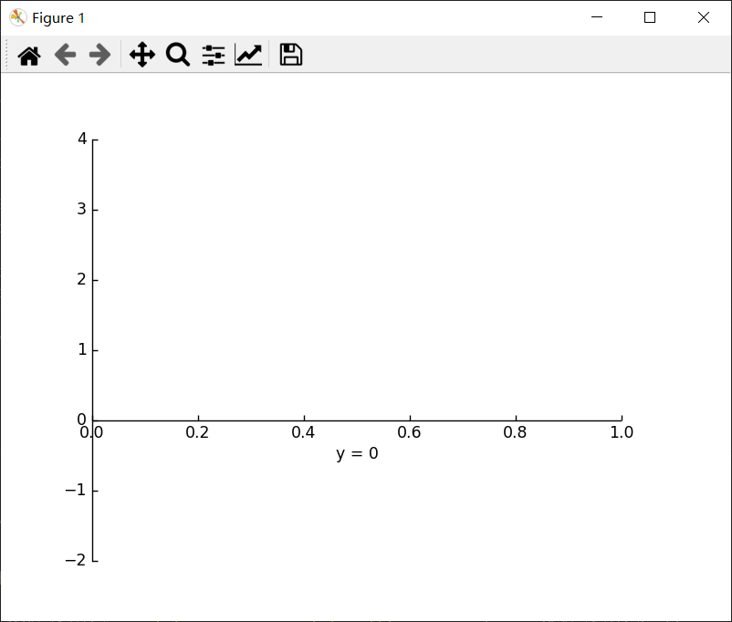
在y=0处添加一个横轴(在数据坐标中):
import matplotlib.pyplot as plt import mpl_toolkits.axisartist as AA fig = plt.figure() fig.subplots_adjust(right=0.85) ax = AA.Subplot(fig, 1, 1, 1) fig.add_subplot(ax) # 使一些轴不可见 ax.axis["bottom", "top", "right"].set_visible(False) # 沿着经过y=0的第一个轴(x轴)创建一个新轴。 ax.axis["y=0"] = ax.new_floating_axis(nth_coord=0, value=0, axis_direction="bottom") ax.axis["y=0"].toggle(all=True) ax.axis["y=0"].label.set_text("y = 0") ax.set_ylim(-2, 4) plt.show()效果:
或带有一些偏移的固定轴:
讯享网# 制作新的(右侧)yaxis,但有一些偏移 ax.axis["right2"] = ax.new_fixed_axis(loc="right", offset=(20, 0))
1)axisartist with ParasiteAxes
axes_grid1 工具包中的大多数命令都可以使用 axes_class 关键字参数,并且这些命令会创建给定类的axes。
示例:
from mpl_toolkits.axes_grid1 import host_subplot import mpl_toolkits.axisartist as AA import matplotlib.pyplot as plt host = host_subplot(111, axes_class=AA.Axes) plt.subplots_adjust(right=0.75) par1 = host.twinx() par2 = host.twinx() offset = 60 new_fixed_axis = par2.get_grid_helper().new_fixed_axis par2.axis["right"] = new_fixed_axis(loc="right", axes=par2, offset=(offset, 0)) par1.axis["right"].toggle(all=True) par2.axis["right"].toggle(all=True) host.set_xlim(0, 2) host.set_ylim(0, 2) host.set_xlabel("Distance") host.set_ylabel("Density") par1.set_ylabel("Temperature") par2.set_ylabel("Velocity") p1, = host.plot([0, 1, 2], [0, 1, 2], label="Density") p2, = par1.plot([0, 1, 2], [0, 3, 2], label="Temperature") p3, = par2.plot([0, 1, 2], [50, 30, 15], label="Velocity") par1.set_ylim(0, 4) par2.set_ylim(1, 65) host.legend() host.axis["left"].label.set_color(p1.get_color()) par1.axis["right"].label.set_color(p2.get_color()) par2.axis["right"].label.set_color(p3.get_color()) plt.show()效果:

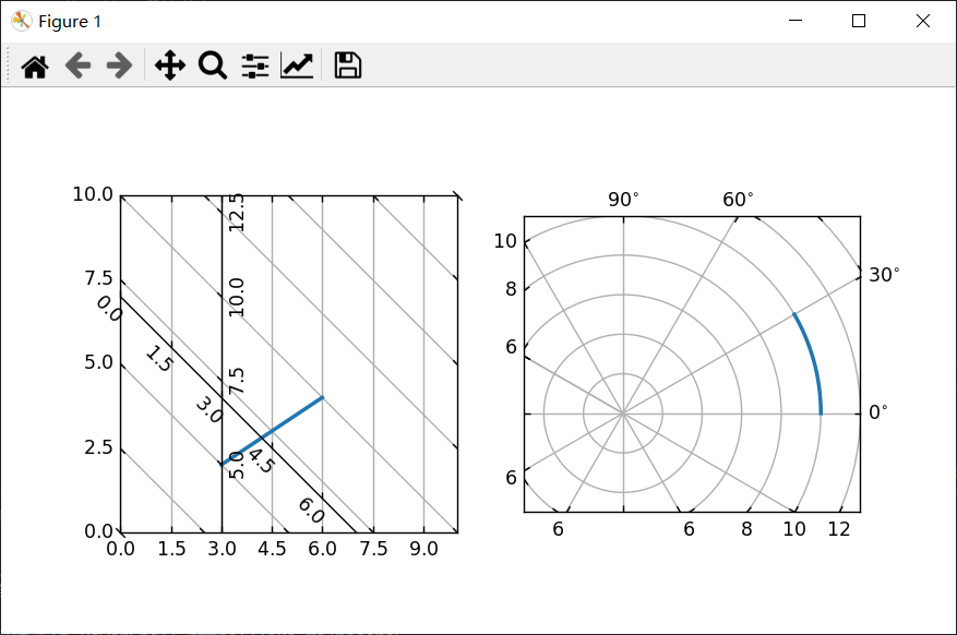
2)Curvilinear Grid
AxisArtist模块背后的动机是支持曲线网格和刻度。
示例:
讯享网import numpy as np import matplotlib.pyplot as plt from matplotlib.projections import PolarAxes from matplotlib.transforms import Affine2D from mpl_toolkits.axisartist import ( angle_helper, Subplot, SubplotHost, ParasiteAxesAuxTrans) from mpl_toolkits.axisartist.grid_helper_curvelinear import ( GridHelperCurveLinear) def curvelinear_test1(fig): """用于自定义转换的网格。""" def tr(x, y): x, y = np.asarray(x), np.asarray(y) return x, y - x def inv_tr(x, y): x, y = np.asarray(x), np.asarray(y) return x, y + x grid_helper = GridHelperCurveLinear((tr, inv_tr)) ax1 = Subplot(fig, 1, 2, 1, grid_helper=grid_helper) # ax1将有一个刻度和网格线,由给定的transform (+ transData of the Axes)定义。注意,坐标轴本身的转换(即transData)不受给定转换的影响。 fig.add_subplot(ax1) xx, yy = tr([3, 6], [5, 10]) ax1.plot(xx, yy, linewidth=2.0) ax1.set_aspect(1) ax1.set_xlim(0, 10) ax1.set_ylim(0, 10) ax1.axis["t"] = ax1.new_floating_axis(0, 3) ax1.axis["t2"] = ax1.new_floating_axis(1, 7) ax1.grid(True, zorder=0) def curvelinear_test2(fig): """ 极坐标投影,不过是在矩形框里 """ # PolarAxes.PolarTransform 采取弧度。但是,我们想要我们的坐标 tr = Affine2D().scale(np.pi/180, 1) + PolarAxes.PolarTransform() # 极坐标投影,涉及周期,也有其坐标的限制,需要一个特殊的方法来找到极值(视图内坐标的最小值,最大值)。 extreme_finder = angle_helper.ExtremeFinderCycle( nx=20, ny=20, # 每个方向的采样点数。 lon_cycle=360, lat_cycle=None, lon_minmax=None, lat_minmax=(0, np.inf), ) # 找到适合坐标的网格值(度、分、秒)。 grid_locator1 = angle_helper.LocatorDMS(12) # 使用适当的格式化程序。请注意,可接受的Locator和Formatter类与Matplotlib类略有不同,Matplotlib不能直接在这里使用。 tick_formatter1 = angle_helper.FormatterDMS() grid_helper = GridHelperCurveLinear( tr, extreme_finder=extreme_finder, grid_locator1=grid_locator1, tick_formatter1=tick_formatter1) ax1 = SubplotHost(fig, 1, 2, 2, grid_helper=grid_helper) # 使右轴和顶轴的标记可见。 ax1.axis["right"].major_ticklabels.set_visible(True) ax1.axis["top"].major_ticklabels.set_visible(True) # 让右轴显示第一个坐标(角度)的标签 ax1.axis["right"].get_helper().nth_coord_ticks = 0 # 让底部轴显示第二坐标(半径)的标签 ax1.axis["bottom"].get_helper().nth_coord_ticks = 1 fig.add_subplot(ax1) ax1.set_aspect(1) ax1.set_xlim(-5, 12) ax1.set_ylim(-5, 10) ax1.grid(True, zorder=0) # 寄生axes具有给定的变换 ax2 = ParasiteAxesAuxTrans(ax1, tr, "equal") # 请注意 ax2.transData == tr + ax1.transData。你在ax2中画的任何东西都将匹配ax1中的刻度和网格。 ax1.parasites.append(ax2) ax2.plot(np.linspace(0, 30, 51), np.linspace(10, 10, 51), linewidth=2) if __name__ == "__main__": fig = plt.figure(figsize=(7, 4)) curvelinear_test1(fig) curvelinear_test2(fig) plt.show()
效果:
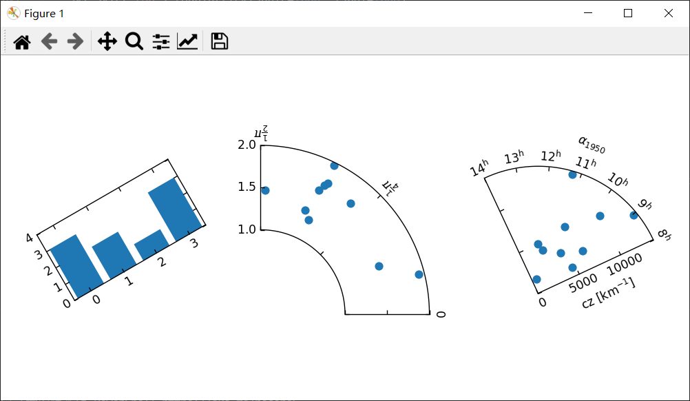
3)Floating Axes
AxisArtister还支持一个浮动Axes,其外部轴定义为浮动轴。
示例:
from matplotlib.transforms import Affine2D import mpl_toolkits.axisartist.floating_axes as floating_axes import numpy as np import mpl_toolkits.axisartist.angle_helper as angle_helper from matplotlib.projections import PolarAxes from mpl_toolkits.axisartist.grid_finder import (FixedLocator, MaxNLocator, DictFormatter) import matplotlib.pyplot as plt # 为再现性固定随机状态 np.random.seed() def setup_axes1(fig, rect): tr = Affine2D().scale(2, 1).rotate_deg(30) grid_helper = floating_axes.GridHelperCurveLinear( tr, extremes=(-0.5, 3.5, 0, 4), grid_locator1=MaxNLocator(nbins=4), grid_locator2=MaxNLocator(nbins=4)) ax1 = floating_axes.FloatingSubplot(fig, rect, grid_helper=grid_helper) fig.add_subplot(ax1) aux_ax = ax1.get_aux_axes(tr) return ax1, aux_ax def setup_axes2(fig, rect): """ 具有自定义定位器和格式化器。注意,极端值被交换了。 """ tr = PolarAxes.PolarTransform() pi = np.pi angle_ticks = [(0, r"$0$"), (.25*pi, r"$\frac{1}{4}\pi$"), (.5*pi, r"$\frac{1}{2}\pi$")] grid_locator1 = FixedLocator([v for v, s in angle_ticks]) tick_formatter1 = DictFormatter(dict(angle_ticks)) grid_locator2 = MaxNLocator(2) grid_helper = floating_axes.GridHelperCurveLinear( tr, extremes=(.5*pi, 0, 2, 1), grid_locator1=grid_locator1, grid_locator2=grid_locator2, tick_formatter1=tick_formatter1, tick_formatter2=None) ax1 = floating_axes.FloatingSubplot(fig, rect, grid_helper=grid_helper) fig.add_subplot(ax1) # 创建一个寄生轴,其transData在RA,cz中 aux_ax = ax1.get_aux_axes(tr) aux_ax.patch = ax1.patch # 让aux_ax具有与ax中相同的剪辑路径 ax1.patch.zorder = 0.9 # 但这有一个副作用:补丁绘制两次,可能超过其他artists。因此,我们降低了zorder来防止这种情况。 return ax1, aux_ax def setup_axes3(fig, rect): """ 有时候,需要对axis_direction之类的东西进行调整。 """ # 旋转一些以获得更好的方向 tr_rotate = Affine2D().translate(-95, 0) # 将度数缩放为弧度 tr_scale = Affine2D().scale(np.pi/180., 1.) tr = tr_rotate + tr_scale + PolarAxes.PolarTransform() grid_locator1 = angle_helper.LocatorHMS(4) tick_formatter1 = angle_helper.FormatterHMS() grid_locator2 = MaxNLocator(3) # 以度为单位指定 theta 限制 ra0, ra1 = 8.*15, 14.*15 # 指定径向限制 cz0, cz1 = 0, 14000 grid_helper = floating_axes.GridHelperCurveLinear( tr, extremes=(ra0, ra1, cz0, cz1), grid_locator1=grid_locator1, grid_locator2=grid_locator2, tick_formatter1=tick_formatter1, tick_formatter2=None) ax1 = floating_axes.FloatingSubplot(fig, rect, grid_helper=grid_helper) fig.add_subplot(ax1) # 调整轴 ax1.axis["left"].set_axis_direction("bottom") ax1.axis["right"].set_axis_direction("top") ax1.axis["bottom"].set_visible(False) ax1.axis["top"].set_axis_direction("bottom") ax1.axis["top"].toggle(ticklabels=True, label=True) ax1.axis["top"].major_ticklabels.set_axis_direction("top") ax1.axis["top"].label.set_axis_direction("top") ax1.axis["left"].label.set_text(r"cz [km$^{-1}$]") ax1.axis["top"].label.set_text(r"$\alpha_{1950}$") # 创建一个寄生轴,其 transData 在 RA, cz aux_ax = ax1.get_aux_axes(tr) aux_ax.patch = ax1.patch # 让 aux_ax 具有与 ax 中一样的剪辑路径 ax1.patch.zorder = 0.9 # 但这有一个副作用:补丁绘制两次,可能超过其他artists。因此,我们降低了zorder来防止这种情况。 return ax1, aux_ax fig = plt.figure(figsize=(8, 4)) fig.subplots_adjust(wspace=0.3, left=0.05, right=0.95) ax1, aux_ax1 = setup_axes1(fig, 131) aux_ax1.bar([0, 1, 2, 3], [3, 2, 1, 3]) ax2, aux_ax2 = setup_axes2(fig, 132) theta = np.random.rand(10)*.5*np.pi radius = np.random.rand(10) + 1. aux_ax2.scatter(theta, radius) ax3, aux_ax3 = setup_axes3(fig, 133) theta = (8 + np.random.rand(10)*(14 - 8))*15. # 度数 radius = np.random.rand(10)*14000. aux_ax3.scatter(theta, radius) plt.show()效果:
2、axisartist命名空间
axisartist 命名空间包含了一个衍生的 Axes 实现。
最大的不同是,负责绘制轴线、刻度、刻度标签和轴标签的artists从 Matplotlib 的 Axis 类中分离出来。
这比原始 Matplotlib 中的artists要多得多,这种改变是为了支持曲线网格。
以下是 mpl_toolkits.axisartist.Axes 与来自 Matplotlib 的原始 Axes 的一些不同之处。
- 轴元素(轴线(spine)、刻度、刻度标签和轴标签)由 AxisArtist 实例绘制。与 Axis 不同,左轴、右轴、顶轴、底轴是由不同的artists绘制的。它们中的每一个都可能有不同的刻度位置和不同的刻度标签。
- 网格线由 Gridlines 实例绘制。这种变化的原因是在曲线坐标中,网格线不能与轴线相交(即没有相关的刻度)。在原始 Axes 类中,网格线与刻度线相关联。
- 如有必要,可以旋转刻度线(即沿网格线)。
总之,所有这些变化都是为了支持:
- 一个曲线网格
- 一个浮动轴
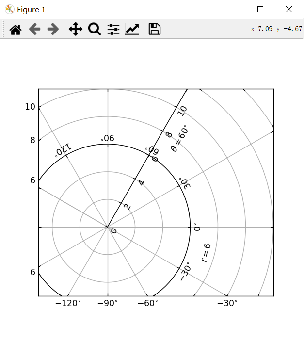
讯享网import numpy as np import matplotlib.pyplot as plt import mpl_toolkits.axisartist.angle_helper as angle_helper from matplotlib.projections import PolarAxes from matplotlib.transforms import Affine2D from mpl_toolkits.axisartist import SubplotHost from mpl_toolkits.axisartist import GridHelperCurveLinear def curvelinear_test2(fig): """极坐标投影,不过是在矩形框里。""" tr = Affine2D().scale(np.pi / 180., 1.) + PolarAxes.PolarTransform() extreme_finder = angle_helper.ExtremeFinderCycle(20, 20, lon_cycle=360, lat_cycle=None, lon_minmax=None, lat_minmax=(0, np.inf), ) grid_locator1 = angle_helper.LocatorDMS(12) tick_formatter1 = angle_helper.FormatterDMS() grid_helper = GridHelperCurveLinear(tr, extreme_finder=extreme_finder, grid_locator1=grid_locator1, tick_formatter1=tick_formatter1 ) ax1 = SubplotHost(fig, 1, 1, 1, grid_helper=grid_helper) fig.add_subplot(ax1) # 现在创建浮动轴 # 第一个坐标(theta)固定为60的浮动轴 ax1.axis["lat"] = axis = ax1.new_floating_axis(0, 60) axis.label.set_text(r"$\theta = 60^{\circ}$") axis.label.set_visible(True) # 第二坐标(r)固定为6的浮动轴 ax1.axis["lon"] = axis = ax1.new_floating_axis(1, 6) axis.label.set_text(r"$r = 6$") ax1.set_aspect(1.) ax1.set_xlim(-5, 12) ax1.set_ylim(-5, 10) ax1.grid(True) fig = plt.figure(figsize=(5, 5)) curvelinear_test2(fig) plt.show()
效果:
mpl_toolkits.axisartist.Axes 类定义了一个axis属性,它是一个 AxisArtist 实例的字典。
默认情况下,字典有 4 个 AxisArtist 实例,负责绘制左、右、下、上轴。
xaxis 和 yaxis 属性仍然可用,但是它们被设置为不可见。由于是单独使用artists来绘制轴,所以Matplotlib 中一些与轴相关的方法可能没有效果。
除了 AxisArtist 实例之外,mpl_toolkits.axisartist.Axes 还会有网格线属性(Gridlines),可以绘制网格线。
在 AxisArtist 和 Gridlines 中,刻度和网格位置的计算都委托给 GridHelper 类的实例。

mpl_toolkits.axisartist.Axes 类使用 GridHelperRectlinear 作为网格助手。
GridHelperRectlinear 类是 Matplotlib 原始 Axes 的 xaxis 和 yaxis 的包装器,它的工作方式与Matplotlib原始坐标轴的工作方式相同。
比如,使用 set_ticks 方法等更改刻度位置应该可以正常工作。但是artists属性(例如颜色)的更改通常不会起作用。
3、AxisArtist
可以将AxisArtist视为具有以下属性的容器artist,这些属性将绘制刻度、标签等。
- line
- major_ticks, major_ticklabels
- minor_ticks, minor_ticklabels
- offsetText
- label
默认情况下,定义了以下轴artists:
ax.axis["left"], ax.axis["bottom"], ax.axis["right"], ax.axis["top"]例如,如果要更改底部x轴的major_ticklabels的颜色属性:
讯享网ax.axis["bottom"].major_ticklabels.set_color("b")
同样,要使刻度标签不可见:
ax.axis["bottom"].major_ticklabels.set_visible(False)AxisArtist 还提供了一个辅助方法来控制刻度、刻度标签和标签的可见性。
使刻度标签不可见:
讯享网ax.axis["bottom"].toggle(ticklabels=False)
使所有刻度、刻度标签和(轴)标签不可见:
ax.axis["bottom"].toggle(all=False)关闭其他的所有但打开刻度:
讯享网ax.axis["bottom"].toggle(all=False, ticks=True)
全部打开,但关闭(轴)标签:
ax.axis["bottom"].toggle(all=True, label=False))也可以采用多个轴名称。例如,要打开 "top" 和 "right" 轴的刻度标签:
讯享网ax.axis["top","right"].toggle(ticklabels=True))
请注意,'ax.axis["top","right"]' 返回一个简单的代理对象,它将上面的代码转换为类似下面的内容:
for n in ["top","right"]: ax.axis[n].toggle(ticklabels=True))其中for 循环中的任何返回值都将被忽略。
而列表索引“:”表示所有项目:
讯享网ax.axis[:].major_ticks.set_color("r") # 更改所有轴上的刻度颜色。
4、应用
1、更改刻度位置和标签
ax.set_xticks([1, 2, 3])2、更改轴属性,如颜色等
讯享网ax.axis["left"].major_ticklabels.set_color("r") # 更改刻度标签的颜色
3、更改多个轴的属性
ax.axis["left","bottom"].major_ticklabels.set_color("r")更改所有轴的属性:
讯享网ax.axis[:].major_ticklabels.set_color("r")
4、其它
- 更改刻度大小(长度),使用:axis.major_ticks.set_ticksize 方法。
- 更改刻度的方向(默认情况下刻度与刻度标签的方向相反),使用 axis.major_ticks.set_tick_out 方法。
- 更改刻度和刻度标签之间的间距,使用 axis.major_ticklabels.set_pad 方法。
- 更改刻度标签和轴标签之间的间距,使用axis.label.set_pad 方法
5、旋转、对齐刻度标签
当想旋转刻度标签时,首先考虑使用“set_axis_direction”方法:
import matplotlib.pyplot as plt import mpl_toolkits.axisartist as axisartist fig = plt.figure(figsize=(4, 2.5)) ax1 = fig.add_subplot(axisartist.Subplot(fig, 111)) fig.subplots_adjust(right=0.8) ax1.axis["left"].major_ticklabels.set_axis_direction("top") ax1.axis["left"].label.set_text("Label") ax1.axis["right"].label.set_visible(True) ax1.axis["right"].label.set_text("Label") ax1.axis["right"].label.set_axis_direction("left") plt.show()效果:
set_axis_direction 的参数是 ["left", "right", "bottom", "top"] 之一。
1、基本的方向概念
1)有一个参考方向,定义为坐标增加的轴线方向。例如,x 轴左侧的参考方向是从下到上。
讯享网import matplotlib.pyplot as plt import mpl_toolkits.axisartist as axisartist def setup_axes(fig, rect): ax = axisartist.Subplot(fig, rect) fig.add_axes(ax) ax.set_ylim(-0.1, 1.5) ax.set_yticks([0, 1]) ax.axis[:].set_visible(False) ax.axis["x"] = ax.new_floating_axis(1, 0.5) ax.axis["x"].set_axisline_style("->", size=1.5) return ax fig = plt.figure(figsize=(3, 2.5)) fig.subplots_adjust(top=0.8) ax1 = setup_axes(fig, 111) ax1.axis["x"].set_axis_direction("left") plt.show()
效果:
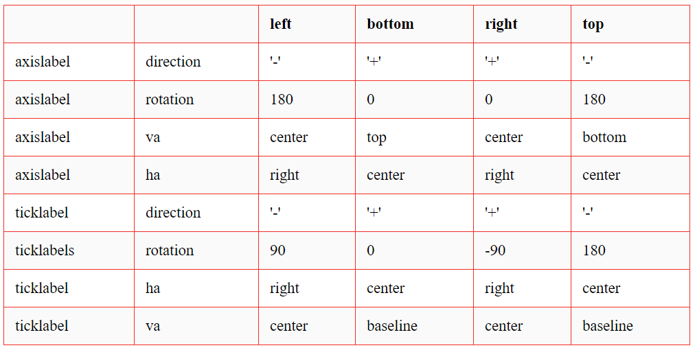
刻度、刻度标签和轴标签的方向、文本角度和对齐方式都是相对于参考方向确定的。
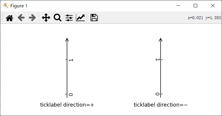
2)刻度标签方向(ticklabel_direction )是参考方向的右侧 (+) 或左侧 (-)。
import matplotlib.pyplot as plt import mpl_toolkits.axisartist as axisartist def setup_axes(fig, rect): ax = axisartist.Subplot(fig, rect) fig.add_axes(ax) ax.set_ylim(-0.1, 1.5) ax.set_yticks([0, 1]) #ax.axis[:].toggle(all=False) #ax.axis[:].line.set_visible(False) ax.axis[:].set_visible(False) ax.axis["x"] = ax.new_floating_axis(1, 0.5) ax.axis["x"].set_axisline_style("->", size=1.5) return ax fig = plt.figure(figsize=(6, 2.5)) fig.subplots_adjust(bottom=0.2, top=0.8) ax1 = setup_axes(fig, 121) ax1.axis["x"].set_ticklabel_direction("+") ax1.annotate("ticklabel direction=$+$", (0.5, 0), xycoords="axes fraction", xytext=(0, -10), textcoords="offset points", va="top", ha="center") ax2 = setup_axes(fig, 122) ax2.axis["x"].set_ticklabel_direction("-") ax2.annotate("ticklabel direction=$-$", (0.5, 0), xycoords="axes fraction", xytext=(0, -10), textcoords="offset points", va="top", ha="center") plt.show()效果:
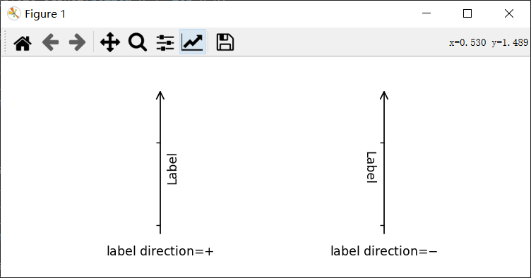
3)轴标签方向(label_direction) 也一样是参考方向的右侧 (+) 或左侧 (-)。
讯享网import matplotlib.pyplot as plt import mpl_toolkits.axisartist as axisartist def setup_axes(fig, rect): ax = axisartist.Subplot(fig, rect) fig.add_axes(ax) ax.set_ylim(-0.1, 1.5) ax.set_yticks([0, 1]) #ax.axis[:].toggle(all=False) #ax.axis[:].line.set_visible(False) ax.axis[:].set_visible(False) ax.axis["x"] = ax.new_floating_axis(1, 0.5) ax.axis["x"].set_axisline_style("->", size=1.5) return ax fig = plt.figure(figsize=(6, 2.5)) fig.subplots_adjust(bottom=0.2, top=0.8) ax1 = setup_axes(fig, 121) ax1.axis["x"].label.set_text("Label") ax1.axis["x"].toggle(ticklabels=False) ax1.axis["x"].set_axislabel_direction("+") ax1.annotate("label direction=$+$", (0.5, 0), xycoords="axes fraction", xytext=(0, -10), textcoords="offset points", va="top", ha="center") ax2 = setup_axes(fig, 122) ax2.axis["x"].label.set_text("Label") ax2.axis["x"].toggle(ticklabels=False) ax2.axis["x"].set_axislabel_direction("-") ax2.annotate("label direction=$-$", (0.5, 0), xycoords="axes fraction", xytext=(0, -10), textcoords="offset points", va="top", ha="center") plt.show()
效果:
4)默认情况下,刻度线是朝着刻度标签的相反方向绘制的。
5)刻度标签和标签的文本旋转分别参考 ticklabel_direction 或 label_direction 确定。刻度标签和标签 的旋转是固定的。
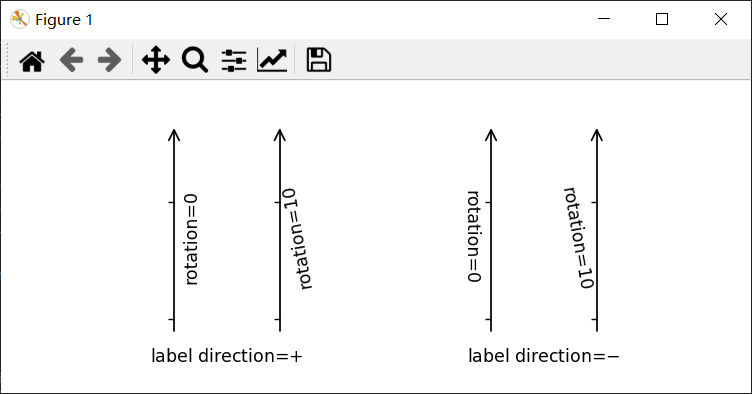
import matplotlib.pyplot as plt import mpl_toolkits.axisartist as axisartist def setup_axes(fig, rect): ax = axisartist.Subplot(fig, rect) fig.add_axes(ax) ax.set_ylim(-0.1, 1.5) ax.set_yticks([0, 1]) ax.axis[:].set_visible(False) ax.axis["x1"] = ax.new_floating_axis(1, 0.3) ax.axis["x1"].set_axisline_style("->", size=1.5) ax.axis["x2"] = ax.new_floating_axis(1, 0.7) ax.axis["x2"].set_axisline_style("->", size=1.5) return ax fig = plt.figure(figsize=(6, 2.5)) fig.subplots_adjust(bottom=0.2, top=0.8) ax1 = setup_axes(fig, 121) ax1.axis["x1"].label.set_text("rotation=0") ax1.axis["x1"].toggle(ticklabels=False) ax1.axis["x2"].label.set_text("rotation=10") ax1.axis["x2"].label.set_rotation(10) ax1.axis["x2"].toggle(ticklabels=False) ax1.annotate("label direction=$+$", (0.5, 0), xycoords="axes fraction", xytext=(0, -10), textcoords="offset points", va="top", ha="center") ax2 = setup_axes(fig, 122) ax2.axis["x1"].set_axislabel_direction("-") ax2.axis["x2"].set_axislabel_direction("-") ax2.axis["x1"].label.set_text("rotation=0") ax2.axis["x1"].toggle(ticklabels=False) ax2.axis["x2"].label.set_text("rotation=10") ax2.axis["x2"].label.set_rotation(10) ax2.axis["x2"].toggle(ticklabels=False) ax2.annotate("label direction=$-$", (0.5, 0), xycoords="axes fraction", xytext=(0, -10), textcoords="offset points", va="top", ha="center") plt.show()效果:
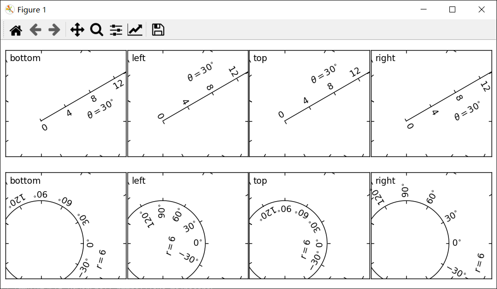
还有一个“axis_direction”的概念,是上述“bottom”、“left”、“top”和“right”轴属性的默认设置。
'set_axis_direction("top")' 表示调整文本旋转等,以适应“top”轴的设置。轴方向的概念通过弯曲轴会更清晰。
讯享网import numpy as np import matplotlib.pyplot as plt import mpl_toolkits.axisartist.angle_helper as angle_helper import mpl_toolkits.axisartist.grid_finder as grid_finder from matplotlib.projections import PolarAxes from matplotlib.transforms import Affine2D import mpl_toolkits.axisartist as axisartist from mpl_toolkits.axisartist.grid_helper_curvelinear import \ GridHelperCurveLinear def setup_axes(fig, rect): tr = Affine2D().scale(np.pi/180., 1.) + PolarAxes.PolarTransform() extreme_finder = angle_helper.ExtremeFinderCycle(20, 20, lon_cycle=360, lat_cycle=None, lon_minmax=None, lat_minmax=(0, np.inf), ) grid_locator1 = angle_helper.LocatorDMS(12) grid_locator2 = grid_finder.MaxNLocator(5) tick_formatter1 = angle_helper.FormatterDMS() grid_helper = GridHelperCurveLinear(tr, extreme_finder=extreme_finder, grid_locator1=grid_locator1, grid_locator2=grid_locator2, tick_formatter1=tick_formatter1 ) ax1 = axisartist.Subplot(fig, rect, grid_helper=grid_helper) ax1.axis[:].toggle(ticklabels=False) fig.add_subplot(ax1) ax1.set_aspect(1.) ax1.set_xlim(-5, 12) ax1.set_ylim(-5, 10) return ax1 def add_floating_axis1(ax1): ax1.axis["lat"] = axis = ax1.new_floating_axis(0, 30) axis.label.set_text(r"$\theta = 30^{\circ}$") axis.label.set_visible(True) return axis def add_floating_axis2(ax1): ax1.axis["lon"] = axis = ax1.new_floating_axis(1, 6) axis.label.set_text(r"$r = 6$") axis.label.set_visible(True) return axis fig = plt.figure(figsize=(8, 4)) fig.subplots_adjust(left=0.01, right=0.99, bottom=0.01, top=0.99, wspace=0.01, hspace=0.01) for i, d in enumerate(["bottom", "left", "top", "right"]): ax1 = setup_axes(fig, rect=241++i) axis = add_floating_axis1(ax1) axis.set_axis_direction(d) ax1.annotate(d, (0, 1), (5, -5), xycoords="axes fraction", textcoords="offset points", va="top", ha="left") for i, d in enumerate(["bottom", "left", "top", "right"]): ax1 = setup_axes(fig, rect=245++i) axis = add_floating_axis2(ax1) axis.set_axis_direction(d) ax1.annotate(d, (0, 1), (5, -5), xycoords="axes fraction", textcoords="offset points", va="top", ha="left") plt.show()
效果:
axis_direction 可以在 AxisArtist 级别或其它子artists级别(即刻度、刻度标签和轴标签)进行调整。
ax1.axis["left"].set_axis_direction("top") # 使用“left”轴改变所有关联artist的轴方向。 ax1.axis["left"].major_ticklabels.set_axis_direction("top") # 仅更改major_ticklabels 的axis_direction请注意,AxisArtist 中的 set_axis_direction 会更改 ticklabel_direction 和 label_direction,而更改 刻度、刻度标签、轴标签的 axis_direction 不会影响它们。
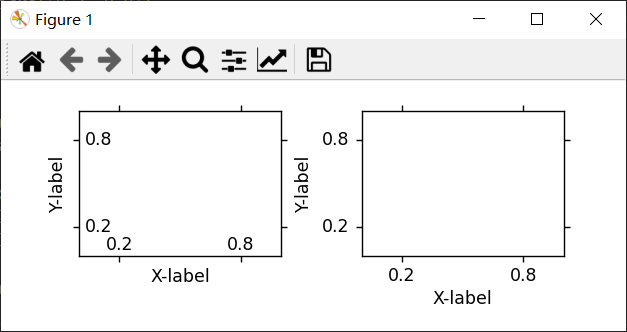
如果要在轴内制作刻度线和刻度线,可以使用 invert_ticklabel_direction 方法。
讯享网ax.axis[:].invert_ticklabel_direction()
一个相关的方法是“set_tick_out”,它使刻度向外(事实上,它使刻度朝着与默认方向相反的方向)。
ax.axis[:].major_ticks.set_tick_out(True)示例:
讯享网import matplotlib.pyplot as plt import mpl_toolkits.axisartist as axisartist def setup_axes(fig, rect): ax = axisartist.Subplot(fig, rect) fig.add_subplot(ax) ax.set_yticks([0.2, 0.8]) ax.set_xticks([0.2, 0.8]) return ax fig = plt.figure(figsize=(5, 2)) fig.subplots_adjust(wspace=0.4, bottom=0.3) ax1 = setup_axes(fig, 121) ax1.set_xlabel("X-label") ax1.set_ylabel("Y-label") ax1.axis[:].invert_ticklabel_direction() ax2 = setup_axes(fig, 122) ax2.set_xlabel("X-label") ax2.set_ylabel("Y-label") ax2.axis[:].major_ticks.set_tick_out(True) plt.show()
效果:
2、总结
1)AxisArtist 的方法
- set_axis_direction : "left", "right", "bottom", or "top"
- set_ticklabel_direction : "+" or "-"
- set_axislabel_direction : "+" or "-"
- invert_ticklabel_direction
2)Ticks 的方法(major_ticks 和 minor_ticks)
- set_tick_out : True or False
- set_ticksize : size in points
3)TickLabels 的方法(major_ticklabels 和 minor_ticklabels)
- set_axis_direction : "left", "right", "bottom", or "top"
- set_rotation : angle with respect to the reference direction
- set_ha and set_va : see below
4)AxisLabels 的方法(label)
- set_axis_direction : "left", "right", "bottom", or "top"
- set_rotation : angle with respect to the reference direction
- set_ha and set_va
3、对齐刻度标签
TickLabels 的对齐方式经过特殊处理。
import matplotlib.pyplot as plt import mpl_toolkits.axisartist as axisartist def setup_axes(fig, rect): ax = axisartist.Subplot(fig, rect) fig.add_subplot(ax) ax.set_yticks([0.2, 0.8]) ax.set_yticklabels(["short", "loooong"]) ax.set_xticks([0.2, 0.8]) ax.set_xticklabels([r"$\frac{1}{2}\pi$", r"$\pi$"]) return ax fig = plt.figure(figsize=(3, 5)) fig.subplots_adjust(left=0.5, hspace=0.7) ax = setup_axes(fig, 311) ax.set_ylabel("ha=right") ax.set_xlabel("va=baseline") ax = setup_axes(fig, 312) ax.axis["left"].major_ticklabels.set_ha("center") ax.axis["bottom"].major_ticklabels.set_va("top") ax.set_ylabel("ha=center") ax.set_xlabel("va=top") ax = setup_axes(fig, 313) ax.axis["left"].major_ticklabels.set_ha("left") ax.axis["bottom"].major_ticklabels.set_va("bottom") ax.set_ylabel("ha=left") ax.set_xlabel("va=bottom") plt.show()效果:

4、调整间距
更改刻度和刻度标签之间的间距:
讯享网ax.axis["left"].major_ticklabels.set_pad(10)
更改刻度标签和轴标签间距:
ax.axis["left"].label.set_pad(10)示例:
讯享网import numpy as np import matplotlib.pyplot as plt import mpl_toolkits.axisartist.angle_helper as angle_helper import mpl_toolkits.axisartist.grid_finder as grid_finder from matplotlib.projections import PolarAxes from matplotlib.transforms import Affine2D import mpl_toolkits.axisartist as axisartist from mpl_toolkits.axisartist.grid_helper_curvelinear import \ GridHelperCurveLinear def setup_axes(fig, rect): """Polar projection, but in a rectangular box.""" # see demo_curvelinear_grid.py for details tr = Affine2D().scale(np.pi/180., 1.) + PolarAxes.PolarTransform() extreme_finder = angle_helper.ExtremeFinderCycle(20, 20, lon_cycle=360, lat_cycle=None, lon_minmax=None, lat_minmax=(0, np.inf), ) grid_locator1 = angle_helper.LocatorDMS(12) grid_locator2 = grid_finder.MaxNLocator(5) tick_formatter1 = angle_helper.FormatterDMS() grid_helper = GridHelperCurveLinear(tr, extreme_finder=extreme_finder, grid_locator1=grid_locator1, grid_locator2=grid_locator2, tick_formatter1=tick_formatter1 ) ax1 = axisartist.Subplot(fig, rect, grid_helper=grid_helper) ax1.axis[:].set_visible(False) fig.add_subplot(ax1) ax1.set_aspect(1.) ax1.set_xlim(-5, 12) ax1.set_ylim(-5, 10) return ax1 def add_floating_axis1(ax1): ax1.axis["lat"] = axis = ax1.new_floating_axis(0, 30) axis.label.set_text(r"$\theta = 30^{\circ}$") axis.label.set_visible(True) return axis def add_floating_axis2(ax1): ax1.axis["lon"] = axis = ax1.new_floating_axis(1, 6) axis.label.set_text(r"$r = 6$") axis.label.set_visible(True) return axis fig = plt.figure(figsize=(9, 3.)) fig.subplots_adjust(left=0.01, right=0.99, bottom=0.01, top=0.99, wspace=0.01, hspace=0.01) def ann(ax1, d): if plt.rcParams["text.usetex"]: d = d.replace("_", r"\_") ax1.annotate(d, (0.5, 1), (5, -5), xycoords="axes fraction", textcoords="offset points", va="top", ha="center") ax1 = setup_axes(fig, rect=141) axis = add_floating_axis1(ax1) ann(ax1, r"default") ax1 = setup_axes(fig, rect=142) axis = add_floating_axis1(ax1) axis.major_ticklabels.set_pad(10) ann(ax1, r"ticklabels.set_pad(10)") ax1 = setup_axes(fig, rect=143) axis = add_floating_axis1(ax1) axis.label.set_pad(20) ann(ax1, r"label.set_pad(20)") ax1 = setup_axes(fig, rect=144) axis = add_floating_axis1(ax1) axis.major_ticks.set_tick_out(True) ann(ax1, "ticks.set_tick_out(True)") plt.show()
效果:

6、网格助手
示例:
import numpy as np import matplotlib.pyplot as plt from matplotlib.projections import PolarAxes from matplotlib.transforms import Affine2D from mpl_toolkits.axisartist import ( angle_helper, Subplot, SubplotHost, ParasiteAxesAuxTrans) from mpl_toolkits.axisartist.grid_helper_curvelinear import ( GridHelperCurveLinear) def curvelinear_test1(fig): """ 用于自定义转换的网格。 """ # 从曲线坐标到直线坐标。 def tr(x, y): x, y = np.asarray(x), np.asarray(y) return x, y - x # 从直线坐标到曲线坐标。 def inv_tr(x, y): x, y = np.asarray(x), np.asarray(y) return x, y + x grid_helper = GridHelperCurveLinear((tr, inv_tr)) ax1 = Subplot(fig, 1, 2, 1, grid_helper=grid_helper) # ax1将有一个由给定的transform (+ transData of the Axes)定义的刻度和网格线。注意,Axes本身的转换(即transData)不受给定转换的影响。 fig.add_subplot(ax1) xx, yy = tr([3, 6], [5, 10]) ax1.plot(xx, yy, linewidth=2.0) ax1.set_aspect(1) ax1.set_xlim(0, 10) ax1.set_ylim(0, 10) ax1.axis["t"] = ax1.new_floating_axis(0, 3) ax1.axis["t2"] = ax1.new_floating_axis(1, 7) ax1.grid(True, zorder=0) def curvelinear_test2(fig): """ 极坐标投影,不过是在矩形框里。 """ # PolarAxes.PolarTransform 采用弧度。但是,我们想要的是度坐标系 tr = Affine2D().scale(np.pi/180, 1) + PolarAxes.PolarTransform() # 极坐标投影,涉及周期,也有坐标的限制,需要一个(视图内坐标的最小值,最大值)。 ''' # extreme finder : 找到一个坐标范围。 # 20, 20 : 沿 x, y 方向的采样点数 # 第一个坐标(经度,但0在极坐标中)有一个360度的周期。第二个坐标(纬度,但半径在极坐标)的最小值为0 ''' extreme_finder = angle_helper.ExtremeFinderCycle( nx=20, ny=20, # Number of sampling points in each direction. lon_cycle=360, lat_cycle=None, lon_minmax=None, lat_minmax=(0, np.inf), ) # 找到适合坐标的网格值(度,分,秒)。参数是近似的网格数。 grid_locator1 = angle_helper.LocatorDMS(12) # 使用适当的格式化程序。请注意,可接受的Locator和Formatter类与Matplotlib类略有不同,你不能直接使用。 tick_formatter1 = angle_helper.FormatterDMS() grid_helper = GridHelperCurveLinear( tr, extreme_finder=extreme_finder, grid_locator1=grid_locator1, tick_formatter1=tick_formatter1) ax1 = SubplotHost(fig, 1, 2, 2, grid_helper=grid_helper) # 使右轴和上轴的刻度标签可见 ax1.axis["right"].major_ticklabels.set_visible(True) ax1.axis["top"].major_ticklabels.set_visible(True) # 让右轴显示第一个坐标(度)的刻度标签 ax1.axis["right"].get_helper().nth_coord_ticks = 0 # 让底轴显示第二个坐标(半径)的刻度标签 ax1.axis["bottom"].get_helper().nth_coord_ticks = 1 fig.add_subplot(ax1) ax1.set_aspect(1) ax1.set_xlim(-5, 12) ax1.set_ylim(-5, 10) ax1.grid(True, zorder=0) # 具有给定转换的寄生轴 ax2 = ParasiteAxesAuxTrans(ax1, tr, "equal") # 注意 ax2.transData == tr + ax1.transData。你在ax2上画的任何东西都将与ax1的刻度和网格相匹配。 ax1.parasites.append(ax2) ax2.plot(np.linspace(0, 30, 51), np.linspace(10, 10, 51), linewidth=2) if __name__ == "__main__": fig = plt.figure(figsize=(7, 4)) curvelinear_test1(fig) curvelinear_test2(fig) plt.show()效果:

7、浮动轴
浮动轴是数据坐标固定的轴,即其位置在轴坐标中不固定,而是随着轴数据限制的变化而变化。
可以使用 new_floating_axis 方法创建浮动轴。但是,得将生成的 AxisArtist 正确添加到坐标区。
推荐的方法是将其添加为 Axes 的轴属性项:
讯享网# 第一个(索引从0开始)坐标(度)固定为60的浮动轴 ax1.axis["lat"] = axis = ax1.new_floating_axis(0, 60) axis.label.set_text(r"$\theta = 60^{\circ}$") axis.label.set_visible(True)
03
mplot3d 工具包
使用 mplot3d 工具包可以生成 3D 图。
3D Axes(属于 Axes3D 类)是通过将 projection="3d" 关键字参数传递给 Figure.add_subplot 来创建的 :
import matplotlib.pyplot as plt fig = plt.figure() ax = fig.add_subplot(111, projection='3d')1、线图
讯享网Axes3D.plot(self, xs, ys, *args, zdir='z', kwargs) 参数: xs:一维类数组 顶点的 x 坐标。 ys:一维类数组 y 顶点坐标。 zs:标量或一维类数组 z 顶点坐标;一个用于所有点或一个用于每个点。 zdir:{'x', 'y', 'z'} 绘制2D数据时,使用的方向为z ('x', 'y'或'z');默认为“z”。 kwargs: 其他参数被转到 matplotlib.axes.Axes.plot。
示例:
import numpy as np import matplotlib.pyplot as plt plt.rcParams['legend.fontsize'] = 10 fig = plt.figure() ax = fig.add_subplot(111, projection='3d') # 准备数组x, y, z theta = np.linspace(-4 * np.pi, 4 * np.pi, 100) z = np.linspace(-2, 2, 100) r = z2 + 1 x = r * np.sin(theta) y = r * np.cos(theta) ax.plot(x, y, z, label='parametric curve') ax.legend() plt.show()效果:

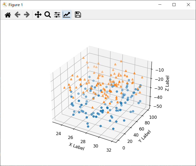
2、散点图
讯享网Axes3D.scatter(self, xs, ys, zs=0, zdir='z', s=20, c=None, depthshade=True, *args, kwargs) 参数: xs, ys:类数组 数据位置 zs:浮点数或类数组,可选,默认值:0 z 位置,与 xs 和 ys 长度相同的数组或将所有点放置在同一平面中的单个值。 zdir:{'x', 'y', 'z', '-x', '-y', '-z'},可选,默认:'z'。 zs 的轴方向。这在 3D 轴上绘制 2D 数据时很有用。数据必须以 xs、ys 的形式传递。将 zdir 设置为 'y' 然后将数据绘制到 x-z 平面。 s:标量或类数组,可选,默认值:20。 标记大小以磅2为单位。可以是与xs和ys长度相同的数组,也可以是使所有标记大小相同的单个值。 c:颜色、顺序或颜色顺序,可选。 标记的颜色,可能的值:单一颜色格式字符串、长度为 n 的颜色序列、使用 cmap 和 norm 映射到颜色的 n 个数字序列、一个二维数组,其中行是 RGB 或 RGBA。 depthshade:布尔值,可选,默认值:True 是否对散点标记进行着色以显示深度。对 scatter() 的每次调用都将独立执行其深度着色。 kwargs: 所有其他参数都传给 scatter。
示例:
import matplotlib.pyplot as plt import numpy as np # 为再现性固定随机状态 np.random.seed() def randrange(n, vmin, vmax): return (vmax - vmin)*np.random.rand(n) + vmin fig = plt.figure() ax = fig.add_subplot(111, projection='3d') n = 100 # 对每一组样式和范围设置,在由[23,32]中的x、[0,100]中的y、[zlow,zhigh]中的z定义的框中绘制n个随机点。 for m, zlow, zhigh in [('o', -50, -25), ('^', -30, -5)]: xs = randrange(n, 23, 32) ys = randrange(n, 0, 100) zs = randrange(n, zlow, zhigh) ax.scatter(xs, ys, zs, marker=m) ax.set_xlabel('X Label') ax.set_ylabel('Y Label') ax.set_zlabel('Z Label') plt.show()效果:
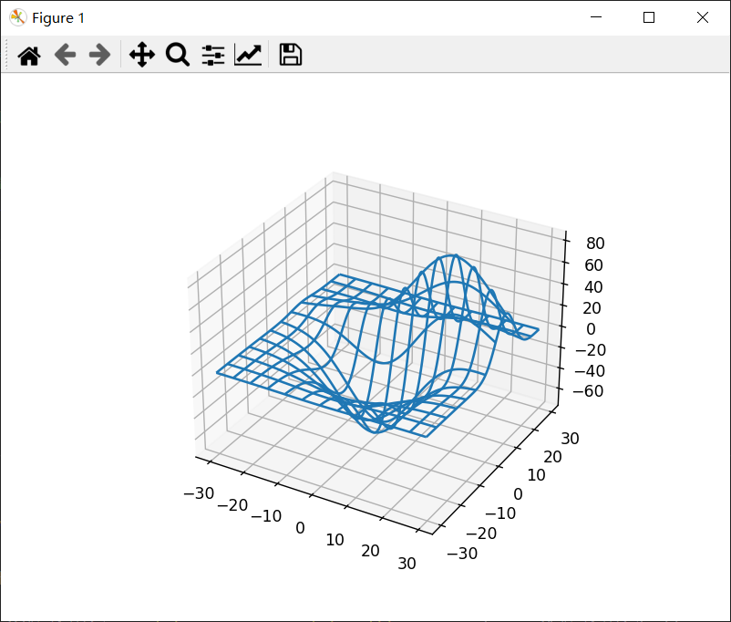
3、线框图
讯享网Axes3D.plot_wireframe(self, X, Y, Z, *args, kwargs) 参数: X, Y, Z:二维数组 数值。 rcount, ccount:整数 每个方向使用的最大样本数。如果输入数据较大,则会向下采样(通过切片)到这些点数。将计数设置为零会导致数据不在相应方向上采样,从而生成3D线图而不是线框图。默认值为50。 rstride, cstride:整数 每个方向的下采样步幅。这些参数与 rcount 和 ccount 互斥。如果仅设置了 rstride 或 cstride 中的一个,则另一个默认为 1。将步幅设置为零会导致数据不在相应方向上采样,从而生成 3D 线图而不是线框图。 “classic”模式使用默认值 rstride = cstride = 1 而不是默认值 rcount = ccount = 50。 kwargs 其他参数被传到 Line3DCollection。
示例:
from mpl_toolkits.mplot3d import axes3d import matplotlib.pyplot as plt fig = plt.figure() ax = fig.add_subplot(111, projection='3d') # 获取一些测试数据。 X, Y, Z = axes3d.get_test_data(0.05) # 绘制基本的线框图。 ax.plot_wireframe(X, Y, Z, rstride=10, cstride=10) plt.show()效果:
4、曲面图
讯享网Axes3D.plot_surface(self, X, Y, Z, *args, norm=None, vmin=None, vmax=None, lightsource=None, kwargs) 参数: X, Y, Z:二维数组 数值。 rcount, ccount:整数 每个方向使用的最大样本数。如果输入数据较大,则会向下采样(通过切片)到这些点数。默认为 50。 rstride, cstride:整数 每个方向的下采样步幅。这些参数与 rcount 和 ccount 互斥。如果仅设置了 rstride 或 cstride 中的一个,则另一个默认为 10。“classic”模式使用默认值 rstride = cstride = 10 而不是默认值 rcount = ccount = 50。 color:类颜色 表面补丁的颜色。 cmap:颜色图 表面补丁的颜色图。 facecolors:颜色的类数组 每个单独补丁的颜色。 norm:标准化 颜色图的规范化。 vmin, vmax:浮点数 规范化的界限。 shade:布尔值 是否对 facecolors 进行着色。默认为真。指定 cmap 时,始终禁用着色。 lightsource:LightSource 当 shade 为 True 时使用的光源。 kwargs 其他参数被转到 Poly3DCollection。
示例:
import matplotlib.pyplot as plt from matplotlib import cm from matplotlib.ticker import LinearLocator, FormatStrFormatter import numpy as np fig = plt.figure() ax = fig.add_subplot(111, projection='3d') X = np.arange(-5, 5, 0.25) Y = np.arange(-5, 5, 0.25) X, Y = np.meshgrid(X, Y) R = np.sqrt(X2 + Y2) Z = np.sin(R) # 绘制表面。 surf = ax.plot_surface(X, Y, Z, cmap=cm.coolwarm, linewidth=0, antialiased=False) # 定制z轴。 ax.set_zlim(-1.01, 1.01) ax.zaxis.set_major_locator(LinearLocator(10)) ax.zaxis.set_major_formatter(FormatStrFormatter('%.02f')) # 添加一个颜色条,它将值映射到颜色。 fig.colorbar(surf, shrink=0.5, aspect=5) plt.show()效果:

5、三面图
讯享网Axes3D.plot_trisurf(self, *args, color=None, norm=None, vmin=None, vmax=None, lightsource=None, kwargs) 参数 X, Y, Z:类数组 数值作为一维数组。 color 表面补丁的颜色。 cmap 表面补丁的颜色图。 norm:标准化 将值映射到颜色的 Normalize 实例。 vmin, vmax:标量,可选,默认值:无 要映射的最小值和最大值。 shade:布尔值 是否对 facecolors 进行着色。默认为真。指定 cmap 时,始终禁用着色。 lightsource:LightSource 当 shade 为 True 时使用的光源。 kwargs 所有其他参数都传给 Poly3DCollection
示例:
import matplotlib.pyplot as plt import numpy as np n_radii = 8 n_angles = 36 # 生成半径和角度空间(半径r=0省略,以消除重复)。 radii = np.linspace(0.125, 1.0, n_radii) angles = np.linspace(0, 2*np.pi, n_angles, endpoint=False)[..., np.newaxis] # 将极坐标(半径,角度)转换为直角坐标(x, y)。(0,0)是在这个阶段手动添加的,所以(x, y)平面上不会有重复的点。 x = np.append(0, (radii*np.cos(angles)).flatten()) y = np.append(0, (radii*np.sin(angles)).flatten()) # 计算z来制作普林格曲面。 z = np.sin(-x*y) fig = plt.figure() ax = fig.add_subplot(111, projection='3d') ax.plot_trisurf(x, y, z, linewidth=0.2, antialiased=True) plt.show()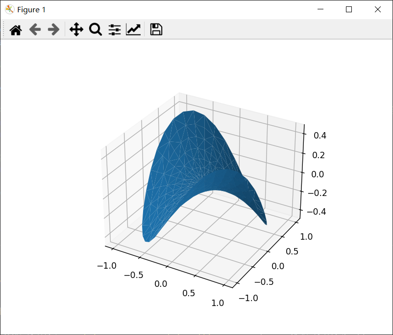
6、轮廓图
讯享网Axes3D.contour(self, X, Y, Z, *args, extend3d=False, stride=5, zdir='z', offset=None, kwargs) 参数: X, Y, Z:类数组 输入数据。 extend3d:布尔值 是否在 3D 中扩展轮廓;默认为False. stride:整数 扩展轮廓的步长。 zdir:{'x', 'y', 'z'} 使用方向;默认为“z”。 offset:标量 如果指定,则在垂直于 zdir 的平面中绘制此位置的轮廓投影 *args, kwargs 其他参数被转到 matplotlib.axes.Axes.contour。
示例:
from mpl_toolkits.mplot3d import axes3d import matplotlib.pyplot as plt from matplotlib import cm fig = plt.figure() ax = fig.add_subplot(111, projection='3d') X, Y, Z = axes3d.get_test_data(0.05) cset = ax.contour(X, Y, Z, cmap=cm.coolwarm) ax.clabel(cset, fontsize=9, inline=1) plt.show()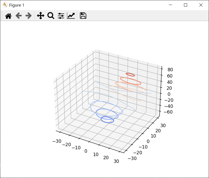
7、填充轮廓图
讯享网Axes3D.contourf(self, X, Y, Z, *args, zdir='z', offset=None, kwargs) 参数: X, Y, Z:类数组 输入数据。 zdir:{'x', 'y', 'z'} 使用方向;默认为“z”。 offset:标量 如果指定,则在垂直于 zdir 的平面中绘制此位置的轮廓投影 *args, kwargs 其他参数被转到 matplotlib.axes.Axes.contourf。
示例:
from mpl_toolkits.mplot3d import axes3d import matplotlib.pyplot as plt from matplotlib import cm fig = plt.figure() ax = fig.add_subplot(111, projection='3d') X, Y, Z = axes3d.get_test_data(0.05) cset = ax.contourf(X, Y, Z, cmap=cm.coolwarm) ax.clabel(cset, fontsize=9, inline=1) plt.show()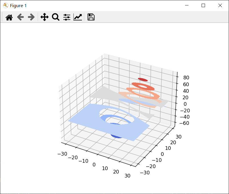
8、多边形图
讯享网Axes3D.add_collection3d(self, col, zs=0, zdir='z')
示例:
from matplotlib.collections import PolyCollection import matplotlib.pyplot as plt from matplotlib import colors as mcolors import numpy as np np.random.seed() def polygon_under_graph(xlist, ylist): """ 构建顶点列表,定义(xlist,ylist)线图下填充空间的多边形。假设X是按升序排列的。 """ return [(xlist[0], 0.), *zip(xlist, ylist), (xlist[-1], 0.)] fig = plt.figure() ax = fig.add_subplot(111, projection='3d') # 使vert成为一个列表,使vert [i]是定义多边形i的(x, y)对列表。 verts = [] # 建立x序列 xs = np.linspace(0., 10., 26) # 第i个多边形将出现在平面y = zs[i]上。 zs = range(4) for i in zs: ys = np.random.rand(len(xs)) verts.append(polygon_under_graph(xs, ys)) poly = PolyCollection(verts, facecolors=['r', 'g', 'b', 'y'], alpha=.6) ax.add_collection3d(poly, zs=zs, zdir='y') ax.set_xlabel('X') ax.set_ylabel('Y') ax.set_zlabel('Z') ax.set_xlim(0, 10) ax.set_ylim(-1, 4) ax.set_zlim(0, 1) plt.show()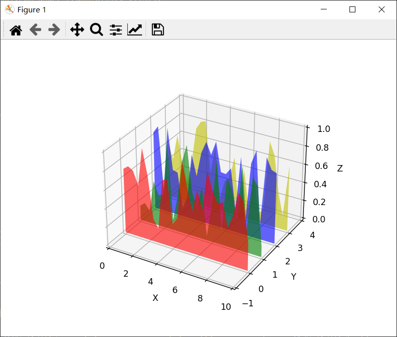
9、条形图
讯享网Axes3D.bar(self, left, height, zs=0, zdir='z', *args, kwargs) 参数: left:一维类数组 条形左侧的 x 坐标。 height:一维类数组 条形的高度。 zs:标量或一维类数组 条形的 Z 坐标;如果指定了单个值,它将用于所有条形。 zdir:{'x', 'y', 'z'} 绘制 2D 数据时,使用的方向作为 z('x'、'y' 或 'z');默认为“z”。 kwargs 其他参数被转到 matplotlib.axes.Axes.bar。
示例:
import matplotlib.pyplot as plt import numpy as np np.random.seed() fig = plt.figure() ax = fig.add_subplot(111, projection='3d') colors = ['r', 'g', 'b', 'y'] yticks = [3, 2, 1, 0] for c, k in zip(colors, yticks): xs = np.arange(20) ys = np.random.rand(20) # 你可以提供单一颜色或与xs和ys相同长度的数组。为了演示这一点,我们将每个集合的第一个竖条涂成青色。 cs = [c] * len(xs) cs[0] = 'c' # 在不透明度为 80% 的平面 y=k 上绘制由 xs 和 ys 给出的条形图。 ax.bar(xs, ys, zs=k, zdir='y', color=cs, alpha=0.8) ax.set_xlabel('X') ax.set_ylabel('Y') ax.set_zlabel('Z') # 在 y 轴上,我们只标记我们拥有数据的离散值。 ax.set_yticks(yticks) plt.show()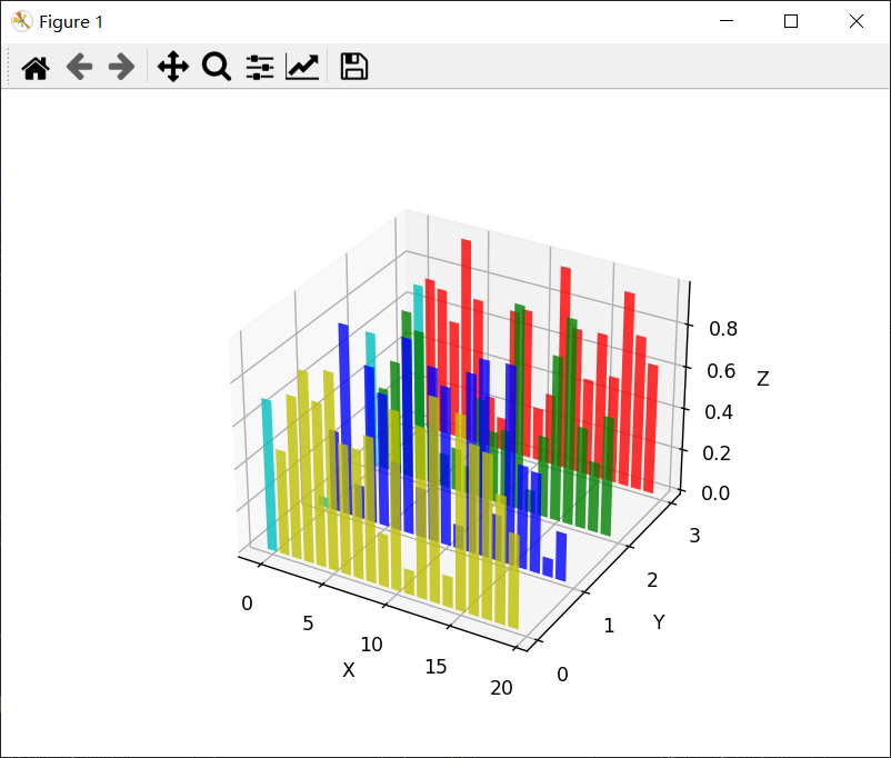
10、矢量图
讯享网Axes3D.quiver(X, Y, Z, U, V, W, /, length=1, arrow_length_ratio=0.3, pivot='tail', normalize=False, kwargs) 参数: X, Y, Z:类数组 箭头位置的 x、y 和 z 坐标(默认是箭头的尾部;参见 pivot kwarg) U, V, W:类数组 箭头向量的 x、y 和 z 分量 length:浮点值 每个箭筒的长度,默认为1.0,单位与axes相同 arrow_length_ratio:浮点值 箭头相对于箭筒的比例,默认为 0.3 pivot:{'tail', 'middle', 'tip'} 箭头在网格点处的部分;箭头围绕这一点旋转,因此得名枢轴。默认为“tail” normalize:布尔值 当为 True 时,所有箭头的长度都相同。这默认为 False,其中箭头的长度取决于 u、v、w 的值。 kwargs 任何其他关键字参数都委托给 LineCollection
示例:
import matplotlib.pyplot as plt import numpy as np fig = plt.figure() ax = fig.add_subplot(111, projection='3d') x, y, z = np.meshgrid(np.arange(-0.8, 1, 0.2), np.arange(-0.8, 1, 0.2), np.arange(-0.8, 1, 0.8)) # 为箭头制作方向数据 u = np.sin(np.pi * x) * np.cos(np.pi * y) * np.cos(np.pi * z) v = -np.cos(np.pi * x) * np.sin(np.pi * y) * np.cos(np.pi * z) w = (np.sqrt(2.0 / 3.0) * np.cos(np.pi * x) * np.cos(np.pi * y) * np.sin(np.pi * z)) ax.quiver(x, y, z, u, v, w, length=0.1, normalize=True) plt.show()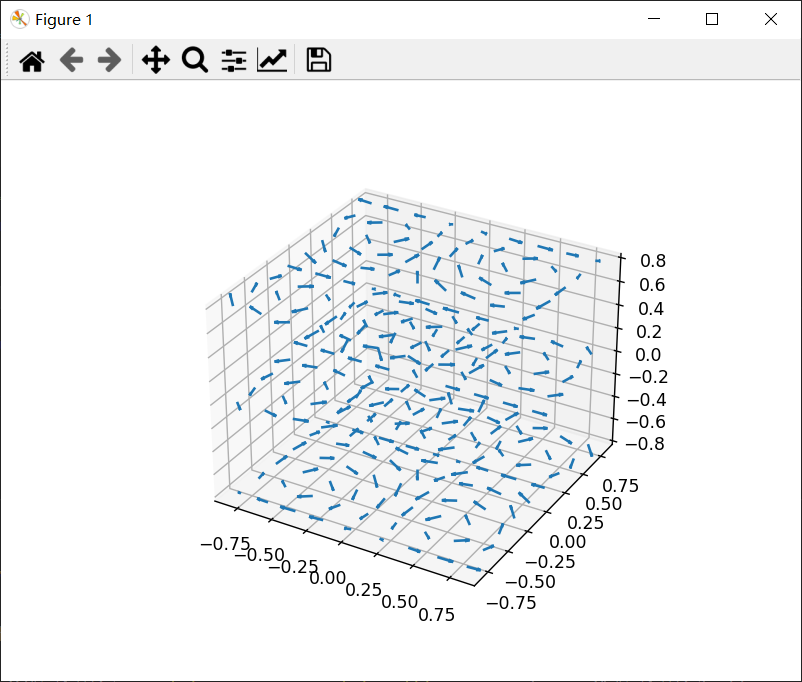
11、3D 中的 2D 绘图
示例:
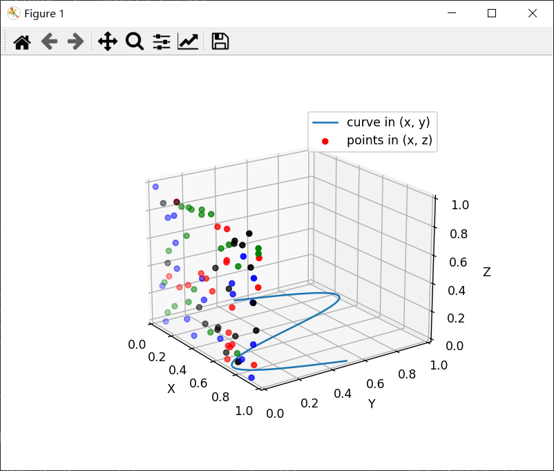
讯享网import numpy as np import matplotlib.pyplot as plt fig = plt.figure() ax = fig.add_subplot(111, projection='3d') # 使用x轴和y轴绘制正弦曲线。 x = np.linspace(0, 1, 100) y = np.sin(x * 2 * np.pi) / 2 + 0.5 ax.plot(x, y, zs=0, zdir='z', label='curve in (x, y)') # 在x轴和z轴上绘制散点图数据(每种颜色20个2D点)。 colors = ('r', 'g', 'b', 'k') # 为再现性固定随机状态 np.random.seed() x = np.random.sample(20 * len(colors)) y = np.random.sample(20 * len(colors)) c_list = [] for c in colors: c_list.extend([c] * 20) # 通过使用zdir='y',这些点的y值固定为zs值0,(x, y)点绘制在x轴和z轴上。 ax.scatter(x, y, zs=0, zdir='y', c=c_list, label='points in (x, z)') # 制作图例,设置坐标轴限制和标签 ax.legend() ax.set_xlim(0, 1) ax.set_ylim(0, 1) ax.set_zlim(0, 1) ax.set_xlabel('X') ax.set_ylabel('Y') ax.set_zlabel('Z') # 自定义视角,这样更容易看到散射点位于y=0平面上 ax.view_init(elev=20., azim=-35) plt.show()
12、文本
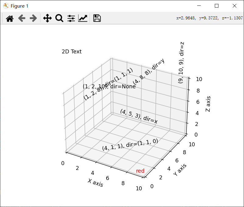
Axes3D.text(self, x, y, z, s, zdir=None, kwargs) kwargs 被传给 Axes.text,除了 zdir 关键字,它设置要用作z方向的方向。示例:
讯享网import matplotlib.pyplot as plt fig = plt.figure() ax = fig.add_subplot(111, projection='3d') zdirs = (None, 'x', 'y', 'z', (1, 1, 0), (1, 1, 1)) xs = (1, 4, 4, 9, 4, 1) ys = (2, 5, 8, 10, 1, 2) zs = (10, 3, 8, 9, 1, 8) for zdir, x, y, z in zip(zdirs, xs, ys, zs): label = '(%d, %d, %d), dir=%s' % (x, y, z, zdir) ax.text(x, y, z, label, zdir) ax.text(9, 0, 0, "red", color='red') # 0,0在左下,1,1在右上。 ax.text2D(0.05, 0.95, "2D Text", transform=ax.transAxes) # 调整显示区域和标签 ax.set_xlim(0, 10) ax.set_ylim(0, 10) ax.set_zlim(0, 10) ax.set_xlabel('X axis') ax.set_ylabel('Y axis') ax.set_zlabel('Z axis') plt.show()
13、子图
可以在一个图形中拥有多个 3D 绘图与 2D 绘图,也可以在同一个图中同时拥有 2D 和 3D 绘图。
示例:
import matplotlib.pyplot as plt from matplotlib import cm import numpy as np from mpl_toolkits.mplot3d.axes3d import get_test_data # 建立一个宽是高两倍的数字 fig = plt.figure(figsize=plt.figaspect(0.5)) ''' 第一个子图 ''' # 为第一个图设置axes ax = fig.add_subplot(1, 2, 1, projection='3d') # 绘制一个3D曲面图 X = np.arange(-5, 5, 0.25) Y = np.arange(-5, 5, 0.25) X, Y = np.meshgrid(X, Y) R = np.sqrt(X2 + Y2) Z = np.sin(R) surf = ax.plot_surface(X, Y, Z, rstride=1, cstride=1, cmap=cm.coolwarm, linewidth=0, antialiased=False) ax.set_zlim(-1.01, 1.01) fig.colorbar(surf, shrink=0.5, aspect=10) ''' 第二个子图 ''' # 为第二个图设置axes ax = fig.add_subplot(1, 2, 2, projection='3d') # 绘制一个3D线框图 X, Y, Z = get_test_data(0.05) ax.plot_wireframe(X, Y, Z, rstride=10, cstride=10) plt.show()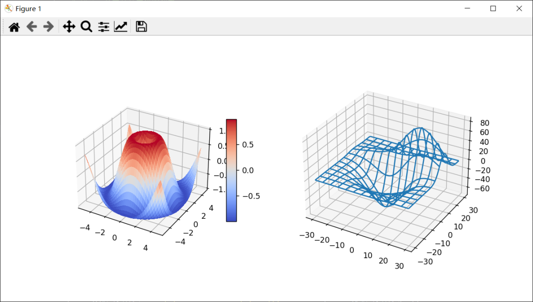
好啦,就到这~

END

您的“点赞”、“在看”和 “分享”是我们产出的动力。
版权声明:本文内容由互联网用户自发贡献,该文观点仅代表作者本人。本站仅提供信息存储空间服务,不拥有所有权,不承担相关法律责任。如发现本站有涉嫌侵权/违法违规的内容,请联系我们,一经查实,本站将立刻删除。
如需转载请保留出处:https://51itzy.com/kjqy/54453.html