
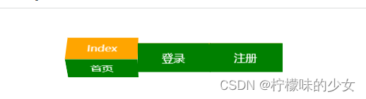
<style> *{ margin: 0; padding: 0; } ul{ list-style: none; width: 300px; height: 40px; /* background-color: pink; */ margin: 50px auto; perspective: 1000px; } li{ position: relative; float: left; width: 100px; height: 40px; /* background-color: aqua; */ /* 开启3D空间 */ transform-style: preserve-3d; /* 过渡效果 */ transition: all 1.5s; /* 侧过来方便观察 */ /* transform: rotateY(41deg) rotateX(342deg); */ } a{ position: absolute; top: 0; left: 0; display: block; text-decoration: none; text-align: center; line-height: 40px; width: 100px; height: 40px; color: white; } .front{ background-color: green; transform: translateZ(20px); } .top{ background-color: orange; transform:translateY(-20px) rotateX(90deg); } ul li:hover{ transform: rotateX(-90deg); } </style> <body> <ul> <li> <a href="#" class="front">首页</a> <a href="#" class="top">Index</a> </li> <li> <a href="#" class="front">登录</a> <a href="#" class="top">Login</a> </li> <li> <a href="#" class="front">注册</a> <a href="#" class="top">Register</a> </li> </ul> </body>讯享网
效果样式
思路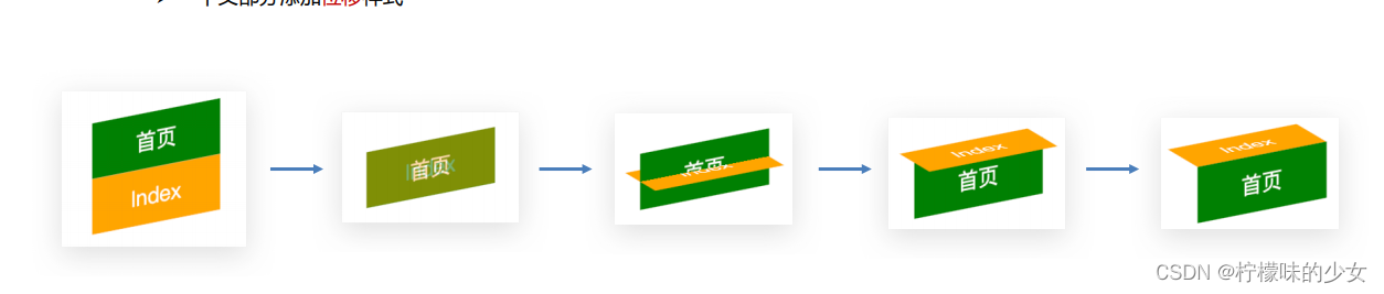
版权声明:本文内容由互联网用户自发贡献,该文观点仅代表作者本人。本站仅提供信息存储空间服务,不拥有所有权,不承担相关法律责任。如发现本站有涉嫌侵权/违法违规的内容,请联系我们,一经查实,本站将立刻删除。
如需转载请保留出处:https://51itzy.com/kjqy/16370.html