
问题引入:
可视化数据大屏需要适配各种大屏尺寸
1080P:1920*1080
2K:2560*1440 左右
4K:3840*2160 左右
8K:7680*4320 左右

① 大屏使用rem 耗时 而且对浏览器最小字体不支持,
② 使用transform:scale可以节省百分之九十工作量
③ 好处不多说:看一篇文章 学习一下 咱们再来实战!
(1)创建一个组件SacleBox
<template> <div class="ScaleBox" ref="ScaleBox" :style="{ width: width + 'px', height: height + 'px', }" > <slot></slot> </div> </template> <script> export default { name: "ScaleBox", props: {}, data() { return { scale: 0, width: 1920, height: 1080, }; }, mounted() { this.setScale(); window.addEventListener("resize", this.debounce(this.setScale)); }, methods: { getScale() { // 固定好16:9的宽高比,计算出最合适的缩放比 const { width, height } = this; const wh = window.innerHeight / height; const ww = window.innerWidth / width; console.log(ww < wh ? ww : wh); return ww < wh ? ww : wh; }, setScale() { // 获取到缩放比例,设置它 this.scale = this.getScale(); if (this.$refs.ScaleBox) { this.$refs.ScaleBox.style.setProperty("--scale", this.scale); } }, debounce(fn, delay) { const delays = delay || 500; let timer; return function () { const th = this; const args = arguments; if (timer) { clearTimeout(timer); } timer = setTimeout(function () { timer = null; fn.apply(th, args); }, delays); }; }, }, }; </script> <style lang="scss"> #ScaleBox { --scale: 1; } .ScaleBox { position: absolute; transform: scale(var(--scale)) translate(-50%, -50%); display: flex; flex-direction: column; transform-origin: 0 0; left: 50%; top: 50%; transition: 0.3s; z-index: 999; // background: rgba(255, 0, 0, 0.3); } </style>讯享网
(2)引用组件
讯享网import ScaleBox from "../../components/ScaleBox/index.vue"; export default { name: "bigScreen", components: { ScaleBox, }, data() { return { // -- } }
(3)用ScaleBox组件包裹整个页面
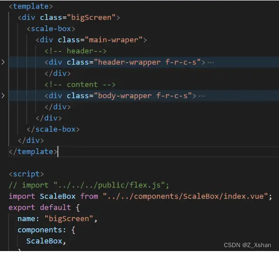
(4)码自己页面
注意:
(1)使用px做单位,不使用rem
(2)ScaleBox内部页面元素最大的盒子按照19201080为容器 严格计算。所有宽高加起来为19201080
(3)最好不要使用百分比分配宽高
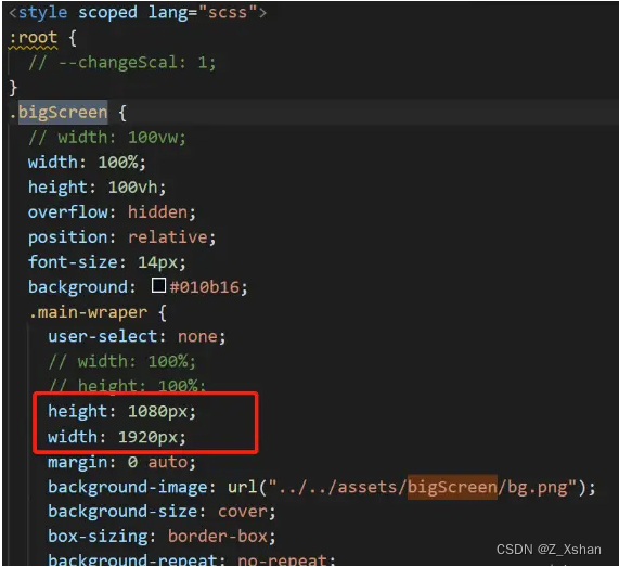
到此结束!
版权声明:本文内容由互联网用户自发贡献,该文观点仅代表作者本人。本站仅提供信息存储空间服务,不拥有所有权,不承担相关法律责任。如发现本站有涉嫌侵权/违法违规的内容,请联系我们,一经查实,本站将立刻删除。
如需转载请保留出处:https://51itzy.com/kjqy/78268.html