
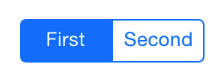
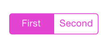
一. 分段控件 (UISegmentedControl)
控件展示 :
1. UISegmentedControl 控件属性
(1) Style 属性
Style 属性 :
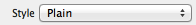
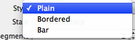
-- Plain : 分段控件使用最普通的风格;
-- Bordered : 在最普通风格上添加一圈边框;
-- Bar : 分段控件使用工具条风格;
(2) State 属性
State 属性 :
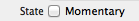
-- Momentary 复选框 : 勾选复选框后, 分段控件不保存控件状态, 如果勾选后, 点击时高亮, 点击后恢复原样;
(3) Tint 属性
Tint 属性 :
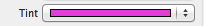
-- 作用 : 设置分段控件被选中的高亮颜色;
-- 效果展示 :
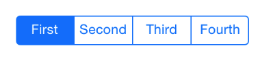
(4) Segments 属性
Segments 属性 :
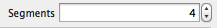
-- 作用 : 控制分成几段;
-- 展示效果 :
(5) Segment 属性
Segment 属性 :
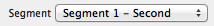
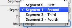
-- 作用 : 为不同的分段设置对应的 标题, 图片 等内容;
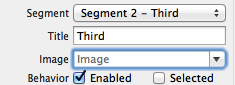
(6) Tittle 属性
Tittle 属性 : 每个 Segment 都有一个 Tittle 属性, 就是分段按钮每个按钮的标题;
(7) Image 属性
Image 属性: 为不同的 分段 Segment 设置图片;
(8) Behavior 属性
Behavior 属性 :
-- Enable 复选框 : 用于设置 Segment 是否可用;
-- Selected 复选框 : 用于设置 Segment 是否被选中;
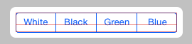
2. 使用 UISegmentedControl 改变背景颜色
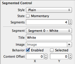
(1) 设置 UISegmentedControl 属性
UISegmentedControl 属性 :
-- 属性截图 :
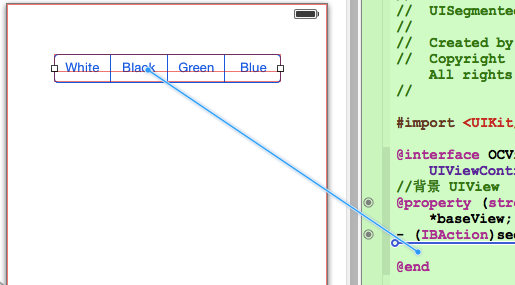
(2) 设置 UISegmentedControl 响应方法
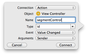
创建 UISegmentedControl 的 IBAction :
-- 按住 control 键将 UISegmentedControl 拖动到 OCViewController.h 中 :
-- 设置 IBAction 属性 :
-- 方法代码 :
- (IBAction)segmentControl:(id)sender { int index = [sender selectedSegmentIndex]; switch (index) { case 0: self.baseView.backgroundColor = [UIColor whiteColor]; break; case 1: self.baseView.backgroundColor = [UIColor blackColor]; break; case 2: self.view.backgroundColor = [UIColor greenColor]; break; case 3: self.view.backgroundColor = [UIColor blueColor]; break; default: break; } }讯享网
(3) 代码示例
代码示例 :
-- OCViewController.h :
讯享网// // OCViewController.h // UISegmentedControl // // Created by octopus on 15-12-4. // Copyright (c) 2015年 www.octopus.org.cn. All rights reserved. // #import <UIKit/UIKit.h> @interface OCViewController : UIViewController //背景 UIView @property (strong, nonatomic) IBOutlet UIView *baseView; - (IBAction)segmentControl:(id)sender; @end
-- OCViewController.m :
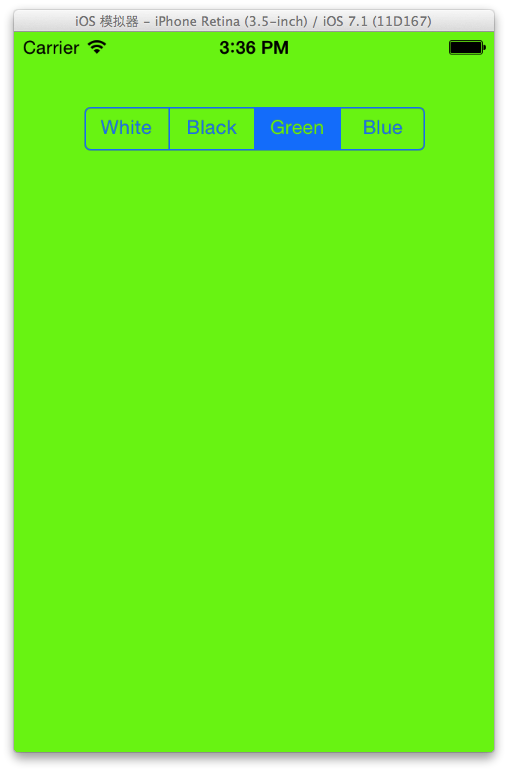
// // OCViewController.m // UISegmentedControl // // Created by octopus on 15-12-4. // Copyright (c) 2015年 www.octopus.org.cn. All rights reserved. // #import "OCViewController.h" @interface OCViewController () @end @implementation OCViewController - (void)viewDidLoad { [super viewDidLoad]; // Do any additional setup after loading the view, typically from a nib. } - (void)didReceiveMemoryWarning { [super didReceiveMemoryWarning]; // Dispose of any resources that can be recreated. } - (IBAction)segmentControl:(id)sender { int index = [sender selectedSegmentIndex]; switch (index) { case 0: self.baseView.backgroundColor = [UIColor whiteColor]; break; case 1: self.baseView.backgroundColor = [UIColor blackColor]; break; case 2: self.view.backgroundColor = [UIColor greenColor]; break; case 3: self.view.backgroundColor = [UIColor blueColor]; break; default: break; } } @end-- 界面展示 :
3. 动态增加删除分段
(1) 主要 API 简介
插入 删除分段 :
-- 插入分段 : 调用 segmentControl 的 insertSegmentWithTittle 方法, 参数一 标题, 参数二 插入索引;
讯享网[self.segmentControl insertSegmentWithTitle:tittle atIndex:count animated:YES];
-- 删除分段 : 删除只需注明 索引值 即可;
[self.segmentControl removeSegmentAtIndex:count - 1 animated:YES];
(2) 源码示例
源码示例 :
-- 界面设计文件 :
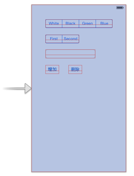
-- OCViewController.h :
讯享网// // OCViewController.h // UISegmentedControl // // Created by octopus on 15-12-4. // Copyright (c) 2015年 www.octopus.org.cn. All rights reserved. // #import <UIKit/UIKit.h> @interface OCViewController : UIViewController //背景 UIView @property (strong, nonatomic) IBOutlet UIView *baseView; //分段控件 @property (strong, nonatomic) IBOutlet UISegmentedControl *segmentControl; //单行文本 @property (strong, nonatomic) IBOutlet UITextField *textField; //分段控件方法 - (IBAction)segmentControl:(id)sender; //点击背景控件方法 - (IBAction)clickBackGround:(id)sender; //添加分段控件 - (IBAction)addSegment:(id)sender; //删除分段控件 - (IBAction)minusSegment:(id)sender; @end
-- OCViewController.m :
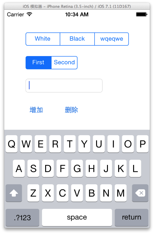
// // OCViewController.m // UISegmentedControl // // Created by octopus on 15-12-4. // Copyright (c) 2015年 www.octopus.org.cn. All rights reserved. // #import "OCViewController.h" @interface OCViewController () @end @implementation OCViewController - (void)viewDidLoad { [super viewDidLoad]; // Do any additional setup after loading the view, typically from a nib. } - (void)didReceiveMemoryWarning { [super didReceiveMemoryWarning]; // Dispose of any resources that can be recreated. } //分段控件响应方法 - (IBAction)segmentControl:(id)sender { int index = [sender selectedSegmentIndex]; switch (index) { case 0: self.baseView.backgroundColor = [UIColor whiteColor]; break; case 1: self.baseView.backgroundColor = [UIColor blackColor]; break; case 2: self.view.backgroundColor = [UIColor greenColor]; break; case 3: self.view.backgroundColor = [UIColor blueColor]; break; default: break; } } - (IBAction)clickBackGround:(id)sender { // 点击背景 取消虚拟键盘 [self.textField resignFirstResponder]; } //添加分段控件 - (IBAction)addSegment:(id)sender { NSUInteger count = self.segmentControl.numberOfSegments; NSString * tittle = self.textField.text; if ([tittle length] > 0) { [self.segmentControl insertSegmentWithTitle:tittle atIndex:count animated:YES]; self.textField.text = @""; } } //删除分段控件 - (IBAction)minusSegment:(id)sender { NSUInteger count = self.segmentControl.numberOfSegments; [self.segmentControl removeSegmentAtIndex:count - 1 animated:YES]; } @end-- 界面展示 :
二. 图像控件 (UIImageView)
1. UIImageView 控件属性
(1) UIImageView 简介
UIImageView 简介 :
-- 继承结构 : UIImageView 继承 UIView, 该类不能响应用户操作, 是静态控件, (活动控件 静态控件 被动控件);
(2) 图片显示属性
设置图片显示的属性 :
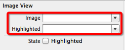
-- image (普通) : 访问或设置该控件显示的图片;
-- HighlightedImage (高亮) : 设置图片处于 高亮状态 时显示的图片;
(3) 动画显示方法
UIImageView 动画显示方法 :
-- animationImages : 设置一个 NSArray 对象, 需要显示多张图片;
-- highlightedAnimationImages : 设置 高亮状态 显示的多张图片;
-- animationDuration : 设置 UIImageView 动画持续时间;
-- animationRepeatCount : 设置 UIImageView 动画重复次数;
-- startAnimating : 开始播放动画;
-- stopAnimating : 停止播放动画;
-- isAnimating : 判断 UIImageView 是否正在播放动画;
(4) UIImageView 缩放属性
UIImageView 缩放属性 :
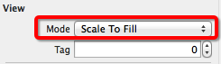
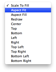
-- Scale To Fill : 不保持 纵横缩放比, 图片完全自适应 UIImageView 控件;
-- Aspect Fit : 保持纵横比缩放, 保证图片长边完全显示出来, 完整显示图片;
-- Aspect Fill : 保持纵横比缩放, 保证图片短边能显示出来, 只在水平或垂直方向某一个方向是完整的, 另一个方向截取;
-- Center : 不缩放图片, 显示图片的中间区域;
-- Top : 不缩放图片, 显示图片的顶部区域;
-- Bottom : 不缩放图片, 显示图片底部区域;
-- Left : 不缩放图片, 显示图片左边区域;
-- Right : 不缩放图片, 显示图片右边区域;
-- Top Left : 不缩放图片, 显示图片左上区域;
-- Top Right : 不缩放图片, 显示图片右上区域;
-- Bottom Left : 不缩放图片, 显示图片左下区域;
-- Bottom Right : 不缩放图片, 显示图片右下区域;
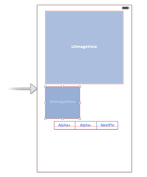
2. 图片浏览器示例
(1) API 简介
手势事件 :
-- 设置手势点击响应 : 每个 UIView 都有一个 userInteractionEnabled 属性为 YES;
讯享网 //设置大图片可以相应手势点击 self.bigPicture.userInteractionEnabled = YES;
-- 创建手势识别器 : 创建 UITapGestureRecognizer 手势识别器, initWithTarget 表示手势响应方法的类, action 对应方法的 selector 方法;
UITapGestureRecognizer * tap = [[UITapGestureRecognizer alloc] initWithTarget:self action:@selector(click:)];-- 为 UIView 添加手势识别器 : 调用 UIView 的 addGestureRecognizer 方法;
讯享网[self.bigPicture addGestureRecognizer:tap];
-- 设置 UIImageView 图片 :
self.bigPicture.image = [UIImage imageNamed:[images objectAtIndex:currentImage%images.count]];-- 设置透明度 :
讯享网self.bigPicture.alpha = alpha;
-- 获取手指触摸位置 :
//获取手指触摸的位置 CGPoint point = [recognizer locationInView:self.bigPicture];-- 获取图片对应的 CGImageRef :
讯享网 //获取原图对应的 CGImageRef CGImageRef imageRef = [srcImage CGImage];
-- 根据一个图片创建新的 CGImageRef :
//创建新的图片 CGImageRef newImageRef = CGImageCreateWithImageInRect(imageRef, CGRectMake(x, y, 140, 140));-- 根据 CGImageRef 创建 UIImage :
讯享网[UIImage imageWithCGImage:newImageRef];
(2) 代码示例
代码示例 :
-- 界面设计文件 :
-- OCViewController.h :
// // OCViewController.h // UIImageView // // Created by octopus on 15-12-7. // Copyright (c) 2015年 www.octopus.org.cn. All rights reserved. // #import <UIKit/UIKit.h> @interface OCViewController : UIViewController //大图片的 UIImageView @property (strong, nonatomic) IBOutlet UIImageView *bigPicture; //小图片的 UIImageView @property (strong, nonatomic) IBOutlet UIImageView *smallPicture; //UISegmentedControl 的方法 - (IBAction)segmentControl:(id)sender; @end-- OCViewController.m :
讯享网// // OCViewController.m // UIImageView // // Created by octopus on 15-12-7. // Copyright (c) 2015年 www.octopus.org.cn. All rights reserved. // #import "OCViewController.h" @interface OCViewController () @end @implementation OCViewController //图片集合 NSArray * images; //当前显示的图片 int currentImage; //透明度 CGFloat alpha; - (void)viewDidLoad { [super viewDidLoad]; // Do any additional setup after loading the view, typically from a nib. //初始化变量 currentImage = 0; alpha = 1.0; images = [NSArray arrayWithObjects:@"1.png" , @"2.jpg", @"3.png", nil]; //设置大图片可以相应手势点击 self.bigPicture.userInteractionEnabled = YES; UITapGestureRecognizer * tap = [[UITapGestureRecognizer alloc] initWithTarget:self action:@selector(click:)]; [self.bigPicture addGestureRecognizer:tap]; } - (void)didReceiveMemoryWarning { [super didReceiveMemoryWarning]; // Dispose of any resources that can be recreated. } - (IBAction)segmentControl:(id)sender { int index = [sender selectedSegmentIndex]; switch (index) { case 0: //透明度+ alpha += 0.1; if(alpha > 1.0){ alpha = 1.0; } self.bigPicture.alpha = alpha; break; case 1: //透明度- NSLog(@"1"); alpha -= 0.1; if(alpha < 0){ alpha = 0; } self.bigPicture.alpha = alpha; break; case 2: //下一张图片 NSLog(@"2"); self.bigPicture.image = [UIImage imageNamed:[images objectAtIndex:currentImage%images.count]]; currentImage ++; break; default: break; } } - (void) click : (UIGestureRecognizer * ) recognizer{ //获取正在显示的图片 UIImage * srcImage = self.bigPicture.image; //获取手指触摸的位置 CGPoint point = [recognizer locationInView:self.bigPicture]; //获取原图对应的 CGImageRef CGImageRef imageRef = [srcImage CGImage]; //获取缩放比例 CGFloat scale = srcImage.size.width / 320; //获取图片位置 CGFloat x = point.x * scale; CGFloat y = point.y * scale; //验证 x y 坐标, 不要超出边界 if (x + 120 > srcImage.size.width - 140) { x = srcImage.size.width - 140; } if (y + 120 > srcImage.size.height) { y = srcImage.size.height - 140; } //创建新的图片 CGImageRef newImageRef = CGImageCreateWithImageInRect(imageRef, CGRectMake(x, y, 140, 140)); self.smallPicture.image = [UIImage imageWithCGImage:newImageRef]; } @end
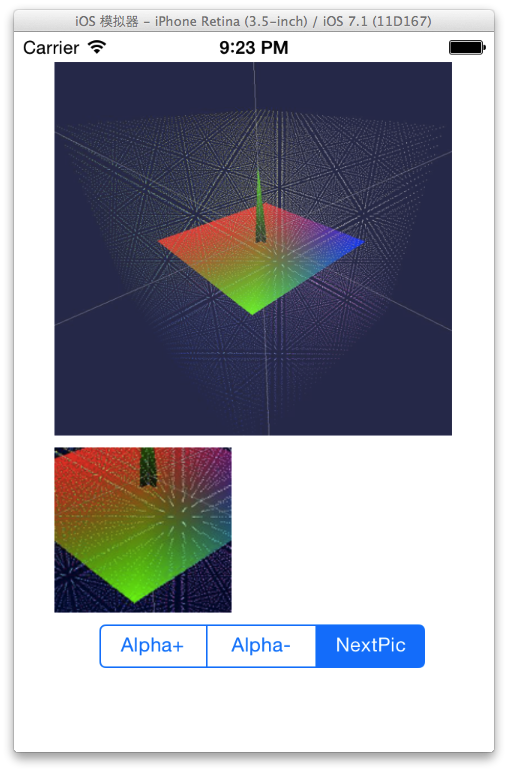
-- 界面展示 :
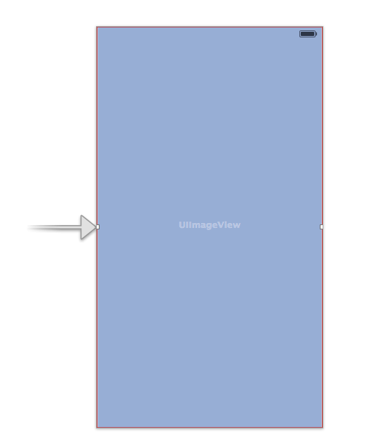
3. 幻灯片放映
(1) API 简介
幻灯片播放相关 API :
-- 设置 UIImage 数组给 UIImageView :
images = [NSArray arrayWithObjects: [UIImage imageNamed:@"1.png"], [UIImage imageNamed:@"2.jpg"], [UIImage imageNamed:@"3.png"], nil]; self.imageView.animationImages = images;-- 设置动画的间隔 和 次数 :
讯享网 //设置 UIImageView 动画间隔 self.imageView.animationDuration = 5; //设置动画重复次数 self.imageView.animationRepeatCount = 0xFFFF;
-- 启动动画 :
//启动动画 [self.imageView startAnimating];
(2) 代码示例
代码示例 :
-- 界面设计文件 :
-- OCViewController.h :
讯享网// // OCViewController.h // UIimageView2 // // Created by octopus on 15-12-9. // Copyright (c) 2015年 www.octopus.org.cn. All rights reserved. // #import <UIKit/UIKit.h> @interface OCViewController : UIViewController @property (strong, nonatomic) IBOutlet UIImageView *imageView; @end
-- OCViewController.m :
// // OCViewController.m // UIimageView2 // // Created by octopus on 15-12-9. // Copyright (c) 2015年 www.octopus.org.cn. All rights reserved. // #import "OCViewController.h" @interface OCViewController () @end @implementation OCViewController NSArray * images; - (void)viewDidLoad { [super viewDidLoad]; // Do any additional setup after loading the view, typically from a nib. //创建 UIImageView 集合 images = [NSArray arrayWithObjects: [UIImage imageNamed:@"1.png"], [UIImage imageNamed:@"2.jpg"], [UIImage imageNamed:@"3.png"], nil]; //设置集合给 UIImageView 的动画 self.imageView.animationImages = images; //设置 UIImageView 动画间隔 self.imageView.animationDuration = 5; //设置动画重复次数 self.imageView.animationRepeatCount = 0xFFFF; //启动动画 [self.imageView startAnimating]; } - (void)didReceiveMemoryWarning { [super didReceiveMemoryWarning]; // Dispose of any resources that can be recreated. } @end-- 界面展示 :
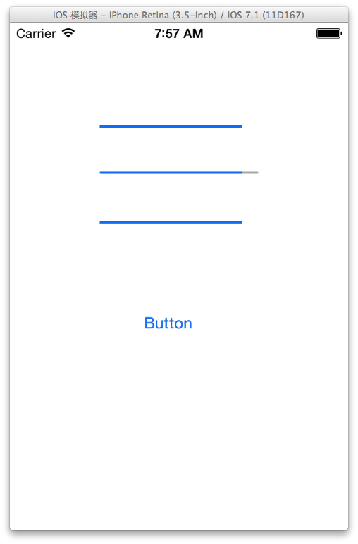
三. 进度条控件 (UIProgressView)
1. UIProgressView 控件属性
UIProgressView 属性截图 :
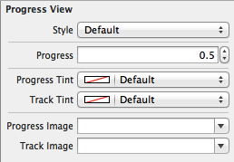
(1) Style 属性
Style 属性 :
-- Default : 使用默认风格的进度条;

-- Bar : 工具条风格;

(2) progress 属性
Progress 属性 : 设置已进行的进度的比例值, 取值范围 0.0 ~ 1.0;
(3) Progress Tint 属性
Progress Tint 属性 : 已完成的颜色;
(4) Track Tint 属性
Track Tint 属性 : 进度条轨道颜色;
(5) progressImage 属性
ProgressImage 属性 : 设置进度条完成的图片;
-- 注意 : 该属性在 Interface Builder 中没有体现出来;
(6) trackImage 属性
trackImage 属性 : 设置进度条轨道图片;
-- 注意 : 代码中设置, 界面设计文件中无该属性;
2. 可拉伸图片
(1) 可拉伸图片用法
可拉伸图片作用 : 在上述进度条中, 设置的 progressImage 和 trackImage 必须是可拉伸图片;
(2) 可拉伸图片创建
创建可拉伸图片 : 使用 UIImage 创建 可拉伸图片, 通过 UIEdgeInsets 结构体定义图片拉伸区域;
-- UIEdgeInsets 结构体 : 包括 left, top, right, bottom 四个值;

-- 缩放主体 : 图片缩放只在 UIEdgeInsets 定义的 四个属性值 区域缩放, 图片的中心部分是不进行缩放的;
3. 定制进度条示例
(1) 相关 API 简介
相关 API 简介 :
-- 创建可拉伸的 UIImage :
讯享网 UIImage * trackImage = [[UIImage imageNamed:@"Snip_139.png"] resizableImageWithCapInsets:UIEdgeInsetsZero resizingMode:UIImageResizingModeTile];
-- 为进度条设置可拉伸图片 :
//将可拉伸图片设置给进度条 self.progress3.progressImage = progressImage; self.progress3.trackImage = trackImage;-- 创建定时器 :
讯享网 //定时器 timer = [NSTimer scheduledTimerWithTimeInterval:0.1 target:self selector:@selector(doProgress) userInfo:nil repeats:YES];
(2) 代码示例
代码示例 :
-- 界面设计文件 :
-- OCViewController.h :
// // OCViewController.h // UIProgressView // // Created by octopus on 15-12-10. // Copyright (c) 2015年 www.octopus.org.cn. All rights reserved. // #import <UIKit/UIKit.h> @interface OCViewController : UIViewController @property (strong, nonatomic) IBOutlet UIProgressView *progress1; @property (strong, nonatomic) IBOutlet UIProgressView *progress2; @property (strong, nonatomic) IBOutlet UIProgressView *progress3; - (IBAction)click:(id)sender; @end-- OCViewController.m :
讯享网// // OCViewController.m // UIProgressView // // Created by octopus on 15-12-10. // Copyright (c) 2015年 www.octopus.org.cn. All rights reserved. // #import "OCViewController.h" @interface OCViewController () @end @implementation OCViewController //定时器 NSTimer * timer; //进度条进度 CGFloat progress; /* CGFloat : 是 float 类型, 在 IOS 中定义了下面的类型 -- 32 位 : typedef float CGFloat;// 32-bit -- 64 位 : typedef double CGFloat;// 64-bit CGPoint : 二维坐标点; -- 定义代码 : struct CGPoint { CGFloat x; CGFloat y; }; typedef struct CGPoint CGPoint; CGSize : 矩形的宽度和高度; -- 定义代码 : struct CGSize { CGFloat width; CGFloat height; }; typedef struct CGSize CGSize; CGRect : 矩形的位置和大小; -- 定义代码 : struct CGRect { CGPoint origin; CGSize size; }; typedef struct CGRect CGRect; */ - (void)viewDidLoad { [super viewDidLoad]; // Do any additional setup after loading the view, typically from a nib. //创建 可拉伸的图片, 平铺样式 UIImage * trackImage = [[UIImage imageNamed:@"Snip_139.png"] resizableImageWithCapInsets:UIEdgeInsetsZero resizingMode:UIImageResizingModeTile]; UIImage * progressImage = [[UIImage imageNamed:@"Snip_140.png"] resizableImageWithCapInsets:UIEdgeInsetsZero resizingMode:UIImageResizingModeTile]; //将可拉伸图片设置给进度条 self.progress3.progressImage = progressImage; self.progress3.trackImage = trackImage; } - (void)didReceiveMemoryWarning { [super didReceiveMemoryWarning]; // Dispose of any resources that can be recreated. } - (IBAction)click:(id)sender { //进度条 progress = 0; //定时器 timer = [NSTimer scheduledTimerWithTimeInterval:0.1 target:self selector:@selector(doProgress) userInfo:nil repeats:YES]; } - (void) doProgress{ progress += 0.1; if(progress > 1.0){ [timer invalidate]; }else{ [self.progress1 setProgress:progress animated:YES]; [self.progress2 setProgress:progress animated:YES]; [self.progress3 setProgress:progress animated:YES]; } } @end
-- 运行展示 : 可拉伸图片效果没有出现, 待调试;
四. 进度环控件 (UIActivityIndicatorView)
1. 进度环控件 (UIActivityIndicatorView) 属性
UIActivityIndicatorView 属性截图 :
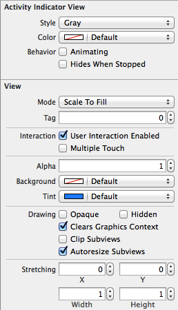
(1) Style 属性
Style 属性 :
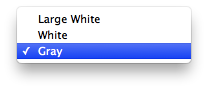
-- Large White : 大的 白色 风格;
-- White : 白色风格;
-- Gray : 灰色风格;
(2) Color 属性
Color 属性 :
-- 作用 : 设置进度条的颜色, 设置该属性会覆盖之前选中的风格中的颜色;
(3) Behavior 属性
Behavior 属性 :
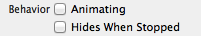
-- Animating : 显示出来后立即转动;
-- Hides When Stopped : 停止时自动隐藏;
(4) UIActivityIndicatorView 大小
两种大小 :
-- 标准风格 : 像素值 20 x 20;
-- 大风格 : 像素值 37 x 37;
(5) 控制方法
UIActivityIndicatorView 控制方法 :
-- 开始转动 : startAnimating 方法;
-- 停止转动 : stopAnimating 方法;
2. UIActivityIndicatorView 代码示例
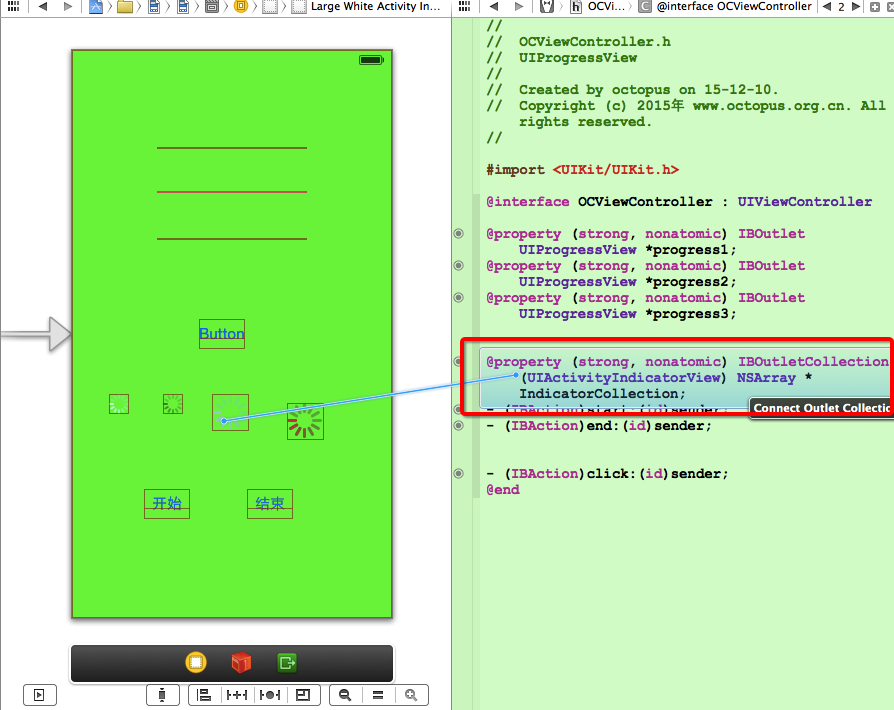
(1) 创建 IBOutletConnection
创建 IBOutletConnection :
-- 按住 Option 键 将一个元素拖动到 OCViewController.h 中 : 其中的 Connection 属性, 不要选择 IBOutlet 属性, 选择 IBOutletConnection 属性;
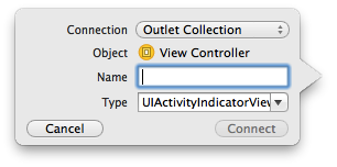
-- 将想要添加到 IBOutletConnection 中的控件拖动到 OCViewController.h 中的 IBOutletConnection 属性变量上 :
(2) 代码示例
代码示例 :
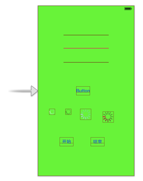
-- 界面设计文件 :
-- OCViewController.h :
// // OCViewController.h // UIProgressView // // Created by octopus on 15-12-10. // Copyright (c) 2015年 www.octopus.org.cn. All rights reserved. // #import <UIKit/UIKit.h> @interface OCViewController : UIViewController @property (strong, nonatomic) IBOutlet UIProgressView *progress1; @property (strong, nonatomic) IBOutlet UIProgressView *progress2; @property (strong, nonatomic) IBOutlet UIProgressView *progress3; @property (strong, nonatomic) IBOutletCollection(UIActivityIndicatorView) NSArray *IndicatorCollection; - (IBAction)start:(id)sender; - (IBAction)end:(id)sender; - (IBAction)click:(id)sender; @end-- OCViewController.m :
讯享网// // OCViewController.m // UIProgressView // // Created by octopus on 15-12-10. // Copyright (c) 2015年 www.octopus.org.cn. All rights reserved. // #import "OCViewController.h" @interface OCViewController () @end @implementation OCViewController //定时器 NSTimer * timer; //进度条进度 CGFloat progress; /* CGFloat : 是 float 类型, 在 IOS 中定义了下面的类型 -- 32 位 : typedef float CGFloat;// 32-bit -- 64 位 : typedef double CGFloat;// 64-bit CGPoint : 二维坐标点; -- 定义代码 : struct CGPoint { CGFloat x; CGFloat y; }; typedef struct CGPoint CGPoint; CGSize : 矩形的宽度和高度; -- 定义代码 : struct CGSize { CGFloat width; CGFloat height; }; typedef struct CGSize CGSize; CGRect : 矩形的位置和大小; -- 定义代码 : struct CGRect { CGPoint origin; CGSize size; }; typedef struct CGRect CGRect; */ - (void)viewDidLoad { [super viewDidLoad]; // Do any additional setup after loading the view, typically from a nib. //创建 可拉伸的图片, 平铺样式 UIImage * trackImage = [[UIImage imageNamed:@"Snip_139.png"] resizableImageWithCapInsets:UIEdgeInsetsZero resizingMode:UIImageResizingModeTile]; UIImage * progressImage = [[UIImage imageNamed:@"Snip_140.png"] resizableImageWithCapInsets:UIEdgeInsetsZero resizingMode:UIImageResizingModeTile]; //将可拉伸图片设置给进度条 self.progress3.progressImage = progressImage; self.progress3.trackImage = trackImage; } - (void)didReceiveMemoryWarning { [super didReceiveMemoryWarning]; // Dispose of any resources that can be recreated. } - (IBAction)start:(id)sender { for(int i = 0; i < 4; i ++){ //从集合中获取 UIActivityIndicatorView 控件并开启动画 [[self.IndicatorCollection objectAtIndex:i] startAnimating]; } } - (IBAction)end:(id)sender { for(int i = 0; i < 4; i ++){ //从集合中获取 UIActivityIndicatorView 控件并结束动画 [[self.IndicatorCollection objectAtIndex:i] stopAnimating]; } } - (IBAction)click:(id)sender { //进度条 progress = 0; //定时器 timer = [NSTimer scheduledTimerWithTimeInterval:0.1 target:self selector:@selector(doProgress) userInfo:nil repeats:YES]; } - (void) doProgress{ progress += 0.1; if(progress > 1.0){ [timer invalidate]; }else{ [self.progress1 setProgress:progress animated:YES]; [self.progress2 setProgress:progress animated:YES]; [self.progress3 setProgress:progress animated:YES]; } } @end
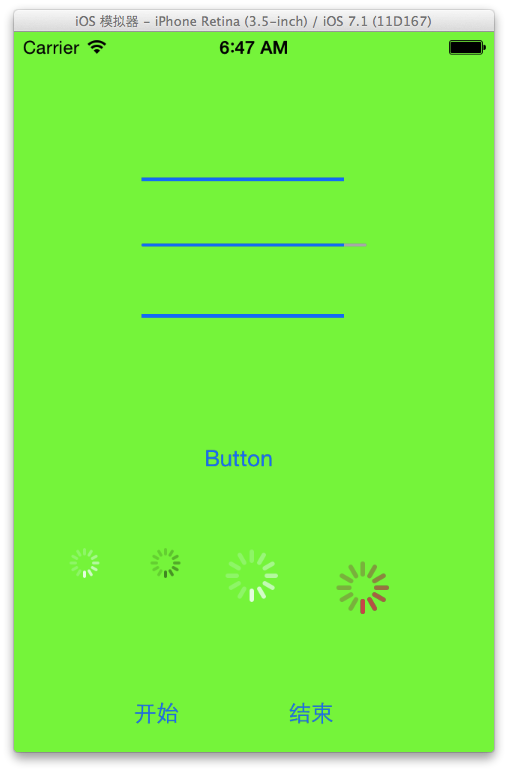
-- 页面展示效果 :
五. 拖动条控件 (UISlider)
1. 拖动条控件 (UISlider) 简介
属性截图 :
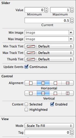
(1) UISlider 图片设置方法
UISlider 设置图片方法 :
-- 已完成进度轨道图片 : "setMinimumTrackingImage : forState :";
-- 未完成进度轨道图片 : "setMaximumTrackingImage : forState :";
-- 设置滑块的图片 : "setThumbImage : forState :";
2. 拖动条改变透明度示例
代码示例 :
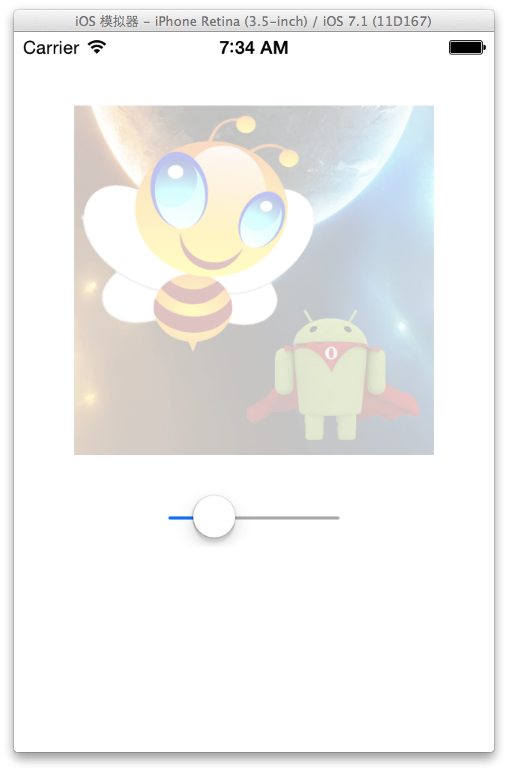
-- 界面设计文件 :
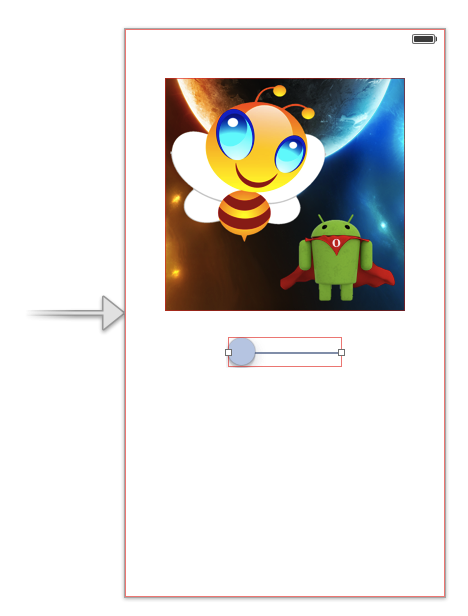
-- OCViewController.h :
// // OCViewController.h // UISlider // // Created by octopus on 15-12-14. // Copyright (c) 2015年 www.octopus.org.cn. All rights reserved. // #import <UIKit/UIKit.h> @interface OCViewController : UIViewController @property (strong, nonatomic) IBOutlet UISlider *slid; @property (strong, nonatomic) IBOutlet UIImageView *image; - (IBAction)valueChange:(id)sender; @end-- OCViewController.m :
讯享网// // OCViewController.m // UISlider // // Created by octopus on 15-12-14. // Copyright (c) 2015年 www.octopus.org.cn. All rights reserved. // #import "OCViewController.h" @interface OCViewController () @end @implementation OCViewController - (void)viewDidLoad { [super viewDidLoad]; // Do any additional setup after loading the view, typically from a nib. [self.image setAlpha: 0]; } - (void)didReceiveMemoryWarning { [super didReceiveMemoryWarning]; // Dispose of any resources that can be recreated. } - (IBAction)valueChange:(id)sender { [self.image setAlpha: self.slid.value]; } @end
-- 运行展示 :
四. 警告框控件 (UIAlertView)
1. 警告框控件 (UIAlertView) 简介
(1) UIAlertView 创建流程
UIAlertView 创建流程 :
-- 创建 UIAlertView : 创建时指定 标题, 内容, 按钮等信息, 按钮监听需要创建 UIAlertView 的 UIAlertViewDelegate 委托对象;
-- 显示 UIAlertView : 调用显示 UIAlertView 的显示方法;
-- 监听按钮 : 为委托对象实现 UIAlertViewDelegate 协议中的方法即可;
(2) UIAlertViewDelegate 协议方法
UIAlertViewDelegate 协议方法简介 :
-- "- (void) alertView : (UIAlertView *) alertView clickedButtonAtIndex : (NSInteger) buttonIndex :" 方法 : 用户单击对话框中的按钮激发的方法, buttonIndex 是点击的按钮的索引;
-- "- (void) willPresentAlertView : (UIAlertView *) alertView" 方法 : 对话框将要显示时激发该方法;
-- "- (void) didPresentAlertView : (UIAlertView *) alertView" 方法 : 对话框完全显示出来后激发该方法;
-- "- (BOOL) alertViewShouldEnableFirstOtherButton : (UIAlertView *) alertView" 方法 : 对话框中除 cancel 按钮之后的第一个按钮被启用回调该方法;
-- "- (void) alertView : (UIAlertView *) alertView willDissmissWithButtonIndex : (NSInteger) buttonIndex" 方法 : 单击某按钮将要隐藏警告框时激发该方法;
-- "- (void) alertView : (UIAlertView *) alertView didDissmissWithButtonIndex : (NSInteger) buttonIndex" 方法 : 单击某个按钮已经隐藏警告框后激发该方法;
-- "- (void) alertViewCancel : (UIAlertView * ) alertView " 方法 : 对话框被取消时激发的方法;
(3) UIAlertView 输入框风格设置
UIAlertView 的 actionSheetStyle 属性 :
-- 主要作用 : 设置 UIAlertView 的风格, 取值是 枚举值;
-- UIAlertViewStyleDefault 枚举值 : 默认警告框风格;
-- UIAlertViewStyleSecureTextInput 枚举值 : 警告框中有一个密码输入框;
-- UIAlertViewStylePlainTextInput 枚举值 : 警告框中包含普通输入框;
-- UIAlertViewStyleLoginAndPasswordInput 枚举值 : 警告框中包含 用户名 密码输入;
访问输入框方法 :
-- "- (UITextField *) textFieldAtIndex : (NSInteger) textFieldIndex" : 获取 索引值 为 textFieldIndex 的文本输入框;
.
.
2. 简单的对话框示例
(1) 创建 UIAlertView API
创建方法 :
[[UIAlertView alloc] initWithTitle:<#(NSString *)#> message:<#(NSString *)#> delegate:<#(id)#> cancelButtonTitle:<#(NSString *)#> otherButtonTitles:<#(NSString *), ...#>, nil];-- 参数一 : initWithTittle 对话框名称;
-- 参数二 : message 对话框内容;
-- 参数三 : delegate 委托对象;
-- 参数四 : cancelButtonTittle 取消按钮文字内容;
-- 参数五 : otherButtonTittles 其它按钮文字内容;
-- 真实代码 :
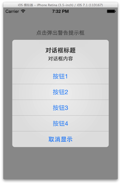
讯享网 /* 创建 UIAlertView 控件, 传入参数 标题 内容 委托对象 取消按钮 其它按钮 */ UIAlertView * alert = [[UIAlertView alloc] initWithTitle:@"对话框标题" message:@"对话框内容" delegate:self cancelButtonTitle:@"取消显示" otherButtonTitles:@"按钮1", @"按钮2", @"按钮3", @"按钮4", nil];
显示对话框 : [UIAlertView show];
(2) 代码示例
代码示例 :
-- 界面设计文件 :
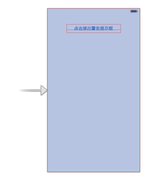
-- OCViewController.h :
// // OCViewController.h // UIAlertView // // Created by octopus on 15-12-14. // Copyright (c) 2015年 www.octopus.org.cn. All rights reserved. // #import <UIKit/UIKit.h> @interface OCViewController : UIViewController <UIAlertViewDelegate> //按钮的 IBAction 方法 - (IBAction)click:(id)sender; @end-- OCViewController.m :
讯享网// // OCViewController.m // UIAlertView // // Created by octopus on 15-12-14. // Copyright (c) 2015年 www.octopus.org.cn. All rights reserved. // #import "OCViewController.h" @interface OCViewController () @end @implementation OCViewController - (void)viewDidLoad { [super viewDidLoad]; // Do any additional setup after loading the view, typically from a nib. } - (void)didReceiveMemoryWarning { [super didReceiveMemoryWarning]; // Dispose of any resources that can be recreated. } //点击按钮弹出 UIAlertView 对话框 - (IBAction)click:(id)sender { /* 创建 UIAlertView 控件, 传入参数 标题 内容 委托对象 取消按钮 其它按钮 */ UIAlertView * alert = [[UIAlertView alloc] initWithTitle:@"对话框标题" message:@"对话框内容" delegate:self cancelButtonTitle:@"取消显示" otherButtonTitles:@"按钮1", @"按钮2", @"按钮3", @"按钮4", nil]; //调用该方法显示 UIAlertView 控件 [alert show]; } //实现的 UIAlertViewDelegate 协议中的方法 - (void) alertView:(UIAlertView *)alertView clickedButtonAtIndex:(NSInteger)buttonIndex{ NSString * msg = [NSString stringWithFormat:@"点击了按钮 %d", buttonIndex]; UIAlertView * alert = [[UIAlertView alloc] initWithTitle:@"弹出框" message: msg delegate:nil cancelButtonTitle:@"取消" otherButtonTitles: nil]; [alert show]; } @end
-- 运行界面展示 :
3. 警告框控件 (UIAlertView) 示例代码
(1) 相关 API 简介
相关 API 简介 :
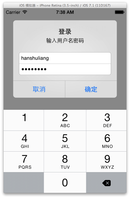
-- 设置 警告提示框 风格 :
//设置提示框的风格 账号密码输入 alertView.alertViewStyle = UIAlertViewStyleLoginAndPasswordInput;-- 设置输入框键盘输入类型 :
讯享网 //设置密码输入是数字键盘 [alertView textFieldAtIndex:1].keyboardType = UIKeyboardTypeNumberPad;
-- 获取指定索引的输入框 :
//获取账号输入文本框 UITextField * userNameField = [alertView textFieldAtIndex:0];-- 生成警告提示框 :
讯享网 //创建一个带 两个按钮的 提示框 确定 取消 UIAlertView * alertView = [[UIAlertView alloc] initWithTitle:@"登录" message:@"输入用户名密码" delegate:self cancelButtonTitle:@"取消" otherButtonTitles:@"确定", nil];
-- 显示警告提示框 :
//显示警告提示框 [alertView show];
(2) 示例代码
示例代码 :
-- 界面设计文件 :
-- OCViewController.h :
讯享网// // OCViewController.h // TextFieldUIAlertView // // Created by octopus on 15-12-17. // Copyright (c) 2015年 www.octopus.org.cn. All rights reserved. // #import <UIKit/UIKit.h> @interface OCViewController : UIViewController <UIAlertViewDelegate> - (IBAction)click:(id)sender; @end
-- OCViewController.m :
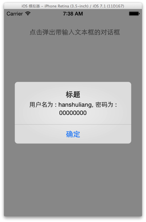
// // OCViewController.m // TextFieldUIAlertView // // Created by octopus on 15-12-17. // Copyright (c) 2015年 www.octopus.org.cn. All rights reserved. // #import "OCViewController.h" @interface OCViewController () @end @implementation OCViewController - (void)viewDidLoad { [super viewDidLoad]; // Do any additional setup after loading the view, typically from a nib. } - (void)didReceiveMemoryWarning { [super didReceiveMemoryWarning]; // Dispose of any resources that can be recreated. } - (IBAction)click:(id)sender { //创建一个带 两个按钮的 提示框 确定 取消 UIAlertView * alertView = [[UIAlertView alloc] initWithTitle:@"登录" message:@"输入用户名密码" delegate:self cancelButtonTitle:@"取消" otherButtonTitles:@"确定", nil]; //设置提示框的风格 账号密码输入 alertView.alertViewStyle = UIAlertViewStyleLoginAndPasswordInput; //设置密码输入是数字键盘 [alertView textFieldAtIndex:1].keyboardType = UIKeyboardTypeNumberPad; //显示警告提示框 [alertView show]; } - (void) alertView:(UIAlertView *)alertView clickedButtonAtIndex:(NSInteger)buttonIndex{ if(buttonIndex == 1){ //获取账号输入文本框 UITextField * userNameField = [alertView textFieldAtIndex:0]; //获取密码输入文本框 UITextField * passwordField = [alertView textFieldAtIndex:1]; //生成 一个 包含账号 密码 输入的字符串 NSString * content = [NSString stringWithFormat:@"用户名为 : %@, 密码为 : %@", userNameField.text, passwordField.text]; //生成警告提示框 UIAlertView * alertView = [[UIAlertView alloc] initWithTitle:@"标题" message:content delegate:nil cancelButtonTitle:@"确定" otherButtonTitles: nil]; //显示警告提示框 [alertView show]; } } - (void) willPresentAlertView:(UIAlertView *)alertView{ //遍历所有的 UIView 集合 for(UIView * view in alertView.subviews){ //如果类型是 UILabel if([view isKindOfClass:[UILabel class]]){ //获取 UILabel 控件 UILabel * label = (UILabel *) view; //设置 UILabel 控件右对齐 label.textAlignment = UITextAlignmentRight; } } } @end-- 界面展示效果 :
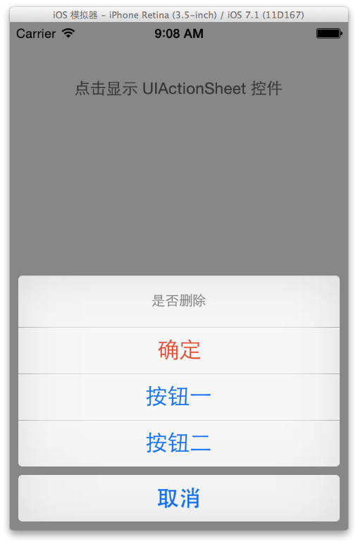
五. UIActionSheet 控件
1. UIActionSheet 简介
(1) UIActionSheet 作用
UIActionSheet 作用 : 该控件是显示在界面底部的按钮列表, 该控件 有 一个标题 和 多个按钮;
(2) UIActionSheet 按钮
UIActionSheet 固定按钮 :
-- 取消按钮 : 灰色背景, 主要用于取消该 UIActionSheet 控件显示;
-- 销毁按钮 : 红色背景, 用于删除某记录时, 使用该按钮确认销毁;
(3) UIActionSheet 风格
UIActionSheet 支持风格 :
-- UIActionSheetStyleDefault : 灰色背景上显示白色文字;
-- UIActionSheetStyleBlackTranselucent : 透明黑色背景上显示白色文字;
-- UIActionSheetBlackOpaque : 纯黑的背景上显示白色文字;
2. UIActionSheet 示例代码
UIActionSheet 示例代码 :
-- 界面设计文件 :
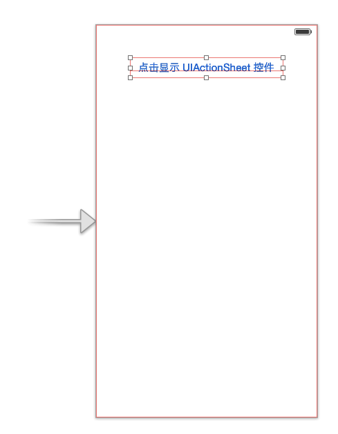
-- OCViewController.h :
讯享网// // OCViewController.h // UIActionSheet // // Created by octopus on 15-12-17. // Copyright (c) 2015年 www.octopus.org.cn. All rights reserved. // #import <UIKit/UIKit.h> @interface OCViewController : UIViewController <UIActionSheetDelegate> - (IBAction)click:(id)sender; @end
-- OCViewController.m :
// // OCViewController.m // UIActionSheet // // Created by octopus on 15-12-17. // Copyright (c) 2015年 www.octopus.org.cn. All rights reserved. // #import "OCViewController.h" @interface OCViewController () @end @implementation OCViewController - (void)viewDidLoad { [super viewDidLoad]; // Do any additional setup after loading the view, typically from a nib. } - (void)didReceiveMemoryWarning { [super didReceiveMemoryWarning]; // Dispose of any resources that can be recreated. } - (IBAction)click:(id)sender { UIActionSheet * actionSheet = [[UIActionSheet alloc] initWithTitle:@"是否删除" delegate:self cancelButtonTitle:@"取消" destructiveButtonTitle:@"确定" otherButtonTitles: @"按钮一", @"按钮二", nil]; actionSheet.actionSheetStyle = UIActionSheetStyleAutomatic; [actionSheet showInView:self.view]; } - (void) actionSheet:(UIActionSheet *)actionSheet clickedButtonAtIndex:(NSInteger)buttonIndex{ UIAlertView * alertView = [[UIAlertView alloc] initWithTitle:@"提示" message:[NSString stringWithFormat : @"点击了第 %d 个按钮", buttonIndex] delegate:nil cancelButtonTitle:@"取消" otherButtonTitles: nil]; [alertView show]; } @end-- 运行界面展示 :
转载请注明出处 : http://blog.csdn.net/shulianghan/article/details/
版权声明:本文内容由互联网用户自发贡献,该文观点仅代表作者本人。本站仅提供信息存储空间服务,不拥有所有权,不承担相关法律责任。如发现本站有涉嫌侵权/违法违规的内容,请联系我们,一经查实,本站将立刻删除。
如需转载请保留出处:https://51itzy.com/kjqy/66446.html