
1.Popover气泡卡片
点击/鼠标移入元素,弹出气泡式的卡片浮层。
2.何时使用
当目标元素有进一步的描述和相关操作时,可以收纳到卡片中,根据用户的操作行为进行展现。
和 Tooltip 的区别是,用户可以对浮层上的元素进行操作,因此它可以承载更复杂的内容,比如链接或按钮等。
组件代码来自: 气泡卡片 Popover - Ant Design
3.本地验证前的准备
参考文章【react项目+antd组件-demo:hello-world react项目+antd组件-demo:hello-world_react+antd 表格demo-CSDN博客】,将 气泡卡片 Popover - Ant Design 中需要在本地使用的代码复制覆盖App2.js中的全部代码,启动代码,可在本地查看现象和更改代码。
4.本地验证Popover的简单用法
复制下图所示代码,了解Popover的简单用法。注意可以不复制CSS中的内容。
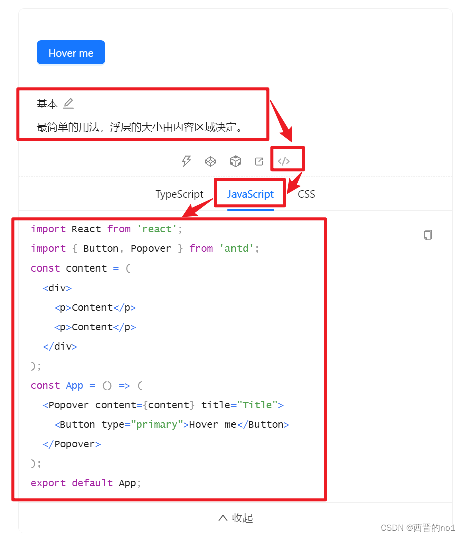
import React from 'react'; import { Button, Popover } from 'antd'; const content = ( <div> <p>Content</p> <p>Content</p> </div> ); const App = () => ( <Popover content={content} title="Title"> <Button type="primary">Hover me</Button> </Popover> ); export default App;讯享网
5.查看3种触发方式的使用方式
复制下图所示代码,了解Popover的3种触发方式。具体方式可参考: 文字提示 Tooltip - Ant Design
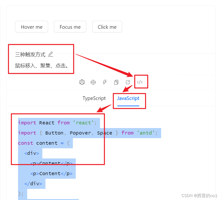
讯享网import React from 'react'; import { Button, Popover, Space } from 'antd'; const content = ( <div> <p>Content</p> <p>Content</p> </div> ); const App = () => ( <Space wrap> <Popover content={content} title="Title" trigger="hover"> <Button>Hover me</Button> </Popover> <Popover content={content} title="Title" trigger="focus"> <Button>Focus me</Button> </Popover> <Popover content={content} title="Title" trigger="click"> <Button>Click me</Button> </Popover> </Space> ); export default App;
6.查看设置气泡 12 个方向的方法:placement
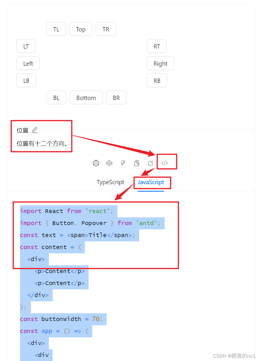
复制下图所示代码,了解如何设置气泡 12 个方向:placement。

气泡框位置,可选 top left right bottom topLeft topRight bottomLeft bottomRight leftTop leftBottom rightTop rightBottom。
具体用法参考下述源代码,或: 文字提示 Tooltip - Ant Design
import React from 'react'; import { Button, Popover, ConfigProvider } from 'antd'; const text = <span>Title</span>; const content = ( <div> <p>Content</p> <p>Content</p> </div> ); const buttonWidth = 80; const App = () => ( <ConfigProvider button={


  { style: { width: buttonWidth, margin: 4, }, }} > <div className="demo"> <div style={


  { marginInlineStart: buttonWidth + 4, whiteSpace: 'nowrap', }} > <Popover placement="topLeft" title={text} content={content}> <Button>TL</Button> </Popover> <Popover placement="top" title={text} content={content}> <Button>Top</Button> </Popover> <Popover placement="topRight" title={text} content={content}> <Button>TR</Button> </Popover> </div> <div style={


  { width: buttonWidth, float: 'inline-start', }} > <Popover placement="leftTop" title={text} content={content}> <Button>LT</Button> </Popover> <Popover placement="left" title={text} content={content}> <Button>Left</Button> </Popover> <Popover placement="leftBottom" title={text} content={content}> <Button>LB</Button> </Popover> </div> <div style={


  { width: buttonWidth, marginInlineStart: buttonWidth * 4 + 24, }} > <Popover placement="rightTop" title={text} content={content}> <Button>RT</Button> </Popover> <Popover placement="right" title={text} content={content}> <Button>Right</Button> </Popover> <Popover placement="rightBottom" title={text} content={content}> <Button>RB</Button> </Popover> </div> <div style={


{ marginInlineStart: buttonWidth, clear: 'both', whiteSpace: 'nowrap', }} > <Popover placement="bottomLeft" title={text} content={content}> <Button>BL</Button> </Popover> <Popover placement="bottom" title={text} content={content}> <Button>Bottom</Button> </Popover> <Popover placement="bottomRight" title={text} content={content}> <Button>BR</Button> </Popover> </div> </div> </ConfigProvider> ); export default App; 7.不随页面滚动而滑动
悬浮出现popover气泡卡片,但气泡卡片随着滚动条滚动改变位置,如何解决这个问题呢?
在代码中给元素 Popover 添加一个属性 getPopupContainer={triggerNode => triggerNode.parentNode},
并且附近标签要有position:'relative'。
8.指定弹出页面的尺寸
在代码中给元素 Popover 添加一个属性 overlayStyle={ {height:"100px"}},具体样式在其中进行设置。
9.指定弹出页面的显示层次
在代码中给元素 Popover 添加一个属性 zIndex={10},具体值根据实际情况进行设置。
本文仅介绍了组件Popover的部分内容,更多内容请参阅官方文档: 气泡卡片 Popover - Ant Design
版权声明:本文内容由互联网用户自发贡献,该文观点仅代表作者本人。本站仅提供信息存储空间服务,不拥有所有权,不承担相关法律责任。如发现本站有涉嫌侵权/违法违规的内容,请联系我们,一经查实,本站将立刻删除。
如需转载请保留出处:https://51itzy.com/kjqy/130670.html