
Button加入等待动画,先运行软件看下效果
建立BusyFrameAnimation类,在类中创建Button中依赖属性IsBusyProperty
public class BusyFrameAnimation : DependencyObject { public static bool GetIsBusy(DependencyObject property) { return (bool)property.GetValue(IsBusyProperty); } public static void SetIsBusy(DependencyObject property, bool value) { property.SetValue(IsBusyProperty, value); } public static readonly DependencyProperty IsBusyProperty = DependencyProperty.RegisterAttached("IsBusy", typeof(bool), typeof(BusyFrameAnimation), new PropertyMetadata(false)); }local:BusyFrameAnimation.IsBusy="{Binding LoginIsRunning}" 属性绑定LoginIsRunning,设置LoginIsRunning值显示或隐藏等待。
讯享网<Button Content="登录" IsDefault="True" Command="{Binding LoginCommand}" local:BusyFrameAnimation.IsBusy="{Binding LoginIsRunning}" CommandParameter="{Binding RelativeSource={RelativeSource AncestorType={x:Type pages:LoginPage}}}" HorizontalAlignment="Center"/>
public class BoolenToVisiblityConverter : BaseValueConverter<BoolenToVisiblityConverter> { public override object Convert(object value, Type targetType, object parameter, CultureInfo culture) { if (parameter == null) return (bool)value ? Visibility.Hidden : Visibility.Visible; else return (bool)value ? Visibility.Visible : Visibility.Hidden; } public override object ConvertBack(object value, Type targetType, object parameter, CultureInfo culture) { throw new NotImplementedException(); } }重点部分来了,实现加载动画和旋转效果功能,先去iconfont找个等待矢量图。
讯享网<Geometry x:Key="Icon-Waiting">M60.014 542.385c0-37.982 30.385-68.367 68.367-68.367 45.578 0 75.964 30.385 75.964 68.367 0 45.578-30.385 75.964-75.964 75.964-37.982 0-68.367-30.385-68.367-75.964zM151.171 276.512v0c0-53.175 37.982-98.753 91.157-98.753s98.753 45.578 98.753 98.753v0c0 53.175-45.578 91.157-98.753 91.157s-91.157-37.982-91.157-91.157v0zM189.153 815.856v0c0-30.385 22.789-53.175 53.175-53.175s53.175 22.789 53.175 53.175v0c0 30.385-22.789 53.175-53.175 53.175s-53.175-22.789-53.175-53.175zM455.027 929.802v0c0-37.982 22.789-60.772 60.772-60.772s60.772 22.789 60.772 60.772v0c0 37.982-22.789 60.772-60.772 60.772-37.982 0-60.772-22.789-60.772-60.772zM751.287 815.856c0-22.789 15.193-37.982 37.982-37.982s37.982 15.193 37.982 37.982c0 22.789-15.193 37.982-37.982 37.982-22.789 0-37.982-15.193-37.982-37.982zM834.847 542.385c0-30.385 30.385-60.772 68.367-60.772 30.385 0 60.772 30.385 60.772 60.772 0 37.982-30.385 68.367-60.772 68.367-37.982 0-68.367-30.385-68.367-68.367zM660.13 276.512c0-75.964 60.772-129.139 129.139-129.139s129.139 53.175 129.139 129.139c0 68.367-60.772 129.139-129.139 129.139-68.367 0-129.139-60.772-129.139-129.139zM386.66 162.566c0-68.367 60.772-129.139 129.139-129.139s129.139 60.772 129.139 129.139c0 68.367-60.772 129.139-129.139 129.139-68.367 0-129.139-60.772-129.139-129.139z</Geometry>
用label实现加载矢量图,PathData="{DynamicResource Icon-Waiting}",动画旋转360度和时长设置等属性,Storyboard.TargetProperty="(UIElement.RenderTransform).(RotateTransform.Angle)"From="0"To="360"Duration="0:0:2"
<Style x:Key="SpinningLabel" TargetType="{x:Type Label}"> <Setter Property="RenderTransformOrigin" Value="0.5,0.5"/> <Setter Property="RenderTransform"> <Setter.Value> <RotateTransform/> </Setter.Value> </Setter> <Setter Property="Template"> <Setter.Value> <ControlTemplate TargetType="{x:Type Label}"> <Viewbox x:Name="IconBox" Width="{TemplateBinding FontSize}" Height="{TemplateBinding FontSize}" HorizontalAlignment="Center" VerticalAlignment="Center"> <Path Data="{DynamicResource Icon-Waiting}" Fill="{TemplateBinding Foreground}" Stretch="Fill"></Path> </Viewbox> </ControlTemplate> </Setter.Value> </Setter> <Style.Resources> <Storyboard x:Key="Spin"> <DoubleAnimation Storyboard.TargetProperty="(UIElement.RenderTransform).(RotateTransform.Angle)" From="0" To="360" Duration="0:0:2" RepeatBehavior="Forever"/> </Storyboard> </Style.Resources> <Style.Triggers> <DataTrigger Binding="{Binding RelativeSource={x:Static RelativeSource.Self}, Path=IsVisible}" Value="True"> <DataTrigger.EnterActions> <BeginStoryboard Name="SpinStoryboard" Storyboard="{StaticResource Spin}"/> </DataTrigger.EnterActions> <DataTrigger.ExitActions> <RemoveStoryboard BeginStoryboardName="SpinStoryboard"/> </DataTrigger.ExitActions> </DataTrigger> </Style.Triggers> </Style>之前讲过触发有三种方式,事件触发和属性触发都使用过,这里用到数据触发功能。

<DataTriggerBinding="{Binding RelativeSource={x:Static RelativeSource.Self}, Path=IsVisible}"Value="True"> 此处代码表示当显示的时候调用Storyboard="{StaticResource Spin}"名称是上面Spin的键。
标签控件显示和旋转功能已经实现了,需要加入到按钮中。
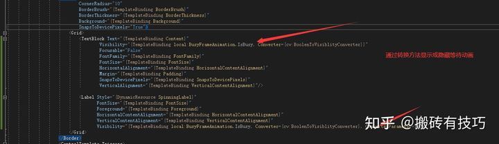
<Style TargetType="{x:Type Button}"> <Setter Property="Background" Value="{StaticResource WordOrangeBrush}"/> <Setter Property="Foreground" Value="{StaticResource ForegroundLightBrush}"/> <Setter Property="BorderThickness" Value="0"/> <Setter Property="FontSize" Value="30"/> <Setter Property="Margin" Value="0,10,0,0"/> <Setter Property="Padding" Value="50,10"/> <Setter Property="local:BusyFrameAnimation.IsBusy" Value="False"/> <Setter Property="Template"> <Setter.Value> <ControlTemplate TargetType="{x:Type ButtonBase}"> <Border x:Name="border" CornerRadius="10" BorderBrush="{TemplateBinding BorderBrush}" BorderThickness="{TemplateBinding BorderThickness}" Background="{TemplateBinding Background}" SnapsToDevicePixels="True"> <Grid> <TextBlock Text="{TemplateBinding Content}" Visibility="{TemplateBinding local:BusyFrameAnimation.IsBusy, Converter={cv:BoolenToVisiblityConverter}}" Focusable="False" FontFamily="{TemplateBinding FontFamily}" FontSize="{TemplateBinding FontSize}" HorizontalAlignment="{TemplateBinding HorizontalContentAlignment}" Margin="{TemplateBinding Padding}" SnapsToDevicePixels="{TemplateBinding SnapsToDevicePixels}" VerticalAlignment="{TemplateBinding VerticalContentAlignment}"/> <Label Style="{DynamicResource SpinningLabel}" FontSize="{TemplateBinding FontSize}" Foreground="{TemplateBinding Foreground}" HorizontalContentAlignment="{TemplateBinding HorizontalContentAlignment}" VerticalContentAlignment="{TemplateBinding VerticalContentAlignment}" Visibility="{TemplateBinding local:BusyFrameAnimation.IsBusy, Converter={cv:BoolenToVisiblityConverter}, ConverterParameter=True}"/> </Grid> </Border> <ControlTemplate.Triggers> <EventTrigger RoutedEvent="MouseEnter"> <BeginStoryboard> <Storyboard> <ColorAnimation To="{StaticResource WordBlue}" Duration="0:0:0.3" Storyboard.TargetName="border" Storyboard.TargetProperty="Background.Color"/> </Storyboard> </BeginStoryboard> </EventTrigger> <EventTrigger RoutedEvent="MouseLeave"> <BeginStoryboard> <Storyboard> <ColorAnimation From="{StaticResource WordBlue}" Duration="0:0:0.3" Storyboard.TargetName="border" Storyboard.TargetProperty="Background.Color"/> </Storyboard> </BeginStoryboard> </EventTrigger> <Trigger Property="IsEnabled" Value="False"> <Setter Property="Background" TargetName="border" Value="{StaticResource ForegroundDarkBrush}"/> </Trigger> </ControlTemplate.Triggers> </ControlTemplate> </Setter.Value> </Setter> </Style>默认等待动画是不显示,所以设置依赖属性<SetterProperty="local:BusyFrameAnimation.IsBusy"Value="False"/>
当Visibility="{TemplateBinding local:BusyFrameAnimation.IsBusy, Converter={cv:BoolenToVisiblityConverter}, ConverterParameter=True}" 转换类型cv:BoolenToVisiblityConverter和设置依赖属性BusyFrameAnimation.IsBusy=true时就会显示等待动画。
最后登录按钮绑定命令是异步等待,这里我设置显示等待10秒。
public ICommand LoginCommand { get { return new DelegateCommand(async parameter => { await RunCommandAsync(() => this.LoginIsRunning, async () => { await Task.Delay(10000); }); }); } }RunCommandAsync异步方法,参数updatingFlag是LoginIsRunning传的值, updatingFlag.SetPropertyValue(true);显示动画,await action();等待时间后再设置false,隐藏动画效果,显示Button默认文本内容
protected async Task RunCommandAsync(Expression<Func<bool>> updatingFlag, Func<Task> action) { lock (updatingFlag) { if (updatingFlag.GetPropertyValue()) return; updatingFlag.SetPropertyValue(true); } try { await action(); } finally { updatingFlag.SetPropertyValue(false); } }
版权声明:本文内容由互联网用户自发贡献,该文观点仅代表作者本人。本站仅提供信息存储空间服务,不拥有所有权,不承担相关法律责任。如发现本站有涉嫌侵权/违法违规的内容,请联系我们,一经查实,本站将立刻删除。
如需转载请保留出处:https://51itzy.com/kjqy/123280.html